Treeitem"
Jimmyshiau (talk | contribs) m (→Treeitem) |
Jimmyshiau (talk | contribs) |
||
| Line 96: | Line 96: | ||
</treeitem> | </treeitem> | ||
</source> | </source> | ||
| + | |||
| + | = The open Property and the onOpen Event = | ||
| + | Each tree item contains the <tt>open</tt> property which is used to control whether to display its child items. The default value is true. By setting this property to false, you are able to control what part of the tree is invisible. | ||
| + | |||
| + | <source lang="xml" > | ||
| + | <treeitem open="false"> | ||
| + | </source> | ||
| + | |||
| + | When a user clicks on the +/- button, he opens the tree item and makes its children visible. The <tt>onOpen</tt> event is then sent to the server to notify the application. | ||
| + | |||
| + | For sophisticated applications, you can defer the creation of the content of the tree item or manipulate its content dynamically until the <tt>onOpen</tt> event is received. Refer to the '''Load on Demand''' section in the '''ZK User Interface Markup Language''' chapter for details. | ||
=Supported Events= | =Supported Events= | ||
Revision as of 09:08, 17 November 2010
Treeitem
- Demonstration: Tree (Dynamic Styling)
- Java API: Treeitem
- JavaScript API: Treeitem
- Style Guide: N/A
Employment/Purpose
Treeitem contains a row of data (treerow), and an optional treechildren.
If the component doesn't contain a treechildren, it is a leaf node that doesn't accept any child items.
If it contains a treechildren, it is a branch node that might contain other items.
For a branch node, an +/- button will appear at the beginning of the row, such that user could open and close the item by clicking on the +/- button.
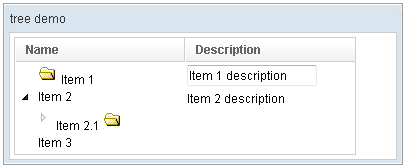
Example
<window title="tree demo" border="normal" width="400px">
	<tree id="tree" width="90%">
		<treecols sizable="true">
			<treecol label="Name" />
			<treecol label="Description" />
		</treecols>
		<treechildren>
			<treeitem>
				<treerow>
					<treecell>
						<image src="/img/folder.gif" />
						Item 1
					</treecell>
					<treecell>
						<textbox value="Item 1 description" />
					</treecell>
				</treerow>
			</treeitem>
			<treeitem>
				<treerow>
					<treecell label="Item 2" />
					<treecell label="Item 2 description" />
				</treerow>
				<treechildren>
					<treeitem open="false">
						<treerow>
							<treecell label="Item 2.1">
								<image src="/img/folder.gif" />
							</treecell>
						</treerow>
						<treechildren>
							<treeitem>
								<treerow>
									<treecell label="Item 2.1.1" />
								</treerow>
							</treeitem>
						</treechildren>
					</treeitem>
				</treechildren>
			</treeitem>
			<treeitem label="Item 3" />
		</treechildren>
	</tree>
 </window>
Label and Image
Treeitem provides Treeitem.setImage(String) and Treeitem.setLabel(String) to simplify the assignment of image and label to a treeitem. However, they are actually placed in the first treecell (of the child treerow). Furthermore, if the treecell or treerow are not created, they will be created automatically. For example,
<treeitem label="hello"/>
is equivalent to
<treeitem>
  <treerow>
    <treecell label="hello"/>
  </treerow>
It also means you cannot attach a treerow child to the treeitem, after setImage or setLabel was invoked. It means, though a bit subtle, the following will cause an exception:
<treeitem label="hello"> <!-- treerow is created automatically because of setLabel -->
  <treerow/> <!-- exception since only one treerow is allowed per treeitem -->
</treeitem>
The open Property and the onOpen Event
Each tree item contains the open property which is used to control whether to display its child items. The default value is true. By setting this property to false, you are able to control what part of the tree is invisible.
<treeitem open="false">
When a user clicks on the +/- button, he opens the tree item and makes its children visible. The onOpen event is then sent to the server to notify the application.
For sophisticated applications, you can defer the creation of the content of the tree item or manipulate its content dynamically until the onOpen event is received. Refer to the Load on Demand section in the ZK User Interface Markup Language chapter for details.
Supported Events
| Event: OpenEvent
Denotes user has opened or closed a component. It is useful to implement load-on-demand by listening to the onOpen event, and creating components when the first time the component is opened. |
- Inherited Supported Events: XulElement
Supported Children
* Treerow, Treechildren
Use Cases
| Version | Description | Example Location |
|---|---|---|
Version History
| Version | Date | Content |
|---|---|---|
