Listbox
Listbox
Employment/Purpose
Components: listbox, listitem, listcell, listhead and listheader.
A list box is used to display a number of items in a list. The user may select an item from the list.
Example
 <window title="listbox demo" border="normal" width="250px">
	<listbox id="box">
		<listhead sizable="true">
			<listheader label="name" sort="auto" />
			<listheader label="gender" sort="auto" />
		</listhead>
		<listitem>
			<listcell label="Mary" />
			<listcell label="FEMALE" />
		</listitem>
		<listitem>
			<listcell label="John" />
			<listcell label="MALE" />
		</listitem>
		<listitem>
			<listcell label="Jane" />
			<listcell label="FEMALE" />
		</listitem>
		<listitem>
			<listcell label="Henry" />
			<listcell label="MALE" />
		</listitem>
		<listfoot>
			<listfooter>
				<label value="This is footer1" />
			</listfooter>
			<listfooter>
				<label value="This is footer2" />
			</listfooter>
		</listfoot>
	</listbox>
</window>
Select Mold
The Listbox has two molds: default and select. If the select mold is used, the HTML's SELECT tag is generated instead.
<listbox mold="select">...</listbox>
Note: if the mold is "select", rows is "1", and none of the items are marked as selected, the browser will display the listbox as if the first item is selected. Worst of all, if user selects the first item in this case, no onSelect event is sent. To avoid this confusion, developers should select at least one item when using mold="select" and rows="1".
In addition to each items label, you can assign an application-specific value to each item using the setValue method.
Listboxes Contain Buttons
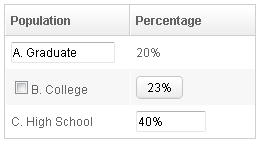
In theory, a list cell can contain any other components, as demonstrated below.
<zk>
	<listbox width="250px">
	    <listhead>
	        <listheader label="Population"/>
	        <listheader label="Percentage"/>
	    </listhead>
	    <listitem value="A">
	        <listcell><textbox width="90%" value="A. Graduate"/></listcell>
	        <listcell label="20%"/>
	    </listitem>
	    <listitem value="B">
	        <listcell><checkbox label="B. College"/></listcell>
	        <listcell><button label="23%"/></listcell>
	    </listitem>
	    <listitem value="C">
	        <listcell label="C. High School"/>
	        <listcell><textbox cols="8" value="40%"/></listcell>
	    </listitem>
	</listbox>
</zk>
Notes:
- Don't use a list box, when a grid is a better choice. The appearances of list boxes and grids are similar, but the listbox should only be used to represent a list of selectable items.
- Users are usually confused if a listbox contains editable components such as a textbox or a checkbox.
- Due to the limitation of the browsers, users cannot select a range of characters from text boxes.
Mouseless Entry Listbox
- Press UP and DOWN to move the selection up and down by one list item.
- Press PgUp and PgDn to move the selection up and down by one page.
- Press HOME to move the selection to the first item, and END to move to the last item.
- Press Ctrl+UP and Ctrl+DOWN to move the focus up and down by one list item without changing the selection.
- Press SPACE to select the item in focus.
Paging
Like grids, you can use multiple pages to represent large content by setting the mold to paging. Similarly, you can control how many items each page displays, whether to use an external paging component and whether to customize the behavior when a page is selected.
The listbox and grid components support the paging intrinsically, so you don't need to specify a paging component explicitly as above unless you want to have different visual layout or to control multiple listbox and gridcontrols with one paging component.
Please refer to the Grid for more details.
Autopaging
When using the paging mold and vflex, you could also turn on autopaging (Listbox.setAutopaging(boolean)) such that the page size will be adjusted automatically based on the available space.
Selection
Nonselectable Tags
By default, when an user clicks on a BUTTON, INPUT, TEXTAREA or A tag, the selection state of the item won't be changed. For example, when an user clicks the textbox in the following example, the selection state of the item won't be changed (only the textbox gains the focus).
<listitem>
  <listcell><textbox/></listcell>
Sometimes it is not intuitive, such as using with inplace editing (InputElement.isInplace()). If you want to have more control of whether to select an item, you could specify a list of tags in the nonselectableTags property (Listbox.setNonselectableTags(String)). For example, if you want to select the item, no matter what tag the user clicks, you could specify an empty string as follows.
<listbox nonselectableTags="">
    <listitem><listcell><textbox/></listcell></listitem>
    <listitem><listcell><button label="button"/></listcell></listitem>
    <listitem><listcell><h:input xmlns:h="native"/></listcell></listitem>
    <listitem><listcell><datebox/></listcell></listitem>
</listbox>
If you only want to ignore BUTTON and INPUT only, you could specify nonselectableTags="button, input".
Multiple Selection
When a user clicks on a list item, the whole row is selected and the onSelect event is sent back to the server to notify the application. You are able to control whether a list box allows multiple selections by setting the multiple attribute to true. The default value is false.
The Checkmark Property
The checkmark attribute controls whether to display a checkbox or a radio button in front of each list item.
In the following example, you will notice how a checkbox is added automatically when you move a list item from the left listbox to the right one. The checkbox is then removed when you move a list item from the right listbox to the left listbox.
<zk>
<hbox>
<listbox id="src" rows="0" multiple="true" width="200px">
<listhead>
<listheader label="Population"/>
<listheader label="Percentage"/>
</listhead>
<listitem id="a" value="A">
<listcell label="A. Graduate"/>
<listcell label="20%"/>
</listitem>
<listitem id="b" value="B">
<listcell label="B. College"/>
<listcell label="23%"/>
</listitem>
<listitem id="c" value="C">
<listcell label="C. High School"/>
<listcell label="40%"/>
</listitem>
<listitem id="d" value="D">
<listcell label="D. Others"/>
<listcell label="17%"/>
</listitem>
</listbox>
<vbox>
<button label="=>" onClick="move(src, dst)"/>
<button label="<=" onClick="move(dst, src)"/>
</vbox>
<listbox id="dst" checkmark="true" rows="0" multiple="true" width="200px">
<listhead>
<listheader label="Population" width="120px"/>
<listheader label="Percentage"/>
</listhead>
<listitem id="e" value="E">
<listcell label="E. Supermen"/>
<listcell label="21%"/>
</listitem>
</listbox>
<zscript>
void move(Listbox src, Listbox dst) {
Listitem s = src.getSelectedItem();
if (s == null)
Messagebox.show("Select an item first");
else
s.setParent(dst);
}
</zscript>
</hbox>
</zk>
Note: If the multiple attribute is false, radio buttons are displayed instead, as demonstrated by the right hand listbox.
Deselect Others when Clicking an Item with Checkmark
If a listbox's checkmark (Listbox.isCheckmark()) is enabled, the selection will be toggled when an user clicks an item. In other words, all other items will remain the same.
If you prefer to deselect all other items and select the item being clicked (which the behavior of ZK 5.0.4 and earlier), you could specify true to this library property called org.zkoss.zul.listbox.checkmarkDeselectOthers in WEB-INF/zk.xml:
<library-property>
	<name>org.zkoss.zul.listbox.checkmarkDeselectOthers</name>
	<value>true</value>
</library-property>
Toggle Selection when Right Clicking an Item with Checkmark
If a listbox's checkmark (Listbox.isCheckmark()) is enabled, the selection will be toggled when user right click on item.
If you prefer not to select/deselect item on right click, you could specify false to this library property called org.zkoss.zul.listbox.rightSelect in WEB-INF/zk.xml:
<library-property>
	<name>org.zkoss.zul.listbox.rightSelect</name>
	<value>false</value>
</library-property>
Sort
Sorting
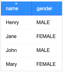
List boxes support sorting of list items directly. There are a few ways to enable the sorting of a particular column. The simplest way is to set the sort attribute of the list header to auto as demonstrated by the code below. Then, the column that the list header is associated with is sort-able based on the label of each list cell of the that column.
<zk>
    <listbox width="200px">
        <listhead>
            <listheader label="name" sort="auto"/>
            <listheader label="gender" sort="auto"/>
        </listhead>
        <listitem>
            <listcell label="Mary"/>
            <listcell label="FEMALE"/>
        </listitem>
        <listitem>
            <listcell label="John"/>
            <listcell label="MALE"/>
        </listitem>
        <listitem>
            <listcell label="Jane"/>
            <listcell label="FEMALE"/>
        </listitem>
        <listitem>
            <listcell label="Henry"/>
            <listcell label="MALE"/>
        </listitem>
    </listbox>
</zk>
The SortAscending and SortDescending Properties
If you prefer to sort list items in different ways, you can assign a java.util.Comparator instance to the sortAscending and/or sortDescending attributes. Once assigned, the list items can be sorted in the ascending and/or descending order with the specified comparator.
The invocation of the sort attribute with auto automatically assigns two comparators to the sortAscending and sortDescending attributes. You can override any of them by assigning another comparator.
For example, assume you want to sort based on the value of list items, rather than list cell's label, then you assign an instance of ListitemComparator to these attributes as follows.
<zscript>
	Comparator asc = new ListitemComarator(-1, true, true);
	Comparator dsc = new ListitemComarator(-1, false, true);
</zscript>
<listbox>
    <listhead>
        <listheader sortAscending="${asc}" sortDescending="${dsc}"/>
 ...
The SortDirection Property
The sortDirection attribute controls whether to display an icon to indicate the order of a particular column. If list items are sorted before adding to the list box, you should set this attribute explicitly.
<listheader sortDirection="ascending"/>
The sorting is maintained automatically by the listboxes as long as you assign the comparator to the corresponding list header.
The onSort Event
When you assign at least one comparator to a list header, an onSort event is sent to the server if user clicks on it. The list header implements a listener to automatically the sorting.
If you prefer to handle this manually, you can add your own listener to the list header for the onSort event. To prevent the default listener invoking the sort method, you have to call the stopPropagation method. Alternatively, you can override the sort method, please see below.
The Sort Method
The sort method is the underlying implementation of the default onSort event listener. It is also useful if you want to sort the list items using Java code. For example, you may have to call this method after adding items (assuming that they are not added in the proper order).
new Listem("New Stuff").setParent(listbox);
if (!"natural".header.getSortDirection())
	header.sort("ascending".equals(header.getSortDirection()));
The default sorting algorithm is quick-sort (by use of the sort method from the org.zkoss.zk.ui.Components class). You can override it with your own implementation or listen to the onSort event as described in the previous section.
Tip: Sorting a large amount of live data could degrade the performance significantly. It is better to intercept the onSort event or the sort method to handle it effectively. Please refer to the Sort Live Data section further down.
Live Data
Like grids[1], list boxes support live data. With live data, developers can separate data from the view. In other words, developers need only to provide the data by implementing the org.zkoss.zul.ListModel interface, rather than manipulating the list box directly.
The benefits are twofold:
- It is easier to use different views to display the same set of data.
- The list box sends the data to the client only if it is visible. This saves a lot of network traffic if there is a large amount of data.
There are three steps to make use of live data.
1 Prepare the data in the form of a ListModel. ZK has a concrete implementation called org.zkoss.zul.SimpleListModel for representing an array of objects. 2 Implement the org.zkoss.zul.RowRenderer interface for rendering a row of data into the grid.
- This is optional. If it is not specified the default renderer is used to render the data into the first column.
- You can implement different renderers for representing the same data in different views.
3 Set the data in the model attribute and, optionally, the renderer in the rowRenderer attribute.
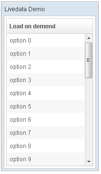
In the following example, we prepared a list model called strset, assigned it to a list box through the model attribute. Then, the list box will do the rest.
<window title="Livedata Demo" border="normal" width="200px">
    <zscript><![CDATA[
        String[] data = new String[30];
        for(int j=0; j < data.length; ++j) {
            data[j] = "option "+j;
        }
        ListModel strset = new SimpleListModel(data);
    ]]></zscript>
    <listbox rows="10" model="${strset}">
        <listhead>
            <listheader label="Load on demend"/>
        </listhead>
    </listbox>
</window>
Sorting with Live Data
If you allow users to sort a grid with live data, you have to implement the interface, org.zkoss.zul.ListModelExt, in addition to the org.zkoss.zul.ListModel.
class MyListModel implements ListModel, ListModelExt {
	public void sort(Comparator cmpr, boolean ascending) {
		//do the real sorting
		//notify the listbox (or grid) that data is changed by use of ListDataEvent
	}
}
When a user wants to sort the listbox, the listbox will invoke the sort method of ListModelExt to sort the data. In other words, the sorting is done by the list model, rather than the listbox.
After sorting, the list model will notify the listbox by invoking the onChange method of the listbox』s registered org.zkoss.zul.event.ListDataListener instances. These are registered by the addListDataListener method. In most cases, all the data is changed, so the list model usually sends the following event:
new ListDataEvent(this, ListDataEvent.CONTENTS_CHANGED, -1, -1)
Note: the implementation of the ListModel and ListModelExt is independent of the visual presentation. In other words, they can be used with grids, listboxes and any other components supporting ListModel.
If you require maximum flexibility, you should not assume the component to used, instead use ListDataEvent to communicate.
Properties
Single-Column Listboxes
The simplest format is as follows. It is a single-column and single-selection list box.
<zk>
	<listbox width="200px">
	    <listitem label="Butter Pecan"/>
	    <listitem label="Chocolate Chip"/>
	    <listitem label="Raspberry Ripple"/>
	</listbox>
</zk>
Multi-Column Listboxes
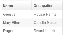
The list box also supports multiple columns. When a user selects an item, the entire row is selected.
To define a multi-column list, the number of listcells must match the number of columns with a row. For example if there are 4 columns then each row must contain 4 listcells.
<zk>
	<listbox width="200px">
		<listitem>
	        <listcell label="George"/>
	        <listcell label="House Painter"/>
	    </listitem>
	    <listitem>
	        <listcell label="Mary Ellen"/>
	        <listcell label="Candle Maker"/>
	    </listitem>
	    <listitem>
	        <listcell label="Roger"/>
	        <listcell label="Swashbuckler"/>
	    </listitem>
	</listbox>
</zk>
Column Headers
You can specify column headers by using listhead and listheader, please see the code below[2]. In addition to label, you can specify an image as the header by use of the image attribute.
<zk>
	<listbox width="200px">
		<listhead>
	                <listheader label="Name"/>
	                <listheader label="Occupation"/>
    	        </listhead>

                ...

	</listbox>
</zk>
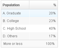
You could specify the column footers by using listfoot and listfooter. Please note, each time a listhead instance is added to a list box, it must be the first child, and a listfoot instance the last child.
<zk>
	<listbox width="200px">
	    <listhead>
	        <listheader label="Population"/>
	        <listheader align="right" label="%"/>
	    </listhead>
	    <listitem id="a" value="A">
	        <listcell label="A. Graduate"/>
	        <listcell label="20%"/>
	    </listitem>
	    <listitem id="b" value="B">
	        <listcell label="B. College"/>
	        <listcell label="23%"/>
	    </listitem>
	    <listitem id="c" value="C">
	        <listcell label="C. High School"/>
	        <listcell label="40%"/>
	    </listitem>
	    <listitem id="d" value="D">
	        <listcell label="D. Others"/>
	        <listcell label="17%"/>
	    </listitem>
	    <listfoot>
	        <listfooter label="More or less"/>
	        <listfooter label="100%"/>
	    </listfoot>
	</listbox>
</zk>
Drop-Down List
You can create a drop-down list by setting the listbox』s mold to select and making the box a single row. Notice you cannot use multi-column for the drop-down list.
<zk>
	<listbox mold="select" rows="1">
	    <listitem label="Car"/>
	    <listitem label="Taxi"/>
	    <listitem label="Bus" selected="true"/>
	    <listitem label="Train"/>
	</listbox>
</zk>
Scrollable Listboxes
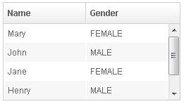
A list box will be scrollable if you specify the rows attribute or the height attribute and there is not enough space to display all list items.
<zk>
	<listbox width="250px" rows="4">
	    <listhead>
	        <listheader label="Name" sort="auto"/>
	        <listheader label="Gender" sort="auto"/>
	    </listhead>
	    <listitem>
	        <listcell label="Mary"/>
	        <listcell label="FEMALE"/>
	    </listitem>
	    <listitem>
	        <listcell label="John"/>
	        <listcell label="MALE"/>
	    </listitem>
	    <listitem>
	        <listcell label="Jane"/>
	        <listcell label="FEMALE"/>
	    </listitem>
	    <listitem>
	        <listcell label="Henry"/>
	        <listcell label="MALE"/>
	    </listitem>
	    <listitem>
	        <listcell label="Michelle"/>
	        <listcell label="FEMALE"/>
	    </listitem>
	</listbox>
</zk>
SizedByContent
By default, the widths of columns have to be specified explicitly, or it will be split equally among columns regardless what content they might have. If you want to have the minimal width (that fit the content), you could specify hflex="min" at the column (not the listbox).
However, the listbox has a special mode called sized-by-content (Listbox.setSizedByContent(boolean)). By specifying it to true, the column width will be adjusted automatically. However, it is controlled by the browser, so have have no 100% control of it. For example, if an user resized a column, the final width might not be exactly the same as what he resized.
In general, we suggest to specify hflex in column, rather than specifying sizedByContent at listbox for much more predictable result.
Span
By default, when sizedByContent is true, column only take required space.

If wanna to span the width of the columns to occupy the whole listbox, you could specify true to this attribute

<listbox sizedByContent="true" span="true" width="800px">
	<listhead>
		<listheader	label="Time Message" />
		<listheader label="Level" />
		<listheader label="Source" />
		<listheader label="Message" />
	</listhead>
	<listitem>
		<listcell label="6/28/10 4:19:18 PM" />
		<listcell label="Info, long content.........................." />
		<listcell label="Server" />
		<listcell label="Merging recovery point 52 created 20 6/27/10 10 :11 PM" />
	</listitem>
</listbox>
Rows
The rows attribute is used to control how many rows are visible. By setting it to zero, the list box will resize itself to hold as many as items if possible.
Vflex
The vflex property controls whether the listbox will grow or shrink vertically to fit the given space. It is named vertical flexibility. For example, if the list is too big to fit in the browser window, its』 height will decrease to make the whole list control visible in the browser window.
This property is ignored if the rows attribute is specified.
Maxlength
The maxlength property defines the maximum number of characters visible at the browser. By setting this attribute, you are able to create a narrower list box.
Sizable
Like columns, you can set the sizable attribute of the listhead to true to allow users to resize the width of list headers. The onColSize event is also sent when a user resizes listbox.
The onAfterRender Event
<zk>
	<zscript><![CDATA[
		ListModelList lm = new ListModelList(Arrays.asList(new String[] { "David",
				"Thomas", "Steven" }));
	]]></zscript>

	<listbox width="300px" model="${lm}" onAfterRender="self.setSelectedIndex(2)"/>
</zk>
Supported Events
| Event: SelectEvent
Notifies one that the user has selected a new item in the listbox. | |
| Event: Event
Denotes when a component gets the focus. Remember event listeners execute at the server, so the focus at the client might be changed when the event listener for onFocus got executed. | |
| Event: Event
Denotes when a component loses the focus. Remember event listeners execute at the server, so the focus at the client might be changed when the event listener for onBlur got executed. | |
| Event: Event
Notifies one that the model's data has been rendered. | |
| Event: RenderEvent
Denotes user has scrolled to the unloaded area. | |
| Event: Event
Denotes user has resized the column of this grid then the inner width of this grid has been changed. | |
| Event: DataLoadingEvent
Notifies one that the unload data has been rendered. | |
| Event: Event
Notifies the paging size has been changed when the autopaging enable and user changed the size of the content. |
- Inherited Supported Events: XulElement
Supported Molds
Available molds of a component are defined in lang.xml embedded in zul.jar.
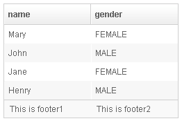
| |

| |
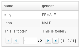
|
Supported Children
Listitem, Listhead, Listfoot, Listgroup, Listgroupfoot
Use Cases
| Version | Description | Example Location |
|---|---|---|
Version History
| Version | Date | Content |
|---|---|---|
| 5.0.2 | May 2010 | Support the autopaging |
| 5.0.4 | July 2010 | Support onAfterRender event |
| 5.0.5 | September 2010 | The nonselectabletag property was introduced to enhance the control of when to select an item |
| 5.0.5 | September 2010 | When a listbox's checkmark is enabled and an item is clicked, it will toggle the selection of the item and the other remains the same. |
| 5.0.5 | October 2010 | When a listbox's checkmark is enabled and an item is right clicked, it will toggle the selection of the item. |
| 5.0.5 | October 2010 | The span property was introduced to span the columns to occupy the whole listbox. |

