Customizing Bootstrap Theme Demonstration
Introduction
ZK 7 is an upcoming big release focusing on HTML5 and CSS3. In our prevous blog, we demonstrated how to use ZK 7′s new theme system with Bootstrap & CSS3. And we also provided another guid with more details on how to integrate ZK components and Bootstrap 3. In this smalltalk, we will customize another theme to look like one coming from {wrapbootstrap}.
Design Layout
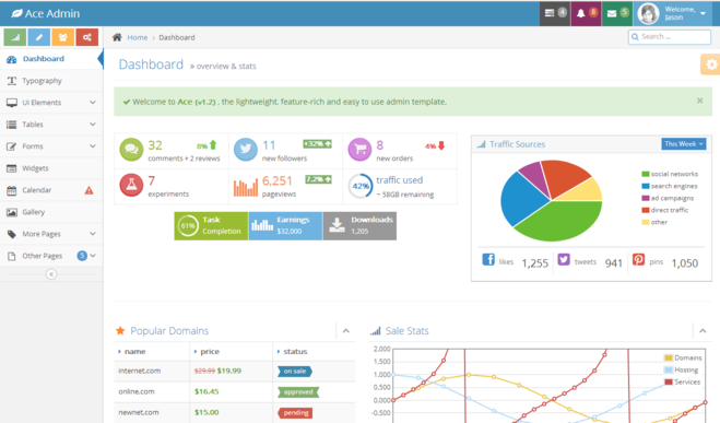
We picked th Ace Template from {**wrap**}bootstrapas our design model. In this demonstration, we will customize the Dashboard page with Pure ZK and CSS3.
Analyze Layout
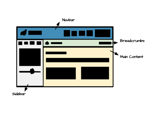
First, we separated the layout into 4 parts as the below show:
- Navbar
- A brand int the left
- A set of menu navigation in the right
- Sidebar
- 4 shourtcut buttons
- Navigation bar
- Collapsed button
- Breadcrumbs
- Breadcrumb
- Search input
- Content
- Header
- Notification
- Infobox
- Panel
- Tab
According to our analysis, we combined ZK components like hlayout and vlayout to layout the the structure of the page, then set hflx="1" to auto adjust its width when resizing. And include is used to include each part's content. Like the below snippets shows:
<include src="navbar.zul"/>
<hlayout id="main" spacing="0">
	<include src="sidebar.zul"/>
	<vlayout spacing="0" hflex="1">
		<include src="breadcrumbs.zul"/>
		<include src="content.zul"/>
	</vlayout>
</hlayout>
Implements Component
After constructed the basic layout, we can add some ZK components to
Customize Look And Feel
Functionality Code
We declare an event handler in popup which will be notified when onOpen event occurs, it will toggle the open sclass to the anchor component. So the anchor's background will be darken when its popup is opened.
<a id="atask" iconSclass="z-icon-tasks" popup="taskpp, position=after_end" sclass="grey">
    ...
</a>
<popup id="taskpp" sclass="tasktodo" width="240px" onOpen="toggleOpenSclass(event, atask);">
    ...
</popup>
<zscript><![CDATA[
import org.zkoss.zk.ui.Component;
import org.zkoss.zk.ui.event.OpenEvent;

// Toggle open sclass to the component
void toggleOpenSclass(OpenEvent event, Component comp) {
	String scls = comp.getSclass();
	if (event.isOpen()) {
		comp.setSclass(scls + " open");
	} else {
		comp.setSclass(scls.replace(" open", ""));
	}
}
]]></zscript>
Implement Collapse Mechanism
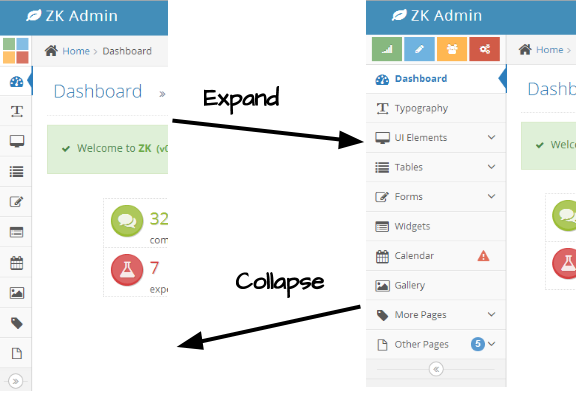
The sidebar is collapsible, user can click the button in the bottom of navbar to collapse or expand sidebar. Like the below picture shows.
So we need to declare toggleSidebarCollapsed() to proceed the actions. As the below code shows:
void toggleSidebarCollapsed() {
	if (!navbar.isCollapsed()) {
	    navbar.setCollapsed(true);
	    calitem.setTooltip("");
		sidebar.setSclass("sidebar sidebar-min");
		toggler.setIconSclass("z-icon-double-angle-right");
	} else {
	    navbar.setCollapsed(false);
	    calitem.setTooltip("calpp, position=end_center, delay=0");
        sidebar.setSclass("sidebar");
        toggler.setIconSclass("z-icon-double-angle-left");
	}
	Clients.resize(main);
}
Because Navbar is collapsible, isCollapsed() can determine whether navbar is collapsed or not. If not, we can easily call setCollapsed(true) to collapse it. When navbar is collapsed, its children only appear with icon and badge. The text part will popup when mouse hover the icon. Next, we need remove the tooltip of Navitem to prevent it show up with text when hovering. Then add sidebar-min class to sidebar and change the toggler's icon. In the end, Clients.resize(main) will force the client to recalculate the size of the main content.
But the shortcuts


