Accessibility
Since 9.5.0 (Preview version)
- Available for ZK:
-

Overview - Achieve AA Compliance
According to W3C, web accessibility means that websites, tools, and technologies are designed and developed so that people with disabilities can use them. This also benefits people without disabilities, for example, people with temporary disabilities (e.g. injured) or people who have situational limitations under particular circumstances (e.g. no mouse access).
The za11y (zk-accessibility) module enables you to create accessible WCAG 2.0 AA (Double-A)-compliant applications. Key features include full keyboard support, assistive technologies support, and high-contrast themes.
To meet accessibility requirements, one key point is to provide semantic information about widgets, structures, and behaviors for assistive technologies. With the za11y module, ZK widgets will render such semantic information based on their purposes according to WAI-ARIA. However, depending on an application’s context, a widget might play different roles in different pages and this has to be designed by application developers -- developers should fully understand the purposes, requirements, and expectations to deliver complete accessibility.
This chapter shares with you what the ZK framework has done in terms of accessibility in general, and how you can specify additional application-specific accessible information. For the details of each component, please refer to ZK Component Reference/Accessibility.
Enable Accessibility Support
ZK accessibility module is a separate, optional jar, you have to include it manually to enable it.
		<dependency>
			<groupId>org.zkoss.zk</groupId>
			<artifactId>za11y</artifactId>
			<version>${zk.version}</version>
		</dependency>
To ensure za11y.jar is running as expected at run-time, you can simply inspect a textbox. If you see ARIA attributes rendered in its DOM elements, that means the module works successfully. Please see Built-in Support.
We use axe DevTools 3.5.3 in ZK 9.5.0 to check the WCAG rules in za11y. We use Lighthouse 11.4.0 in ZK 10.0.0 to check the WCAG rules in za11y.
Built-in Support
To know what default ARIA attributes are rendered by ZK, please open the developer tool to inspect the widget.
textbox.zul
<textbox />
Visit the zul page and inspect the textbox with a browser developer tool, you will see some aria attributes rendered:
<input id="h5AP0" class="z-textbox" type="text"
       aria-disabled="false" aria-readonly="false">
Some components render special ARIA attributes, please refer to ZK Component Reference/Accessibility.
Specify ARIA Attributes
You can specify arbitrary ARIA attribute as needed on a component with namespace "client/attribute" like:
<zk  xmlns:ca="client/attribute">
    <div ca:aria-hidden="true"/>
    <textbox ca:aria-label="${field}"/>
    <intbox ca:aria-labelledby="${price}"/>
</zk>
Label with an Input Component
There are 3 ways to associate an input component with a label:
Enclose with a label
<zk xmlns:h="native" xmlns:ca="client/attribute">
    <h:label>Address
        <textbox/>
    </h:label>
Specify at aria-label
<zk xmlns:h="native" xmlns:ca="client/attribute">
    <custom-attributes field="Account:"/>
    ${field}
    <textbox ca:aria-label="${field}"/>
Specify at aria-labelledby
<zk xmlns:h="native" xmlns:ca="client/attribute">
    <label value="price" id="priceLabel"/>
    <textbox ca:aria-labelledby="${priceLabel.uuid}"/>
Demo Application
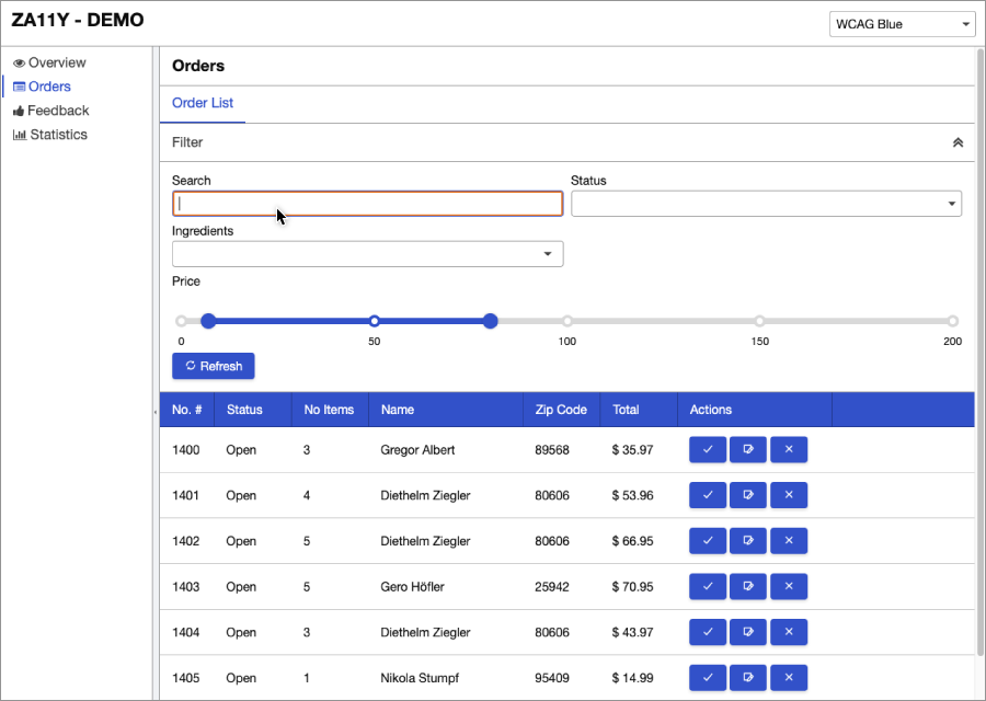
This demo application shows how you can build a ZK-based application with za11y module support. It also demonstrates key accessible features such as high contrast themes, keyboard support, screen reader support, mouse/touch support, landmarks and so on.
Screen Reader
During the development, we have tested the accessibility with the following screen readers:
JAW
NVDA
- Toggle browse/focus mode: Insert + Spacebar
VoiceOver
- Mac built-in, activate by
Command + F5 - using VoiceOver to browse and navigate webpages
Narrator
- Windows 10 built-in
- start/stop narrator:
windows + ctrl + enter - switch scan mode:
narrator(CapsLock) + space
