New Features of ZK 3.5.0
Robbie Cheng, Potix Corporation
September 10, 2008
The ZK team proudly presents you ZK 3.5. It includes a lot of new features - Comet server push, Grouping Grid/Listbox , more layout components - Panel, Portallayout, Columnlayout. Moreover, Boderlayout and Window component is much enhanced.
In addition, the look-and-feel of ZK components become more interactive, and more fabulous with a brand-new style of theme, and the most important of all is that ZK introduces the concept of moldSclass which simplifies the job of customizing layout of ZK components.
Don't hesitate! Download ZK Now!
In the following paragraphs, I'll introduce the most exciting new additions to ZK 3.5.
Comet Server Push Supported
ZK supports server push since ZK 3.0, ZK 3.5 now supports Comet-based server push. Developers could use the server-push in the way they are used to. The implementation of server push is transparent to developers. ZK chooses which implementation to use according to the edition of ZK automatically, but it is configurable.
For more information, please refer to Gmaps Monitor on Telecom Network Monitoring System, Server Push with a Stock Chart Example, Integrate Server Push with ListModel - SimpleListModelSharer, Simple and Intuitive Server Push with a Chat Room Example.
ZK Components Reloaded
In ZK 3.5, both of Grid and Listbox support Grouping concept, moreover, Grid is much enhanced with Menupopup and Detail. In addition, more layout component are introduced for UI design. A more powerful container component - Panel - is introduced. Over 10+ new components, and many other components are enhanced, too.
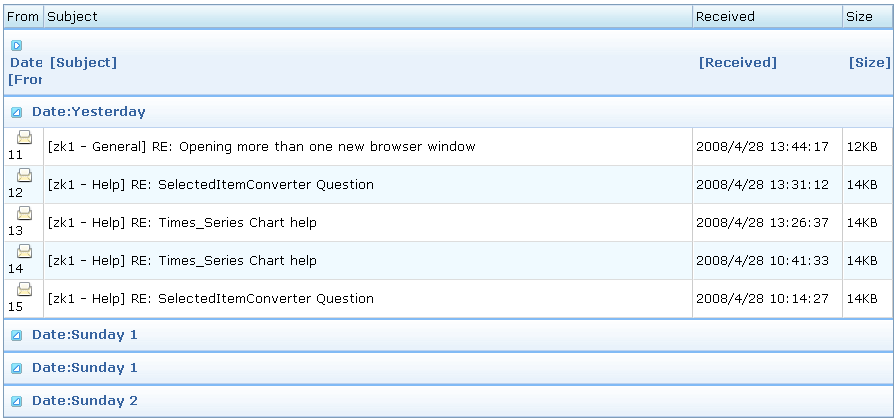
Grouping Grid and Listbox
Both Grid, and Listbox support Grouping concept, it enables developers to display data in an advanced way. Moreover, live data are also supported in Grouping Grid, and Listbox with the GroupsModel interface..
For more information, please take a look at these smalltalks, Learn About Grouping with Listbox and Grid, About How Grouping Works with Live Data, and Add Summary Field For Grouping.
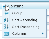
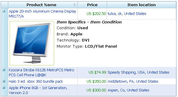
Grid supports Menupopup, and Master-Detail.
For better user experience, Grid now supports default menupopup which allows users to control Grid more easily.
Moreover, Grid supports master-detail concepts which enables developers to add more information on each row.
For more information, please refer to Enhance the Usage of Grid.
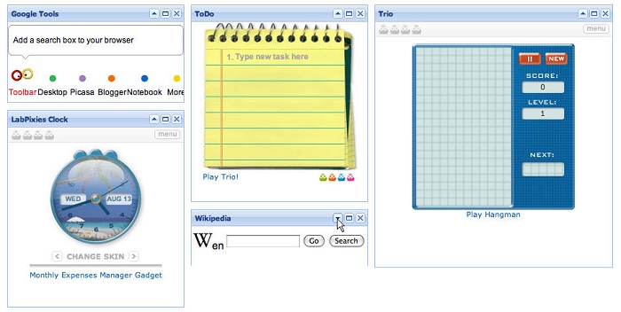
More Layout Components - Portallayout, Columnlayout, and Tablelayout
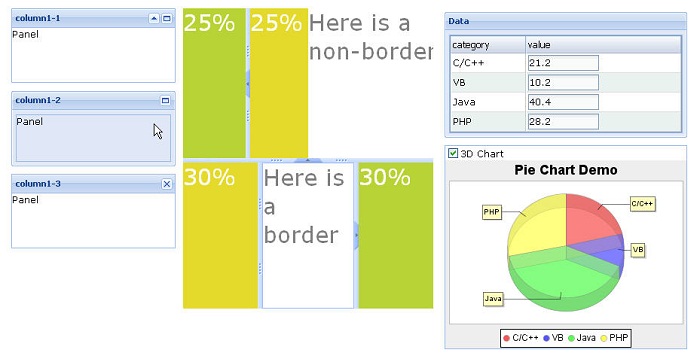
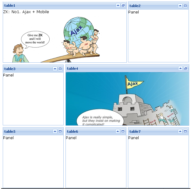
To satisfy various requirements of UI design, ZK provides 3 new layout components, Portallayout, Columnlayout, and Tablelayout. The choice is yours.
Portallayout, for more information about Portallayout, please refer to Working with Portal Layouts.
Columnlayout, for more information about Columnlayout, please refer to Using Columnlayout Component.
Tablelayout, for more information about Tablelayout, please refer to Working with Tablelayout.
A Powerful Container Component - Panel
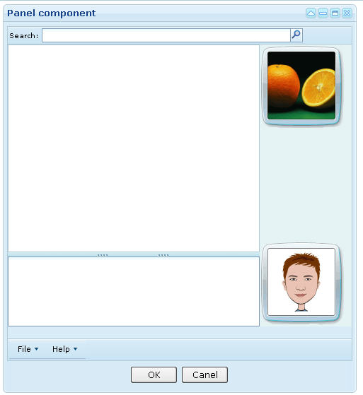
Before ZK 3.5, we used to use Window component as a container of UI components. In ZK 3.5, a more powerful container component is introduced, Panel. Panel includes bottom, top, and foot toolbars, along with separate header, footer and body sections. Moreover, it provides built-in closable, collapsible, maximizable, and minimizable behavior, along with a variety of pre-built tool buttons that can be wired up to provide more customized behavior.
For more information, please refer to Using Panel to Lay out Your Website.
Scrolling Tabbox
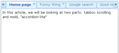
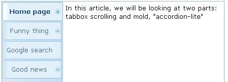
The look and feel of Tabbox is much enhanced, Tabbox now supports scrolling feature, and it supports 4 kinds of molds. Default mold,
Default mold with vertical orientation,
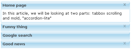
Accordion mold,
Accordion-lite mold,
For more information, please refer to Using scrolling tabs on tabbox.
More Fabulous Borderlayout
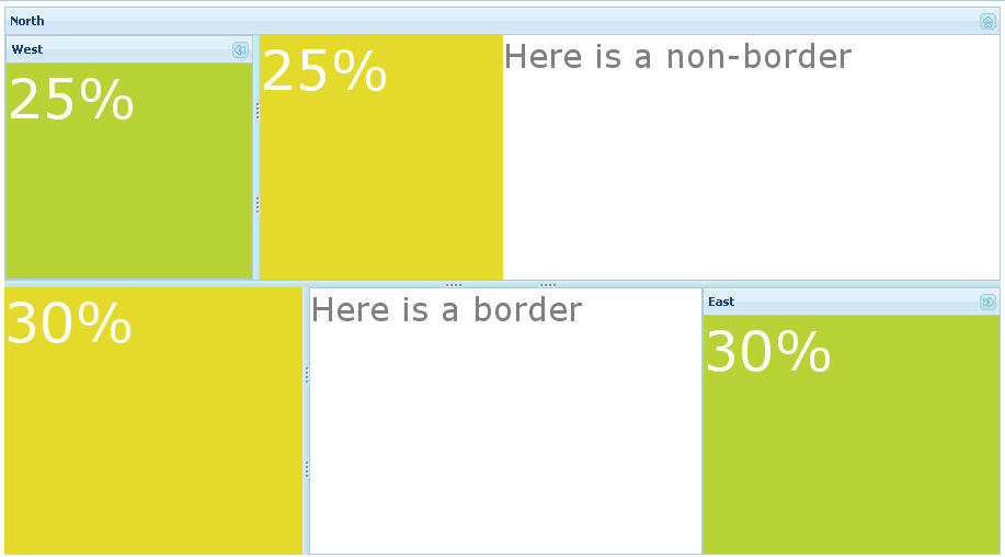
Borderlayout supports more animations by supporting title attriubte, it looks more interactive, and more fancy.
Window supports Maximize, and Minimize features.
Window is one of the most important component of ZK components, for ease of use, it supports Maximize, and Minimize concepts.
Spinner Component
Spinner is a long-awaited component by the community, finally ZK supports Spinner. Please take a look at the following example,
For more information, please refer to Using Spinner Component.
Fisheyebar Component
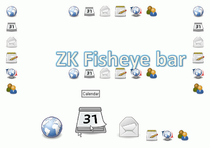
Though fisheye component has been integrated into zk.forge, the ZK Team transforms it into a native ZK component, and optimizes its performance.
For more information, please refer to A Compact, Robust, and Efficient ZK Fisheye.
Button/Image/Tab/Listcell/... Supports Hover Image
It's a common requirement that developers want to change the image of components while mouse-over. Since ZK 3.5, LabelImageElement supports the hover image as follows,
<button label="Left" image="/img/m1.gif" hoverImage="/img/m2.gif"
width="125px"/>
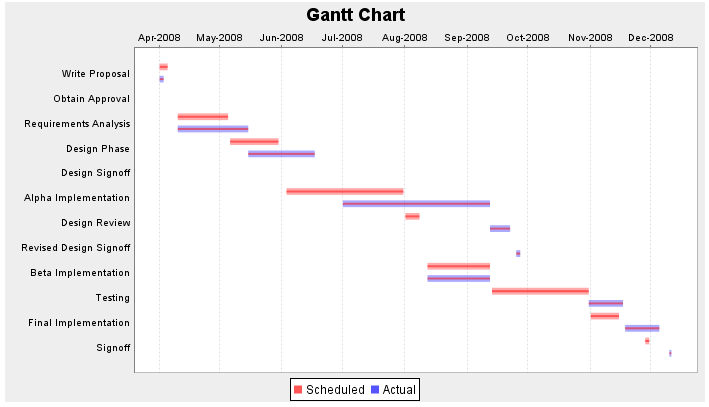
Chart Supports Gannt Chart, Watermap Chart, Bubble Chart, Wind Chart.
Chart component supports 4 new types of chart, including Gannt Chart, Watermap Chart, Bubble Chart, Wind Chart. Gannt chart is a convenient tool for project management. Other charts serves different requirements.
Customization of Look and Feel
To simplify the job of layout customization of ZK components, ZK enables developers to do partial customization by overriding those related CSS definitions. Moreover, ZK introduces the concept of moldSclass which allows developer to change the theme of ZK components at once.
Partial Customization
For ease of customization, ZK allows developers to override the CSS definitions of components to change their look and feel. For example, icons of tree, splitter, and slider could be customized by overriding their CSS definitions. For example, you could change the style of selected item of listbox by overriding the following CSS definitions,
 tr.z-list-item-seld {
  background-color:red;
 }
And the result is as follows.
Full Customization
For better modularization of layout of ZK components, ZK introduces the concept of moldSclass. Each mold of ZK components has its own set of CSS definitions. Developers can change the look and feel of components with ease by defining required CSS definitions, and changing the moldSclass of component accordingly. For example, to change the look and feel of button, simply define those required CSS definitions, and change moldSclass as follows,
<style>
 .blue-button .blue-button-tl {
	background: url(/img/button/blue-btn-trendy.gif) no-repeat 0 0;
	width: 3px; height: 3px; padding: 0; margin: 0;
}
.blue-button .blue-button-tm {
	background: url(/img/button/blue-btn-trendy.gif) repeat-x 0 -252px;
}
.blue-button .blue-button-tr {
	background: url(/img/button/blue-btn-trendy.gif) no-repeat 0 -126px;
	width: 3px; height: 3px; padding: 0; margin: 0;
}
...................
</style>
<button/>
<button moldSclass="blue-button"/>
And the result is as follows.
Performance Monitor
Performance monitoring always plays an important role when users complaint about bad performance of Web applications. It provides great help for developers to determine the cause of bad performance for further optimization.
Measure Performance from End to End
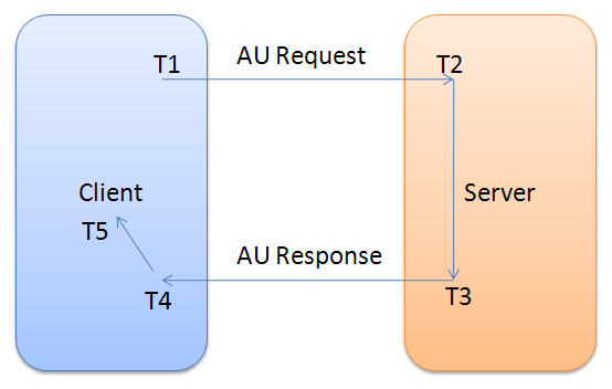
For easier performance monitoring, ZK provides org.zkoss.zk.ui.util.PerformanceMeter which is a listener that enables developers to monitor each phase of a request, network traffic, sever processing time, browser processing time to find out the bottleneck. There are five timings in the lifecycle of an AU request as follows,
Developers could use the following methods to calculate their required information.
- T1, the time browser sends a request to server
- requestStartAtClient(java.lang.String requestId, Execution exec, long time)
- T2, the time server receives a request
- requestCompleteAtServer(java.lang.String requestId, Execution exec, long time)
- T3, the time server sends a request to browser
- requestStartAtServer(java.lang.String requestId, Execution exec, long time)
- T4, the time browser receives a request from server
- requestReceiveAtClient(java.lang.String requestId, Execution exec, long time)
- T5, the time the browser finishes processing a request
- requestCompleteAtClient(java.lang.String requestId, Execution exec, long time)
Integration with Other Technologies
It's an inevitable trend to integrate different technologies together, and Iframe is a good solution to integrate applications with different technolgogies or versions, but there is one thing that developers have to take care of: bookmark management. In the following paragraph, we'll demonstrates how to solve the problem of Bookmark in iframe.
Iframe Supports Bookmark Change
Ifame is always a good way for integrating different technologies, but it brings another trouble to developers if they want to keep the state of web pages using bookmark. To solve this problem, ZK's iframe components supports onURIChange event that developers could change the bookmark accordingly . Moreover, if ZK is integrated by other technologies, it will invoke a JavaScript function for further processing.
The onURIChange Event
When the user navigates the iframe component to another URL (or bookmark), an object of the org.zkoss.zk.ui.event.URIEvent class is sent to the iframe component. This event is usually used to bookmark the status of the iframe component, such that the right content can be restored later.
Integrate with Other Technologies.
The onURIChange event won't be sent if the iframe component contains a non-ZK page. For example, it won't be sent if it contains a PDF page. On the other hand, if you use other technologies to put a ZK page in an iframe, you can monitor the URL by writing a JavaScript method called onIframeChange as follows.
<script type="text/script">
function onIframeChange(uuid, url) {
	do_whatever_you_need_in_the_technology_you_use(uuid, url);
}
</script>
Ease of Use
For ease of use, fulfill event is much enhanced, Event supports subscribe/publish mechanism, ZUML supports switch/case, and etc.
Fulfill Event is Enhanced
For better modularization, ZK 3.5 allows developers to specify an URL in the fulfill condition. Moreover, onFulfill Event is supported for developers to do further processing.
With an URI Expression
Since ZK 3.5, ZK enables developers to wrap components into a zul page, and then specify its URI in fulfull attribute, instead of direct declaration of child components. If the URI expression is specified, ZK will create the components defined in the specified URI and assign them as the child components. In the following example, ZK will create child components for the "d" div, when the "b" button is clicked.
<button id="b" label="open"/>
<div id="d" fulfill="b.onClick=/my/super.zul">
</div>
The onFulfill Event
For further processing, ZK fires the onFulfill event with an instance of org.zkoss.zk.ui.event.FulfillEvent to notify the component. For example, if you use the wireVariables method of the org.zkoss.zk.ui.Components class, you might have to call wireVariables again to wire the new components in the onFulfill event.
Event Supports subscribe/publish Mechanism
Currently, ZK allows developer to send/post event to particular component. In ZK 3.5, ZK allow developers to do many-to-many communication by introducing the subscribe/publish mechanism like message queue.
Image:Publish.png
	<window title="Event Queue">
	<textbox id="tb"/><button label="Test" onClick="publish()"/>
	Outcome: <label id="l"/>
		<zscript>
		import org.zkoss.zkmax.ui.eq.EventQueues;
		EventListener listener = new EventListener() {
			public void onEvent(Event event) {
				l.value += tb.value;
			}
		};
		EventQueues.lookup("test").subscribe(listener);
		EventQueues.lookup("test").subscribe(listener);
		EventQueues.lookup("test").subscribe(listener);

		void publish() {
			l.value = "";
			EventQueues.lookup("test").publish(event);
		}
		</zscript>
	</window>
ZUML Supports switch/case and choose/when
For ease of use, from now on, ZK supports switch/case and choose/when in ZUML.
<zk switch="${each}" forEach="zk, gwt">
  <zk case="gwt">
	Correct 3
  </zk>
  <zk case="${each}" forEach="best, zk">
	Correct 4
  </zk>
  <zk>
	Error 3
  </zk>
</zk>
<zk choose="">
  <zk when="${var == 'orange'}">
  Error 1.1
  </zk>
  <zk when="${var == 'apple'}">
  Correct 2
  </zk>
  <zk>
  Error 1.2
  </zk>
</zk>
An Intuitive Way to Define XML as Component's Content
Before ZK 3.5, developers could define XML as component's content using CDATA, but the drawback of this solution is that it is difficult to read and it cannot leverage many powerful features of ZK. From now on, ZK enables developers to put XML as component's content directly, and leverages the power of ZK at the same time. The native content (aka., a XML fragment) can be specified inside of <attribute> as follows,
<html>
 <attribute name="content">
  <ol>
   <li forEach="${values}">${each}</li>
  </ol>
 </attribute>
</html>
| Copyright © Potix Corporation. This article is licensed under GNU Free Documentation License. |
