Customizing Bootstrap Theme Demonstration
Introduction
ZK 7 is an upcoming big release focusing on HTML5 and CSS3. In our previous blog, we demonstrated how to use ZK 7′s new theme system with Bootstrap & CSS3. And we also provided another guide with more details on how to integrate ZK components and Bootstrap 3. In this smalltalk, we will customize another theme to look like one coming from {wrap}bootstrap.
Prerequisites
Design Template
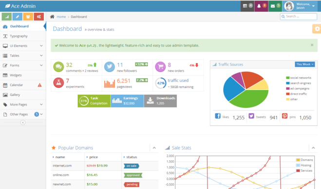
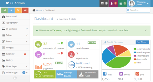
We picked Ace Template from {wrap}bootstrap as our design template. The theme's styling is a bit complicated, so we can take a deeper look at ZK theme system by customizing the template. In this demonstration, we will customize the Dashboard page with Pure ZK and CSS3.
Analyze Layout
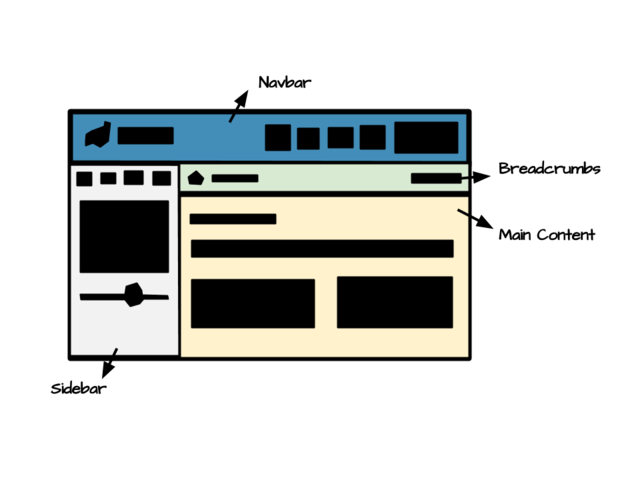
The layout can be separated into 4 parts.
- Navbar
- A brand in the left side
- A set of menu navigation in the right side
- Sidebar
- Four button shourtcuts
- Navigation bar
- Collapsed button
- Breadcrumbs
- Breadcrumb
- Search input
- Content
- Header
- Notification
- Infobox
- Panel
- Tab
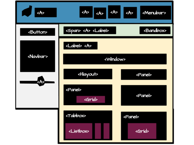
According to the analysis, we combined ZK components hlayout and vlayout to layout the the structure of the page, then assigned hflx="1" to recalculate its width when resizing. Component include is used to include each part's content.
<include src="navbar.zul"/>
<hlayout id="main" spacing="0">
  <include src="sidebar.zul"/>
  <vlayout spacing="0" hflex="1">
    <include src="breadcrumbs.zul"/>
    <include src="content.zul"/>
  </vlayout>
</hlayout>
Implement with ZK Components
After constructed the basic layout, we can implement content in each part with various ZK components.
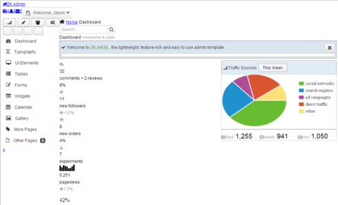
And it will look like this:
Customize Look And Feel
In this section, we will mention the necessary preparations and some customized components as examples. There are some tips at the end of the section which may help user in customize phase.
Import Fonts
Before customizing the look and feel, we need to import the Open Sans font from google server or download it to your folder directly.
1 <?link href="css/fonts.css" rel="stylesheet" type="text/css"?>
Import LESS Files
LESS is a dynamic stylesheet language, which extends CSS with dynamic behavior such as variables, mixins, operations and functions. Bootrap's and ZK's already defined many helpful variables and mixins for usage. We can import them to reuse code instead of reinventing the wheel. The ZK's variables and mixins can be obtained from ZK theme maven project, please refer here.
Customize Button
ZK button's default style contains gradient background and rounded corner.
1 <button iconSclass="z-icon-thumbs-up" label="Button"/>
We need to remove gradient background and rounded corner, then mimic the css from bootstrap and ace template. The .borderRadius(0), .transition(all, ease, .15s) and .resetGradient() are built-in rulesets defined in zk mixins.
 1 .z-button {
 2   position: relative;
 3   padding: 3px 12px;
 4   .borderRadius(0);
 5   text-shadow: 0 -1px 0 rgba(0, 0, 0, 0.25);
 6   min-height: 0;
 7   color: #FFF !important;
 8   .transition(all, ease, .15s);
 9
10   &:active {
11     top: 1px;
12     left: 1px;
13   }
14
15   &, &:hover, &:focus, &:active {
16     .resetGradient();
17   }
18
19   /* Icon in the button */
20   > [class*="z-icon-"] {
21     display: inline;
22     margin-right: 4px;
23   }
24 }
After applying the style, button's background would be transparent.
Then assign btn-primiry or other CSS class to the button's sclass attribute, it will create a colored button.
1 <button iconSclass="z-icon-thumbs-up" label="Button" sclass="btn-primary"/>
 1 >
 2 .btn-color(@color-name) {
 3   @color1-name : ~`"btn-@{color-name}"`;
 4   @color2-name : ~`"btn-@{color-name}-hover"`;
 5
 6   .btn-color(@@color1-name, @@color2-name);
 7 }
 8
 9 .btn-primary {
10   .btn-color(~"primary");
11 }
Customize Progressmeter
To customize progressmeter, we change its height and background color, remove the border line.
1 <progressmeter value="65" width="100%"/>
 1 .z-progressmeter {
 2   height: 9px;
 3   border: 0;
 4   background-image: none;
 5   background-color: #DADADA;
 6
 7   &-image {
 8     display: inline-block;
 9     .resetGradient();
10     background-color: #2A91D8;
11   }
12 }
Customize Tooltip
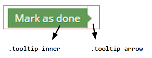
The ZK tooltip's look is totally different from the demo. The easiest way to customize tooltip's look is assigning zclass tooltip to it.
1 <popup zclass="tooltip" sclass="left tooltip-success">
2   <span zclass="tooltip-arrow"/>
3   <label zclass="tooltip-inner" value="Mark as done"/>
4 </popup>
 1 .tooltip-success.tooltip {
 2   > .tooltip-content >.tooltip-inner {
 3    background-color:@tooltip-success-color;
 4    color:#FFF;
 5    text-shadow:1px 1px 0 rgba(60,100,20,0.3);
 6    border-radius: 0;
 7   }
 8   &.left .tooltip-arrow {
 9     border-left-color: @tooltip-success-color;
10   }
11 }
The span component inside the popup's job is to display a triangle as an arrow of the tooltip.
The bootstrap tooltip's opacity level is zero. We should change the opacity to 1 to make it visible when the tooltip shows up.
.tooltip {
  .opacity(1) !important;
}
Customize Tabbox
When Tabbox is in the default orientation, the row of tabs displayed on top left side.
 1 <a label="RECENT" iconSclass="z-icon-rss orange" sclass="rcaption lighter"/>
 2 <tabbox sclass="rtab">
 3   <tabs>
 4     <tab label="Tasks"/>
 5     <tab label="Members"/>
 6     <tab label="Comments"/>
 7   </tabs>
 8   <tabpanels>
 9     <tabpanel><!-- Tasks content --></tabpanel>
10     <tabpanel><!-- Menbers content --></tabpanel>
11     <tabpanel><!-- Comments content --></tabpanel>
12   </tabpanels>
13 </tabbox>
If we want to move the tabs to the top right side, we can float each tab to the right.
.rtab.z-tabbox {
    .z-tab {
      float: right;
    }
}
After floating each tab to the right, the first tab would be pulled to the rightmost side. So the order of tabs should be inversed, and the last tab should be selected as default.
<a label="RECENT" iconSclass="z-icon-rss orange" sclass="rcaption lighter"/>
<tabbox sclass="rtab">
  <tabs>
    <tab label="Comments"/>
    <tab label="Members"/>
    <tab label="Tasks" selected="true"/>
  </tabs>
  <tabpanels>
    <tabpanel><!-- Comments content --></tabpanel>
    <tabpanel><!-- Menbers content --></tabpanel>
    <tabpanel><!-- Tasks content --></tabpanel>
  </tabpanels>
</tabbox>
The header and tabbox need be displayed horizontally side by side, so tabbox's position should be absolute and set top to zero.
.rtab.z-tabbox {
    position: absolute;
    top: 0;
    ...
Finally, customize the look and feel.
Customize Scrollbar
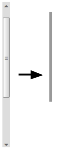
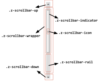
ZK7 introduces the fake scrollbar in meshwidget and borderlayout, it behaves as the browser's native scrollbar. Fake scrollbar allows user to style it. In this demo we styled the scrollbar in the grid to thinner and much simpler.
Styling the scrollbar consists of the following five steps:
- Hide all the icons
- Move the wrapper to the top
- Make the backgroud transparent
- Simplify indicator
- Slim the scrollbar
 1 .z-scrollbar.z-scrollbar-vertical {
 2   width: 7px;
 3   .z-scrollbar-up, .z-scrollbar-down,
 4   .z-scrollbar-icon, .z-scrollbar-rail {
 5     display: none;
 6   }
 7   .z-scrollbar-wrapper {
 8     top: 0;
 9     .z-scrollbar-indicator {
10       width: 7px;
11       background-image: none;
12       background-color: #999;
13       border: 0;
14       border-radius: 0;
15     }
16     .z-scrollbar-rail {
17       background-color: transparent;
18     }
19   }
20 }
Tips for Customization
Here we provides some tips which may be helpful if users want to customize their own theme.
Refer ZK Component's Less File
The ZK theme maven project consists of all the ZK Component's less files. Referring the less files could understand and revise component's styling easily.
Use Sclass and Zclass Pattern
Using CSS class rule with sclass zclass pattern can get higher priority level to apply to the component's class. For example:
.comments.z-grid {
    ...
}
Put icon in the span
If we want to display the icon only, it can be placed in the span with .z-icon-xxx sclass or zclass. For example:
1 <span zclass="z-icon-comments"/>
Adjust Popup's position
There are two ways to dictate the position for ZK's popup. One is specify the relative position and the reference component( position=overlap_end), another is giving a specific position( x=100, y=40) directly. We can use the position attribute and style popup's margin to adjust popup's position. For example, we use relative position to make the popup appear below the button, aligned to the right.
<button sclass="btn-primary" iconSclass="z-icon-cog" popup="cogtt, position=after_end"/>
<popup id="cogtt" sclass="cog">
    ...
</popup>
Style the popup's margin to adjust popup's position.
.cog.z-popup {
    margin-left: 4px;
}
Use Pseudo-Element
Using :before and :after can add an element before or after a component, they decorate the component without the need of change its DOM structure. For exmaple.
<navbar>
  ...
  <nav label="Other Pages" badgeText="5" iconSclass="z-icon-file-alt">
  ...
</navbar>
// Add an angel down icon after the Nav
.z-nav-text:after {
  .baseIconFont();
  .iconFontStyle(18px, #666);
  .displaySize(inline-block, 14px, 14px);
  content: "\f107";
  position: absolute;
  line-height: 14px;
  right: 11px;
  top: 11px;
  padding: 0;
}
Functionality Code Fragments
Although in most cases we don't have to writing any code, it still needs to declare some functions to manipulate the components in some situations.
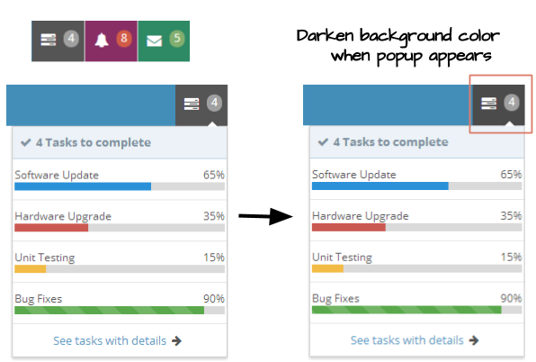
We declared an event handler in popup which will be notified when onOpen event occurs, it will toggle the open sclass to the anchor component. So the component's background will be darken when its popup is showing up.
 1 @Listen("onOpen = #taskpp")
 2 public void toggleTaskPopup(OpenEvent event) {
 3   toggleOpenClass(event.isOpen(), atask);
 4 }
 5
 6 // Toggle open class to the component
 7 public void toggleOpenClass(Boolean open, Component component) {
 8   HtmlBasedComponent comp = (HtmlBasedComponent) component;
 9   String scls = comp.getSclass();
10   if (open) {
11     comp.setSclass(scls + " open");
12   } else {
13     comp.setSclass(scls.replace(" open", ""));
14   }
15 }
Implement Collapse Mechanism
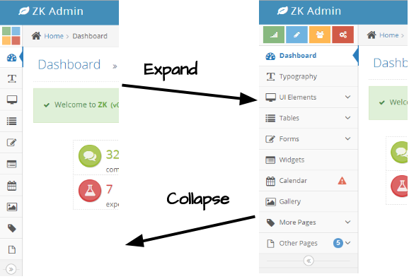
The sidebar in this demo is collapsible, user can click the button in the bottom of navbar to collapse or expand sidebar. Like the below picture shows.
So we need to declare toggleSidebarCollapsed() to proceed the action. As the below code shows:
 1 // Toggle sidebar to collapse or expand
 2 @Listen("onClick = #toggler")
 3 public void toggleSidebarCollapsed() {
 4   if (navbar.isCollapsed()) {
 5     sidebar.setSclass("sidebar");
 6     navbar.setCollapsed(false);
 7     calitem.setTooltip("calpp, position=end_center, delay=0");
 8     toggler.setIconSclass("z-icon-double-angle-left");
 9   } else {
10     sidebar.setSclass("sidebar sidebar-min");
11     navbar.setCollapsed(true);
12     calitem.setTooltip("");
13     toggler.setIconSclass("z-icon-double-angle-right");
14   }
15   // Force the hlayout contains sidebar to recalculate its size
16   Clients.resize(sidebar.getRoot().query("#main"));
17 }
Because Navbar is collapsible, isCollapsed() can determine whether navbar is collapsed or not. If not, we can easily call setCollapsed(true) to collapse it. When navbar is collapsed, its children only appear with icon and badge. The text part will appear when mouse hover the icon. Next, we need remove the tooltip of Navitem to prevent it show up with text when hovering. Then add sidebar-min class to sidebar and change the toggler's icon. In the end, Clients.resize(sidebar.getRoot().query("#main")) will force the client to recalculate the size of the main content.
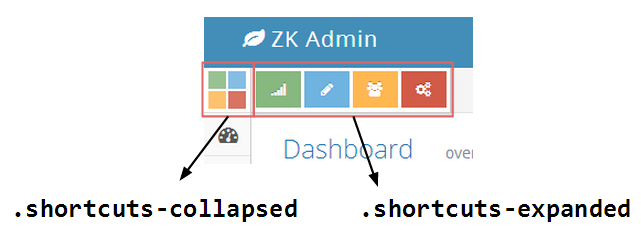
The shortcuts also should to be collapsed, so it needs an additional set of collapsed shortcuts to display when the sidebar is collapsed. If user mouses over the collapsed shortcuts, the expanded shortcuts will appear.
<div class="shortcuts">
  <div class="shortcuts-expanded">
    <button type="button" class="btn-success" iconSclass="z-icon-signal"/>
    <button type="button" class="btn-info" iconSclass="z-icon-pencil"/>
    <button type="button" class="btn-warning" iconSclass="z-icon-group"/>
    <button type="button" class="btn-danger" iconSclass="z-icon-cogs"/>
  </div>
  <div class="shortcuts-collapsed">
    <button type="button" class="btn-success"/>
    <button type="button" class="btn-info"/>
    <button type="button" class="btn-warning"/>
    <button type="button" class="btn-danger"/>
  </div>
</div>
Conclusion
In this demo, we used ZK7 with bootstrap and CSS3 to customize a bootstrap theme from scratch. We analyzed the template and implemented it with ZK compoents, then styled the look and feel using CSS3. This demonstrated that ZK7 new theme system's flexibility, and how to customize a theme with CSS3, LESS and bootstrap easily.
Example Source
The source code can be found in Github and the layout design is owned by EasyMind.
