Using Panel to Lay out Your Website"
m (→Combination) |
m (moved Small Talks/Using Panel to Lay out Your Website to Small Talks/2008/July/Using Panel to Lay out Your Website) |
(No difference)
| |
Latest revision as of 01:11, 21 September 2010
Jumper Chen, Engineer, Potix Corporation
July 1, 2008
Applicable to zk-3.5.0-FL-2008-07-01 and later.
Introduction
In the past, we were used to using Window component as a container of UI manager to lay out the web page. However, the Window component, an independent ID space owner, separate each ID of its descendants from other Window component (a feature and also a limitation). In upcoming ZK 3.5.0, we make a Panel component, a non ID space owner, that has specific functionality and structural components that make it the perfect building block for application-oriented user interfaces. The Panel contains bottom, top, and foot toolbars, along with separate header, footer and body sections. It also provides built-in closable, collapsible, maximizable, and minimizable behavior, along with a variety of pre-built tool buttons that can be wired up to provide other customized behavior. Furthermore, Panel can be flexibly embedded into any kind of ZUL component that is allowed to have children or layout component. Panel also provides specific features like float and move. Unlike Window, Panel can only be floated and moved inside its parent node. In other words, the floated panel might not be floated in the whole page.
Live Demo
Let's have a look at a real case, a MSN-like application which layouts several ZK components into a Panel component.
The following fragment is the Panel example,
<panel id="panel" framable="true" width="500px" height="550px"
    title="Panel component" floatable="true" movable="true"
    maximizable="true" minimizable="true" border="normal"
    collapsible="true" closable="true">
        <toolbar>
          ... // Top Toolbar of the panel
        </toolbar>
        <panelchildren>
          ... // Each added child will show into the body content of the panel
        </panelchildren>
        <toolbar>
          ... // Bottom Toolbar of the panel
        </toolbar>
        <toolbar>
          ... // Foot Toolbar of the panel
        </toolbar>
</panel>
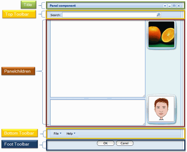
As you can see, the panel contains three Toolbar components and a Panelchildren component, which manages each child component, to construct the panel component that would produce on the web page. Let me explain each section as follows.
- Title: You can use the setTitle() or the Caption component to show the title of the panel. Note that each built-in tool button, maximize, minimize, close, and collapse, is only applied when the title bar is shown.(It is an option)
- Top Toolbar: It is used to show the top toolbar close to the body content of the panel.(It is an option)
- Panelchildren: It is used to manage each child showing on the body content of the panel, and it supports any kind of ZUL component as its child.
- Bottom Toolbar: It is used to show the bottom toolbar close to the body content of the panel. (It is an option)
- Foot Toolbar: It is used to show the operating button under the body content with a few padding. (It is an option)
Combination
Here is a demo about combining Window with Panel.
As you can see, we use a Panel inside the Window to show the footer toolbar as a toolbar of the Window, and the Listbox inside the Panel can be scrolled as the content of the window.
Download
Download the panel-demo.war for the article here.
Summary
Panel not only provides the fancy layout design, but also keeps the substance of ZK: Simple, Rich, and Flexible. If you come up with any problem, please feel free to ask us on ZK forum.
| Copyright © Potix Corporation. This article is licensed under GNU Free Documentation License. |
