Customize Look and Feel of ZK Components Using CSS3"
From Documentation
m |
|||
| Line 4: | Line 4: | ||
|version=ZK5+ | |version=ZK5+ | ||
}} | }} | ||
| − | + | {{Template:UnderConstruction}} | |
=Introduction: ZK & CSS3= | =Introduction: ZK & CSS3= | ||
Revision as of 08:40, 30 November 2011
Author
Vincent Jian, Engineer, Potix Corporation
Vincent Jian, Engineer, Potix Corporation
Date
December 04, 2011
December 04, 2011
Version
ZK5+
ZK5+
 This page is under construction, so we cannot guarantee the accuracy of the content!
Introduction: ZK & CSS3
This article will guide users through customizing the look and feel of a ZK component using CSS3 and DSP[1] and some EL expression used in DSP. Two case examples – the button component & the window component will be demonstrated to show the process and implementation.
Case Examples
Button Component
- Re-design from original styles
- Default button component provides trendy and os mold. Here we use os mold to modify since it is much easier than trendy mold.
- Create “button.css.dsp” file in web application
- In line 1, we define prefix “c” in order to use EL expression. Because not all browsers support CSS3, we use “<c:if>” tag in line 2 to determine whether or not we override the origin CSS class or not.
- To view the full source code of button.css.dsp please click here.
- Create button-css3sample.zul file to test[2]
- In line 1, we use “<?link ?>” directive to include “button.css.dsp” file.
- Visit http://localhost:8080/projectName/button-css3sample.zul to show result and keep tweaking the style until you are satisfied with it.
<%@ taglib uri="http://www.zkoss.org/dsp/web/core" prefix="c" %>
<c:if test="${c:browser('gecko2') || c:browser('ie9') || c:browser('opera') || c:browser('safari')}">
.z-button-os {
	color: #FFFFFF;
	font-weight: bold;
	text-shadow: 0 -1px 0 rgba(0,0,0,1), 0 0 0 rgba(252,0,21,0);
	padding: 7px 17px;
	border: 1px solid #000000;
	border-radius: 3px;
	-moz-border-radius: 3px;
	-webkit-border-radius: 3px;
	/* IE9 SVG, needs conditional override of 'filter' to 'none' */
	background: url(data:image/svg+xml;base64,PD94bWwgdmVyc2lvbj0iMS4wIiA/Pgo8c3ZnIHhtbG5zPSJodHRwOi8vd3d3LnczLm9yZy8yMDAwL3N2ZyIgd2lkdGg9IjEwMCUiIGhlaWdodD0iMTAwJSIgdmlld0JveD0iMCAwIDEgMSIgcHJlc2VydmVBc3BlY3RSYXRpbz0ibm9uZSI+CiAgPGxpbmVhckdyYWRpZW50IGlkPSJncmFkLXVjZ2ctZ2VuZXJhdGVkIiBncmFkaWVudFVuaXRzPSJ1c2VyU3BhY2VPblVzZSIgeDE9IjAlIiB5MT0iMCUiIHgyPSIwJSIgeTI9IjEwMCUiPgogICAgPHN0b3Agb2Zmc2V0PSIwJSIgc3RvcC1jb2xvcj0iIzJlMmUyZSIgc3RvcC1vcGFjaXR5PSIxIi8+CiAgICA8c3RvcCBvZmZzZXQ9IjEwMCUiIHN0b3AtY29sb3I9IiMwMzAzMDMiIHN0b3Atb3BhY2l0eT0iMSIvPgogIDwvbGluZWFyR3JhZGllbnQ+CiAgPHJlY3QgeD0iMCIgeT0iMCIgd2lkdGg9IjEiIGhlaWdodD0iMSIgZmlsbD0idXJsKCNncmFkLXVjZ2ctZ2VuZXJhdGVkKSIgLz4KPC9zdmc+);
	background: -moz-linear-gradient(top, rgba(46,46,46,1) 0%, rgba(3,3,3,1) 100%); /* FF3.6+ */
	background: -webkit-gradient(linear, left top, left bottom, color-stop(0%,rgba(46,46,46,1)), color-stop(100%,rgba(3,3,3,1))); /* Chrome,Safari4+ */
	background: -webkit-linear-gradient(top, rgba(46,46,46,1) 0%,rgba(3,3,3,1) 100%); /* Chrome10+,Safari5.1+ */
	background: -o-linear-gradient(top, rgba(46,46,46,1) 0%,rgba(3,3,3,1) 100%); /* Opera 11.10+ */
	background: -ms-linear-gradient(top, rgba(46,46,46,1) 0%,rgba(3,3,3,1) 100%); /* IE10+ */
	background: linear-gradient(top, rgba(46,46,46,1) 0%,rgba(3,3,3,1) 100%); /* W3C */
	filter: none\0/;
	box-shadow: 0 3px 0 rgba(0,0,0,1), inset 0 0 1px rgba(255,255,255,0.6);
	-moz-box-shadow: 0 3px 0 rgba(0,0,0,1), inset 0 0 1px rgba(255,255,255,0.6);
	-webkit-box-shadow: 0 3px 0 rgba(0,0,0,1), inset 0 0 1px rgba(255,255,255,0.6);
	cursor: pointer;
}
</c:if>
<?link rel="stylesheet" type="text/css" href="css/button.css.dsp"?>
<zk>
	<button label="os mold" mold="os" width="200px" height="50px" />
</zk>


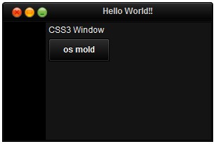
Window Component
- Re-design from original styles
- Default window component consists of four parts (top, head, content and bottom, for more details, please refer to Window Style). The top and bottom part are only used for rounded corners. Therefore, we can set height of the top and bottom part to zero, and still keep the DOM structure.
- Create “window.css.dsp” file
- a) Include DSP taglib and define prefix “c” in order to use EL expression.
- b) Determine whether to override origin CSS class by browser type.
- c) Adjust top part CSS classes, make the height to 0 and add 5px (the origin height) to head part.
- d) The close, maximize and minimize icons in head part still need image. However we can use transparent image and gradient background at the same time due to CSS spec.

- e) Adjust bottom part CSS classes, make the height to 0 and add to content part.
- To view the full source code of window.css.dsp please click here.
- Create window-css3sample.zul file to test[2]
- Visit http://localhost:8080/projectName/window-css3sample.zul to show result and keep tweaking the style until you are satisfied with it
<%@ taglib uri="http://www.zkoss.org/dsp/web/core" prefix="c" %>
<c:if test="${c:browser('gecko2') || c:browser('ie9') || c:browser('opera') || c:browser('safari')}">
<%-- override css --%>
...
</c:if>
.z-window-embedded-tl,
.z-window-embedded-tr {
	height: 0px;
	padding: 0;
	margin: 0;
	background: none;
}
.z-window-embedded-hl,
.z-window-embedded-hr {
	background: none;
	border-radius: 4px 4px 0 0;
	-moz-border-radius: 4px 4px 0 0;
	-webkit-border-radius: 4px 4px 0 0;
	margin: 0;
	padding: 0;
}
.z-window-embedded-hr {
	border-left: 1px solid #000000;
}
.z-window-embedded-hm {
	border-width: 1px;
	border-style: solid;
	border-color: #000000 #000000 #000000 #0C0C0C;
	border-radius: 4px 4px 0 0;
	-moz-border-radius: 4px 4px 0 0;
	-webkit-border-radius: 4px 4px 0 0;
	-moz-box-shadow: inset 0 1px 0 #595959, inset -1px -1px 0 #0C0C0C;
	-webkit-box-shadow: inset 0 1px 0 #595959, inset -1px -1px 0 #0C0C0C;
	box-shadow: inset 0 1px 0 #595959, inset -1px -1px 0 #0C0C0C;
	padding-top: 5px;
	/* IE9 SVG, needs conditional override of 'filter' to 'none' */
	background: url(data:image/svg+xml;base64,PD94bWwgdmVyc2lvbj0iMS4wIiA/Pgo8c3ZnIHhtbG5zPSJodHRwOi8vd3d3LnczLm9yZy8yMDAwL3N2ZyIgd2lkdGg9IjEwMCUiIGhlaWdodD0iMTAwJSIgdmlld0JveD0iMCAwIDEgMSIgcHJlc2VydmVBc3BlY3RSYXRpbz0ibm9uZSI+CiAgPGxpbmVhckdyYWRpZW50IGlkPSJncmFkLXVjZ2ctZ2VuZXJhdGVkIiBncmFkaWVudFVuaXRzPSJ1c2VyU3BhY2VPblVzZSIgeDE9IjAlIiB5MT0iMCUiIHgyPSIwJSIgeTI9IjEwMCUiPgogICAgPHN0b3Agb2Zmc2V0PSIwJSIgc3RvcC1jb2xvcj0iIzJmMmYyZiIgc3RvcC1vcGFjaXR5PSIxIi8+CiAgICA8c3RvcCBvZmZzZXQ9IjI1JSIgc3RvcC1jb2xvcj0iIzFkMWQxZCIgc3RvcC1vcGFjaXR5PSIxIi8+CiAgICA8c3RvcCBvZmZzZXQ9IjEwMCUiIHN0b3AtY29sb3I9IiMwMjAyMDIiIHN0b3Atb3BhY2l0eT0iMSIvPgogIDwvbGluZWFyR3JhZGllbnQ+CiAgPHJlY3QgeD0iMCIgeT0iMCIgd2lkdGg9IjEiIGhlaWdodD0iMSIgZmlsbD0idXJsKCNncmFkLXVjZ2ctZ2VuZXJhdGVkKSIgLz4KPC9zdmc+) no-repeat;
	background: -moz-linear-gradient(top, #2f2f2f 0%, #1d1d1d 25%, #020202 100%); /* FF3.6+ */
	background: -webkit-gradient(linear, left top, left bottom, color-stop(0%,#2f2f2f), color-stop(25%,#1d1d1d), color-stop(100%,#020202)); /* Chrome,Safari4+ */
	background: -webkit-linear-gradient(top, #2f2f2f 0%,#1d1d1d 25%,#020202 100%); /* Chrome10+,Safari5.1+ */
	background: -o-linear-gradient(top, #2f2f2f 0%,#1d1d1d 25%,#020202 100%); /* Opera 11.10+ */
	background: -ms-linear-gradient(top, #2f2f2f 0%,#1d1d1d 25%,#020202 100%); /* IE10+ */
	background: linear-gradient(top, #2f2f2f 0%,#1d1d1d 25%,#020202 100%); /* W3C */
	filter: none\0/; /*IE9 hack*/
}
.z-window-embedded-header {
	overflow: hidden;
	padding: 0 8px 4px;
	color: #D0D0D0;
	font-weight: bold;
	text-align: center;
}
.z-window-embedded-icon {
	width: 16px;
	height: 16px;
	float: left;
}
.z-window-embedded-close {
	/* can add other background color here, separator by "," sign */
	background: url('../img/wnd-icon.png') no-repeat scroll 0 0, linear-gradient(top, #2f2f2f 0%,#1d1d1d 25%,#020202 100%);
}
.z-window-embedded-bl,
.z-window-embedded-br {
	height: 0px;
	padding: 0;
	margin: 0;
	background: none;
}
.z-window-embedded-cl,
.z-window-embedded-cr {
	background: none;
	margin: 0;
	padding: 0px;
}
.z-window-embedded-cm {
	border-width: 0 1px 1px;
	border-style: solid;
	border-color: #000000;
	-moz-box-shadow: inset 1px 1px 0 #141414, inset -1px -1px 0 #141414;
	-webkit-box-shadow: inset 1px 1px 0 #141414, inset -1px -1px 0 #141414;
	box-shadow: inset 1px 1px 0 #141414, inset -1px -1px 0 #141414;
	background: #141414;
	margin: 0;
	padding: 1px;
}
.z-window-embedded-cnt {
	background-color: #141414;
	border-width: 1px 1px 1px 60px;
	border-style: solid;
	border-color: #000000;
	padding: 4px;
	overflow: hidden;
	color: #FFFFFF;
	word-wrap: break-word;
	margin: 0;
}
<?link rel="stylesheet" type="text/css" href="css/window.css.dsp"?>
<?link rel="stylesheet" type="text/css" href="css/button.css.dsp"?>
<zk>
	<window id="win" title="Hello World!!" width="300px" border="normal" minimizable="true" maximizable="true" closable="true">
		<vlayout>
			<label id="lbl" value="CSS3 Window" />
			<button label="os mold" mold="os" />
		</vlayout>
	</window>
</zk>

Conclusion
This customization method improves client side performance as it avoids the necessity to load huge amounts of images while the look and feel of a component can be tweaked at will. However, note that in order to prevent component failure due to customization, it is suggested not to change any DOM structure of a component.
References
- Users can customize any components by overriding the CSS class described in Style Guide
- Some useful websites for generating CSS3 styles
- CSS syntax dictionary: http://instacss.com
- Ultimate CSS Gradient Generator: http://www.colorzilla.com/gradient-editor/
- CSS3 generator: http://css3generator.com/

Comments
| Copyright © Potix Corporation. This article is licensed under GNU Free Documentation License. |