ZK 6.5 Responsive design
Jumper Chen, Senior Engineer, Potix Corporation
August 07, 2012
ZK 6.5
Introduction
Within upcoming ZK 6.5 release, the one of the hot topic in the great features is how ZK to deal with Responsive Design. The aim of ZK framework team is to serve the wide and varied devices and screens, in the following tutorial we will guide you how to deal with those diverseness.
Fluid Layouts
Since ZK 5.0.0 release, we provided a way to adjust the component size using either the vflex or the hflex instead of giving the component fixed width in pixels.
For example,
<hlayout vflex="1">
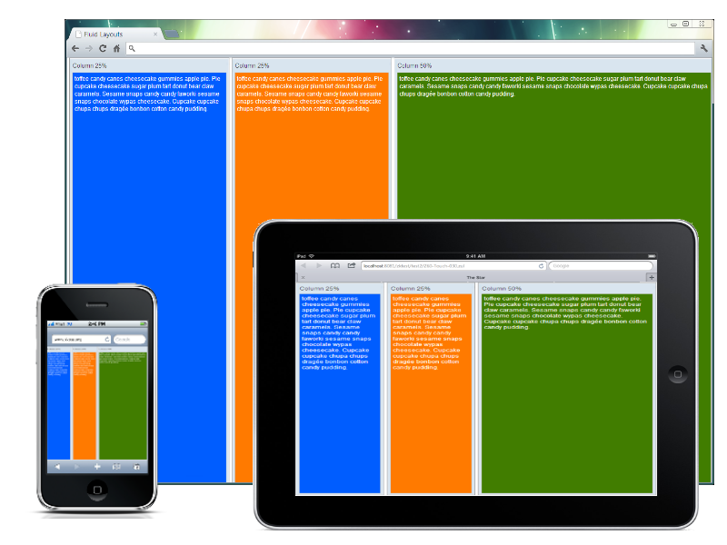
	<window title="Column 25%" vflex="1" hflex="1" sclass="column1" border="normal">
			toffee candy canes cheesecake gummies apple pie. Pie cupcake cheesecake sugar plum tart donut
			bear claw caramels. Sesame snaps candy candy faworki sesame snaps chocolate wypas cheesecake.
			Cupcake cupcake chupa chups dragée bonbon cotton candy pudding.
	</window>
	<window title="Column 25%" vflex="1" hflex="1" sclass="column2" border="normal">
			toffee candy canes cheesecake gummies apple pie. Pie cupcake cheesecake sugar plum tart donut
			bear claw caramels. Sesame snaps candy candy faworki sesame snaps chocolate wypas cheesecake.
			Cupcake cupcake chupa chups dragée bonbon cotton candy pudding.
	</window>
	<window title="Column 50%" vflex="1" hflex="2" sclass="column3" border="normal">
			toffee candy canes cheesecake gummies apple pie. Pie cupcake cheesecake sugar plum tart donut
			bear claw caramels. Sesame snaps candy candy faworki sesame snaps chocolate wypas cheesecake.
			Cupcake cupcake chupa chups dragée bonbon cotton candy pudding.
	</window>
</hlayout>
As you can see above, we use the attributes vflex and hflex to adjust the size according user's screen size.
Adaptive Layouts
The method of the adaptive layout is more advantageous than #Fluid Layouts, the problem we met with the fluid layout is that its content can only fit with the size according to the screen's size, but the layout may break if the size is not good enough to display or display in odd way. The adaptive layout can solve this by using CSS 3 Media Query.
For example,
<?taglib uri="http://www.zkoss.org/dsp/web/theme" prefix="t"?>
<zk>
<style>
.z-hlayout-inner {
	${t:applyCSS3('box-sizing', 'border-box')};
	height: 100%;
}
.z-hlayout-inner {
	width: 25%;
}
.z-hlayout-inner:last-child {
	width: 50%;
}
@media screen and (max-width: 1024px) {
	.z-hlayout-inner {
		width: 50%;
		height: 50%;
	}
	.z-hlayout-inner:last-child {
		width: 100%;
		display: block;
	}
}
@media screen and (max-width: 750px) {
	.z-hlayout-inner {
		width: 100%;
		height: 33%;
		display: block;
	}
}
</style>
<hlayout vflex="1">
	<window title="Column 25%" height="100%" sclass="column1" border="normal">
		toffee candy canes cheesecake gummies apple pie. Pie cupcake cheesecake sugar plum tart donut
		bear claw caramels. Sesame snaps candy candy faworki sesame snaps chocolate wypas cheesecake.
		Cupcake cupcake chupa chups dragée bonbon cotton candy pudding.
	</window>
	<window title="Column 25%" height="100%" sclass="column2" border="normal">
		toffee candy canes cheesecake gummies apple pie. Pie cupcake cheesecake sugar plum tart donut
		bear claw caramels. Sesame snaps candy candy faworki sesame snaps chocolate wypas cheesecake.
		Cupcake cupcake chupa chups dragée bonbon cotton candy pudding.
	</window>
	<window title="Column 50%" height="100%" sclass="column3" border="normal">
		toffee candy canes cheesecake gummies apple pie. Pie cupcake cheesecake sugar plum tart donut
		bear claw caramels. Sesame snaps candy candy faworki sesame snaps chocolate wypas cheesecake.
		Cupcake cupcake chupa chups dragée bonbon cotton candy pudding.
	</window>
</hlayout>
</zk>
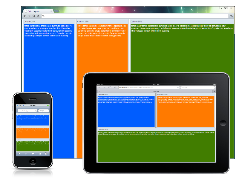
As you can see, we remove the vflex and hflex for Window component replaced with the pure CSS style and some condition statements with the @media query to switch the layout to fit its screen size crossing different devices. max-width: 1024px for ipad or tablet devices and max-width: 750px for iphone or smartphones.
Responsive Design (mix all)
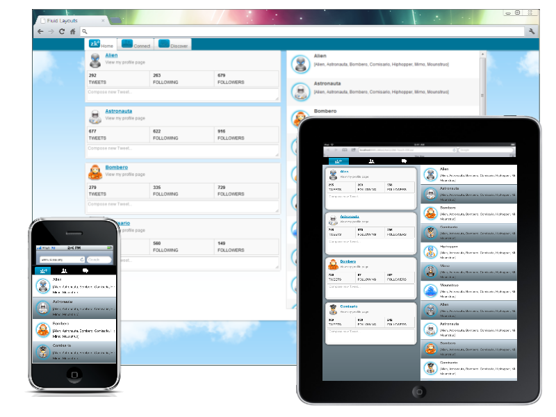
In ZK 6.5, we refine and polish all components to display them seamlessly between PC's browser or Tablet devices. In some of the use cases the default styling is not satisfied for user to adjust the layout for different devices and screen sizes, therefor we could employ the ClientInfoEvent to detect whether the browser's orientation change, and then switch some components' orientation to conform that.
For example,
<scrollview id="sv" orient="horizontal" vflex="1" hflex="1" onClientInfo="doOrientationChange(event)">
	<zscript><![CDATA[
	void doOrientationChange(ClientInfoEvent evt) {
		if (execution.isBrowser("android")) {
			if (evt.getScreenWidth() < evt.getScreenHeight()) {
				menu.setOrient("horizontal");
				sv.setOrient("vertical");
			} else {
				menu.setOrient("vertical");
				sv.setOrient("horizontal");
			}
		} else {
			if (evt.getDesktopWidth() < evt.getDesktopHeight()) {
				menu.setOrient("horizontal");
				sv.setOrient("vertical");
			} else {
				menu.setOrient("vertical");
				sv.setOrient("horizontal");
			}
		}
	}
	]]></zscript>
	<vlayout sclass="landscape">
		<div sclass="logo" />
		<menubar id="menu" orient="vertical">
			<menu src="product.png" label="Products">
				<menupopup>
					<menuitem label="ZK" />
					<menuseparator />
					<menuitem label="ZK Studio" />
					<menuseparator />
					<menuitem label="ZK Spring" />
					<menuseparator />
					<menuitem label="ZK Spreadsheet" />
					<menuseparator />
					<menuitem label="ZK Pivottable" />
					<menuseparator />
					<menuitem label="ZK Calendar" />
					<menuseparator />
					<menuitem label="ZK JSP" />
					<menuseparator />
					<menuitem label="ZATS" />
				</menupopup>
			</menu>
			<menuitem src="demo.png" label="Demo" />
			<menuitem src="download.png" label="Downloads" />
			<menuitem src="community.png" label="Community" />
			<menuitem src="support.png" label="Support" />
		</menubar>
	</vlayout>
	<vlayout>
		<image id="main" sclass="main" src="demo-1.PNG"/>
		<hlayout>
			<toolbarbutton mode="toggle" checked="true" label="Demo 1"
				onClick='doChecked(self, "demo-1.PNG")' />
			<toolbarbutton mode="toggle" label="Demo 2"
				onClick='doChecked(self, "demo-2.PNG")' />
			<toolbarbutton mode="toggle" label="Demo 3"
				onClick='doChecked(self, "demo-3.PNG")' />
		</hlayout>
	</vlayout>
</scrollview>
- Summary
- Download
Comments
| Copyright © Potix Corporation. This article is licensed under GNU Free Documentation License. |


