New Features of ZK 7.0.0 Preview"
Tmillsclare (talk | contribs) m (→Introduction) |
Tmillsclare (talk | contribs) m (→Introduction) |
||
| Line 8: | Line 8: | ||
= Introduction = | = Introduction = | ||
| − | <div"><div style="background: url("/resource/img/index/top_buttons_sprite.png") no-repeat scroll 0 0 transparent; cursor: pointer; float: left; height: 57px; margin-top: 40px; width: 165px;><a title="Demo" href="http://www.zkoss.org/zkdemo"></a></div><div style="background-position: -165px 0px;"><a title="Download" href="/download/zkpivottable"></a></div> | + | <div"><div style="background: url("http://www.zkoss.org/resource/img/index/top_buttons_sprite.png") no-repeat scroll 0 0 transparent; cursor: pointer; float: left; height: 57px; margin-top: 40px; width: 165px;><a title="Demo" href="http://www.zkoss.org/zkdemo"></a></div><div style="background-position: -165px 0px;"><a title="Download" href="/download/zkpivottable"></a></div> |
</div> | </div> | ||
Revision as of 09:59, 8 August 2013
Timothy Clare, Potix Corporation
August 13, 2013
ZK 7.0.0 Preview
Introduction
<div">
Enhanced themes with Bootstrap, CSS 3 and LESS
ZK 7's major enhancement focuses on theming. It is something that has been spoken about and suggested by many of our users and customers, therefore we are proud to announce that ZK 7 has simplified the process of creating themes using the following technologies:
- Bootstrap theme support - You can seamlessly apply Bootstrap themes without breaking component functionality
- LESS support - Themes are now based on LESS, meaning the code is cleaner and more concise than ever before
- CSS 3 support - The default theme has been totally revised using CSS 3 functionality, bringing better performance and cleaner code
The video below demonstrates a sample application in action using a Boostrap theme and LESS.
For more information on this you can refer to Jumper's blog post here
Why Bootstrap and why the change?
The text above hints at the reasons for this change "to simplify the process of creating themes" and that is the core fundamental reason for the introduction by the ZK team. However, ZK 7 brings so much more than that.
The power of Bootstrap
Bootstrap has a lot of themes available, this gives ZK developers the ability to use and expand other's Bootstrap themes for use with their ZK applications. This substantially reduces the resources needed to produce great looking themes.
In addition to that designers are now much more familiar with Bootstrap conventions and this gives a significant learning advantage when coming to ZK as Bootstrap conventions for base components are used and even ZK's more sophisticated components will still follow similar naming patterns.
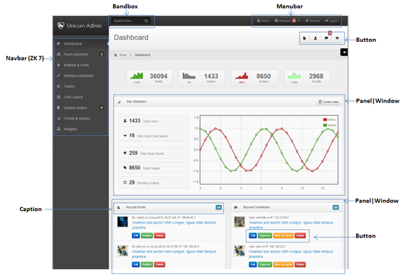
The image below shows Bootstrap styled ZK components in action.
CSS 3
The power of CSS 3 is obvious, the later browsing are supporting the specification and it means that previous effects which took more DOM "tricks" to implement can now be implemented using a simple CSS command. This leads to applications & themes having much more simplified CSS code along with major performance boosts which CSS 3 brings with it.
The combination of Bootstrap and further CSS 3 support gives developers the opportunity to build themes quicker, for less money and which perform much better in the browser.
So what does this mean for designers and developers
It means the design and development teams have a much easier job and spend less time creating applications which look great and perform better than ever. Additionally, these changes will make prototyping even easier, ZUL provides a great base for prototyping but with now simplified themes and Bootstrap support meaning it will take less time to produce an impressive application which uses, or is similar to the company's theme.
Navigation is a key component in a website, a good navigation design can greatly improve a user’s experience. It not only presents the website’s information briefly, but also helps users locate and link to other pages in the website.
In ZK 7 we are pleased to introduce a new set of navigation components. Developers are now able to design excellent navigation menus and sitemaps more easily and rapidly by using the new navigation components.
The video below shows the navigation component in action.
The following is an implementation of a navigation component using ZUL.
<navbar id="sidebar" orient="vertical">
  <navitem label="Inbox" iconSclass="z-icon-inbox"/>
  <navitem label="Create Task" iconSclass="z-icon-pencil"/>
  <nav label="Next Actions" iconSclass="z-icon-th-list" detailed="true">
    <navitem label="Rescue the Baby" iconSclass="z-icon-star"/>
    <navitem label="Play Darts" />
Performance Improvement
In addition to the already existing performance improvements using CSS 3 the ZK have been working hard on the layout code for ZK. Four attribute layout performance has been improved in ZK 7, those are:
- height & width
- hflex & vflex
Height & Width
The height & width calculation code has been updated in ZK 7 with tests indicating a 30% improvement.
hflex & vflex
hflex & vflex have also been updated with their ZK 7 improvement coming in at around 20%.
It should be noted that the improvement is not for every single component but around 70% of available components.
Tabbox supporting right and bottom positioned tabs
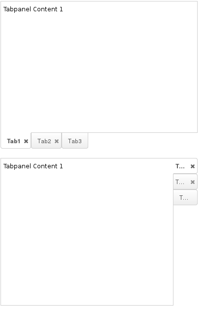
ZK 7 has brought about the ability to position tabs on the right and bottom of the tab boxing providing developers with more flexibility than every before. The screenshot below shows both tab boxes in action.
The position of the tabs can be specfied using the "orient" attribute. The code sample below outlines this.
<tabbox height="300px" width="400px" orient="horizontal-bottom">
   ...
</tabbox>

<tabbox height="300px" width="400px" orient="vertical-right">
   ...
</tabbox>
Audio component now supports HTML 5
The audio component has now been enhanced to support HTML 5. Instead of using "embed" HTML tag it now uses the HTML 5 provided "audio" tag.
To use the audio component is very simple, an example is provided below.
<audio id="audio" height="20"/>

