Style"
From Documentation
| Line 15: | Line 15: | ||
| + | [[Image:ZKComRef_Style_Example.png]] | ||
| − | + | <source lang="xml" > | |
| + | <style> a{ color:red; }</style> | ||
| + | </source> | ||
=Supported events= | =Supported events= | ||
Revision as of 06:59, 12 May 2010
Style
Employment/Purpose
The style component used to specify CSS styles for the owner desktop.
Note: a style component can appear anywhere in a ZUML page, but it affects all components in the same desktop.
Example
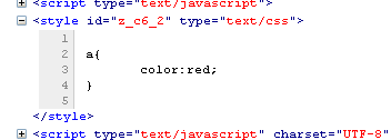
<style> a{ color:red; }</style>
Supported events
| None | None |
Supported Children
*NONE
Use cases
| Version | Description | Example Location |
|---|---|---|
| 5.0+ |
Version History
| Version | Date | Content |
|---|---|---|
| 5.x.x | x/x/20xx | Initialization |
