Cascader
Cascader
- Demonstration
- Java API: Cascader
- JavaScript API: Cascader
- Available for ZK:
-

Since 9.0.0
Employment/Purpose
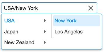
Cascader is used to select an item from a hierarchical structure of data. It accepts a TreeModel.
Example
    <zscript><![CDATA[
    DefaultTreeModel treeModel = new DefaultTreeModel(new DefaultTreeNode("ROOT",
            Arrays.asList(new DefaultTreeNode[]{
                    new DefaultTreeNode("USA",
                            Arrays.asList(new TreeNode[]{new DefaultTreeNode("New York"),new DefaultTreeNode("Los Angelas")})),
                    new DefaultTreeNode("Japan",
                            Arrays.asList(new TreeNode[]{new DefaultTreeNode("Tokyo"),new DefaultTreeNode("Kyoto")})),
                    new DefaultTreeNode("New Zealand",
                            Arrays.asList(new TreeNode[]{new DefaultTreeNode("Auckland"),new DefaultTreeNode("Queenstown")}))}
            )));
    ]]></zscript>
    <cascader width="300px" model="${treeModel}"/>
Users can select in layers, and the selected items are converted into text. (Default: joining by slashes, i.g. "A/B/C")
Custom Item Rendering
Since this component has no child component like Listbox, if you want to render its items differently, there 2 ways:
Change text
If you just want to change the text e.g. enclosing it with brackets, just put <template> as its child and add characters with ${each}:
   <cascader>
       <template name="model">[${each}]</template>
   </cascader>
- The template only allows text that can be converted into a ZK
Label.
Change HTML Structure
If you want to make more changes e.g. adding tooltips by setting title attributes, you need to create your own ItemRenderer. See ZK Developer's Reference/MVC/View/Renderer/Item Renderer.
Properties
Disabled
Sets whether it is disabled. A disabled component can't interact with users.
ItemConverter
Specify a full qualified class name that implements Converter.
The default implementation is joining all the toString() result of items by slashes /.
By implementing your own one, you can generate a custom text that represents the selected item.
Custom Item Rendering
Since this component has no child component like Listbox, if you want to render its items differently, there 2 ways:
Change text
If you just want to change the text e.g. enclosing it with brackets, just put <template> as its child and add characters with ${each}:
   <cascader>
       <template name="model">[${each}]</template>
   </cascader>
- The template only allows text that can be converted into a ZK
Label.
Change HTML Structure
If you want to make more changes e.g. adding tooltips by setting title attributes, you need to create your own ItemRenderer. See ZK Developer's Reference/MVC/View/Renderer/Item Renderer.
Model
The tree model associated with this cascader.
Open
Drops down or closes the list of items.
Placeholder
When the selected item is empty, the placeholder text would be displayed. (Default: empty)
SelectedItem
Represents the selected item, or null if no item is selected.
Items are selected only if the leaf item is selected. For example, in an A - B - C structure, selected item remains null until the leaf node C is selected.
Supported Events
onAfterRender |
Event: Event
Notifies one that the model's data has been rendered as components on the server side. |
onSelect |
Event: SelectEvent
Represents an event caused by user's the selection changed at the client. |
onOpen |
Event: OpenEvent
Represents an event that indicates an open state that is changed at the client. |
- Inherited Supported Events: HtmlBasedComponent
Supported Children
* None
