Tablelayout"
From Documentation
m ((via JWB)) |
|||
| (3 intermediate revisions by 3 users not shown) | |||
| Line 10: | Line 10: | ||
= Employment/Purpose = | = Employment/Purpose = | ||
| − | Tablelayout | + | Tablelayout lays out a container as an HTML table in which the columns can be specified, and rowspan and colspan of its child can also be specified to create complex layouts within the table. |
= Example = | = Example = | ||
| Line 44: | Line 44: | ||
</source> | </source> | ||
| − | + | {{versionSince| 6.0.0}} | |
The child of tablechildren can be any component: | The child of tablechildren can be any component: | ||
| Line 71: | Line 71: | ||
=Supported Events= | =Supported Events= | ||
| − | {| | + | {| class='wikitable' | width="100%" |
! <center>Name</center> | ! <center>Name</center> | ||
! <center>Event Type</center> | ! <center>Event Type</center> | ||
| Line 86: | Line 86: | ||
=Use Cases= | =Use Cases= | ||
| − | {| | + | {| class='wikitable' | width="100%" |
! Version !! Description !! Example Location | ! Version !! Description !! Example Location | ||
|- | |- | ||
| Line 97: | Line 97: | ||
{{LastUpdated}} | {{LastUpdated}} | ||
| − | {| | + | {| class='wikitable' | width="100%" |
! Version !! Date !! Content | ! Version !! Date !! Content | ||
|- | |- | ||
Revision as of 13:13, 7 January 2022
Tablelayout
- Demonstration: Tablelayout
- Java API: Tablelayout
- JavaScript API: Tablelayout
- Style Guide: TableLayout
- Available for ZK:
-

Employment/Purpose
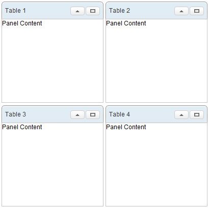
Tablelayout lays out a container as an HTML table in which the columns can be specified, and rowspan and colspan of its child can also be specified to create complex layouts within the table.
Example
<tablelayout columns="2">
	<tablechildren>
		<panel title="Table 1" border="normal" maximizable="true"
			collapsible="true" width="200px" height="200px">
			<panelchildren>Panel Content</panelchildren>
		</panel>
	</tablechildren>
	<tablechildren>
		<panel title="Table 2" border="normal" maximizable="true"
			collapsible="true" width="200px" height="200px">
			<panelchildren>Panel Content</panelchildren>
		</panel>
	</tablechildren>
	<tablechildren>
		<panel title="Table 3" border="normal" maximizable="true"
			collapsible="true" width="200px" height="200px">
			<panelchildren>Panel Content</panelchildren>
		</panel>
	</tablechildren>
	<tablechildren>
		<panel title="Table 4" border="normal" maximizable="true"
			collapsible="true" width="200px" height="200px">
			<panelchildren>Panel Content</panelchildren>
		</panel>
	</tablechildren>
</tablelayout>
Since 6.0.0
The child of tablechildren can be any component:
	<tablelayout columns="2">
	    <tablechildren>
	        <label value="Table 1" />
	    </tablechildren>
	    <tablechildren>
	        <button label="Table 2" />
	    </tablechildren>
	    <tablechildren>
	        <textbox value="Table 3" />
	    </tablechildren>
	    <tablechildren>
	        <window border="normal">
	        	Table 4
	        </window>
	    </tablechildren>
	</tablelayout>
Supported Events
| None | None |
- Inherited Supported Events: XulElement
Supported Children
* Tablechildren
Use Cases
| Version | Description | Example Location |
|---|---|---|
Version History
| Version | Date | Content |
|---|---|---|

