Scrollview
From Documentation
Scrollview
- Demonstration: N/A
- Java API: Scrollview
- JavaScript API: Scrollview
- Style Guide: N/A
- Available in ZK EE only
Employment/Purpose
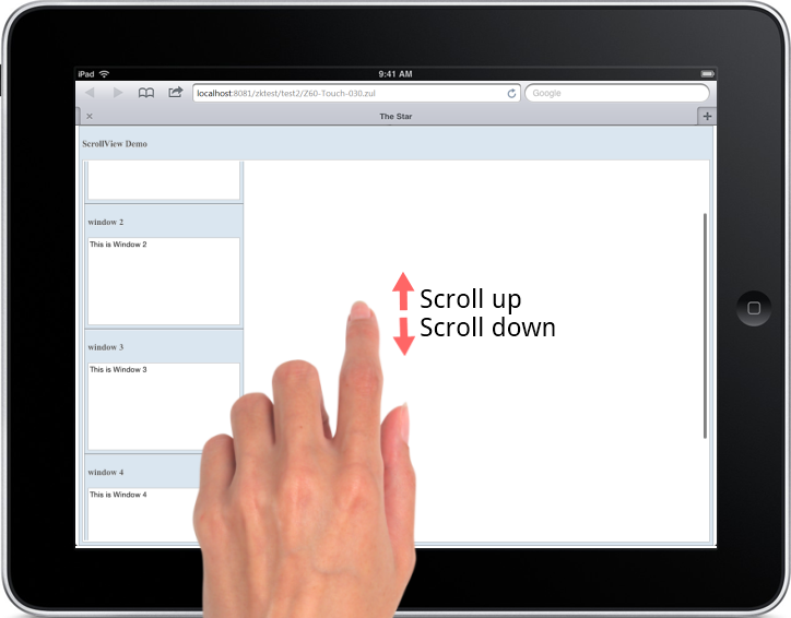
Scrollview provides a container to make its content scroll-able on tablet/mobile device.
Example
You can scroll up/down to see other window components with the following sample ZUL.

<scrollview vflex="1" hflex="1">
    <zk forEach="1,2,3,4,5">
        <window title="window ${each}" border="normal" width="255px" height="200px">
        This is Window ${each}
        </window>
    </zk>
</scrollview>
Properties
Orient
The default orient of child components inside Scrollview is vertical. You can also change it to horizontal.
<scrollview vflex="1" hflex="1" orient="horizontal" />
Supported Events
| Event: ScrollEvent
Denotes that the content of a scrollable component has been scrolled by the user. Notice that you can check if it is scrolled outside/inside boundaries by invoking getOutOfBound method in the ScrollEvent. | |
| Event: ScrollEvent
Denotes that the user is scrolling a scrollable component. |
- Inherited Supported Events: XulElement
Supported Children
*ALL
Use Cases
| Version | Description | Example Location |
|---|---|---|
Version History
| Version | Date | Content |
|---|---|---|
| 6.5.0 | August, 2012 | new added component |