Form and Inputs
![]() This documentation is for an older version of ZK. For the latest one, please click here.
This documentation is for an older version of ZK. For the latest one, please click here.
Label
A label component represents a piece of text.
<window border="normal">
	Hello World
</window>
If you want to add an attribute to a label, it has to be written as follows:
<window border="normal">
	<label style="color: red" value="Hello World" />
</window>
Tip: ZUML is XML, not HTML, so it doesn't accept . However, you can use   instead.
The pre, hyphen, maxlength and multiline Properties
[since 5.0.0]
You can control how a label is displayed using the pre, multiline and maxlength properties. For example, if you specify pre to be true, all white spaces, such as new lines, spaces and tabs, are preserved.
| All white spaces are preserved, including new lines, spaces and tabs. | |||
| New lines are preserved. | |||
| The label only show its value up to the length of "maxlength". | |||
| The label is displayed regularly. |
<window border="normal" width="300px">
	<vbox id="result">
		<label id="lb1" pre="true" />
		<label id="lb2" multiline="true" />
		<label id="lb3" maxlength="10" />
		<zscript><![CDATA[
			lb1.value = "this   thing   has   spaces.\nnext line.";
			lb2.value = "this   thing   no   space.\nnext line.";
			lb3.value = "this is more than 10 chars.";
		]]></zscript>
	</vbox>
</window>
[For ZK3 users]
This displaying rule is slightly different in ZK3.
| Truncated the characters that exceeds the specified maxlength. | |||
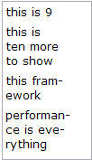
| If the length of a line exceeds maxlength, the line is hyphenated. | |||
| maxlength is ignored. | |||
| hyphen is ignored. |
<window border="normal" width="100px">
	<vbox id="result">
	</vbox>
	<zscript><![CDATA[
		String[] s = {"this is 9", "this is ten more to show",
			"this framework", "performance is everything"};
    	for (int j = 0; j < s.length; ++j) {
			Label l = new Label(s[j]);
			l.maxlength = 9;
			l.hyphen = true;
			l.parent = result;
		}
    ]]>
    </zscript>
</window>
The multiline property is similar to the pre property, except it only preserves new lines and white space at the beginning of each line.
Buttons
There are two types of buttons: button and toolbarbutton. While the looks of the buttons are different, their behaviors are the same. The button component uses the HTML BUTTON tag, while the toolbarbutton component uses the HTML Anchor(A) tag.
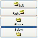
You could assign a label and an image to a button by utilizing the label and image attributes. If both are specified, the dir property controls which is displayed first, and the orient property controls whether the layout is horizontal or vertical.
<zk>
	<button label="Left" image="/img/folder.gif" width="125px"/>
	<button label="Right" image="/img/folder.gif" dir="reverse" width="125px"/>
	<button label="Above" image="/img/folder.gif" orient="vertical" width="125px"/>
	<button label="Below" image="/img/folder.gif" orient="vertical" dir="reverse" width="125px"/>
</zk>
In addition to employing URLs to specify images, you can dynamically assign a generated image to a button using the setImageContent method. Refer to the following section for details.
Tip: The setImageContent method is supplied by all components that have an image property. Simply put, setImageContent is used for dynamically generated images, while image is used for images identifiable by a URL.
The onClick Event and href Property
There are two ways to add behavior to a button and toolbarbutton. Firstly, you can specify a listener for the onClick event. Secondly, you could specify a URL for the href property. If both are specified, the href property has the higher priority, i.e., the onClick event won't be sent.
<zk>
	<window title="example">
		<zscript>
			void do_something_in_Java()
			{
				alert("hello");
				//redirect to another page
			}
		</zscript>

		<button label="click me" onClick="do_something_in_Java()"/>
		<button label="don't click that one, click me" href="/another_page.zul"/>
	</window>
</zk>
The sendRedirect Method of the org.zkoss.zk.ui.Execution Interface
When processing an event, you can decide to stop processing the current desktop and redirect to another page by using the sendRedirect method. In other words, from the user』s viewpoint the following two buttons have exactly the same effect.
<zk>
<window>
<zscript>
void sendRedirect(url)
{
alert("sending redirect");
//send redirect url
}
</zscript>
<button label="redirect" onClick="sendRedirect("another.zul")"/>
<button label="href" href="another.zul"/>
</window>
</zk>
Since the onClick event is sent to the server for processing, you are able to perform additional tasks before invoking sendRedirect, such as redirecting to another page only if certain conditions are satisfied.
On the other hand, the href property is processed at the client side. Your application won't be notified when users click the button.
Button supports OS mold
For those who prefer native Button styling, please use the OS mold as demonstrated below:
<zk>
	<button mold="os" label="os mold"/>
</zk>
The difference lies in the generated HTM, OS molds will generate the <button> tag instead of
tags.Radio and Radio Group
A radio button is a component that can be turned on and off. Radio buttons are grouped together using radiogroup. Only one radio button in a group may be selected at a time.
<zk>
	<radiogroup onCheck="alert(self.selectedItem.label)">
	    <radio label="Apple"/>
	    <radio label="Orange"/>
	    <radio label="Banana"/>
	</radiogroup>
</zk>
Versatile Layouts
You can add additional controls into radiogroups to achieve the desired layout, as illustrated below.
<zk>
	<radiogroup>
	    <grid>
		    <rows>
		        <row><radio label="Apple" selected="true"/> Fruit, music or computer</row>
		        <row><radio label="Orange"/><textbox/></row>
		        <row><radio label="Banana"/><datebox/></row>
			</rows>
	    </grid>
	</radiogroup>
</zk>
The radio button belongs to the nearest radiogroup ancestor. You can even nest one radio group within another and each of them will operate independently. However, there might be some sort of visual overlap.
<zk>
	<radiogroup>
	    <grid>
		    <rows>
		        <row>
					<radio label="Apple" selected="true"/>
					Fruit, music or computer
				</row>
		        <row>
		        	<radio label="Orange"/>

		            <radiogroup>
			            <radio label="Small"/>
			            <radio label="Large" selected="true"/>
		            </radiogroup>
		        </row>
		        <row>
		        	<radio label="Banana"/><datebox/>
		        </row>
			</rows>
	    </grid>
	</radiogroup>
</zk>
Comboboxes
Components: combobox and comboitem.
A combobox is a special text box which embeds a drop-down list. Using comboboxes, users are allowed to select items from a drop-down list, in addition to entering text manually.
<zk>
	<combobox>
	    <comboitem label="Simple and Rich"/>
	    <comboitem label="Cool!"/>
	    <comboitem label="Ajax and RIA"/>
	</combobox>
</zk>
Mouseless Entrycombobox
- Alt+DOWN to pop up the list.
- Alt+UP or ESC to close the list.
- UP and DOWN to change the selection of the items from the list.
The autodrop Property
By default, the drop-down list won't be opened until user clicks the button, or presses Alt+DOWN. However, you could set the autodrop property to true, meaning as soon as the user types a character the drop-down list will be opened. This is helpful for novice users, but it might be annoying for experienced users.
<combobox autodrop="true"/>
The description Property
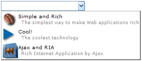
You are able add a description to each combo item to make it more descriptive or assign an image to every item.
<zk>
	<combobox>
	    <comboitem label="Simple and Rich" image="/img/coffee.gif"
	     description="The simplest way to make Web applications rich"/>
	    <comboitem label="Cool!" image="/img/corner.gif"
	     description="The coolest technology"/>
	    <comboitem label="Ajax and RIA" image="/img/cubfirs.gif"
	     description="Rich Internet Application by Ajax"/>
	</combobox>
</zk>
Akin to other components that support images, you are able to use the setImageContent method to assign a dynamically generated image to the comboitem component. Please refer to the Image section for details.
The onOpen Event
The onOpen event is sent to the application when a user opens the drop-down list. To defer the creation of combo items, you can use the fulfill attribute as shown below.
<zk>
	<combobox fulfill="onOpen">
	    <comboitem label="Simple and Rich"/>
	    <comboitem label="Cool!"/>
	    <comboitem label="Ajax and RIA"/>
	</combobox>
</zk>
Alternatively, you can listen to the onOpen event and prepare the drop-down list or change it dynamically as demonstrated below.
<zk>
	<zscript>
		void prepare()
		{
			if (combo.getItemCount() == 0)
			{
				combo.appendItem("Simple and Rich");
				combo.appendItem("Cool!");
				combo.appendItem("Ajax and RIA");
			}
		}
	</zscript>
	<combobox id="combo" onOpen="prepare()" />
</zk>
The appendItem method is equivalent to creating a combo item and then setting the combobox as its parent.
The onChanging Event
Since a combobox is also a text box, you are also able to listen to an onChanging event. By listening to this event, you can manipulate the drop-down list as demonstrated by Google Suggests[1]. This feature is sometimes called auto-complete.
As illustrated below, you can populate the drop-down list based on what user is entering.
<zk>
	<zscript>
	     void suggest()
	     {
	         combo.getItems().clear();
	         if (event.value.startsWith("A")) {
	             combo.appendItem("Ace");
	             combo.appendItem("Ajax");
	             combo.appendItem("Apple");
	         } else if (event.value.startsWith("B")) {
	             combo.appendItem("Best");
	             combo.appendItem("Blog");
	         }
	     }
	</zscript>

	<combobox id="combo" autodrop="true" onChanging="suggest()"/>
</zk>
Notice that, when the onChanging event is received, the content of the combobox has not changed. Therefore, you cannot use the value property of the combobox. Instead, you should use the value property of the event (org.zkoss.zk.ui.event.InputEvent).
Bandboxes
Components: bandbox and bandpopup.
A bandbox is a special text box that embeds a customizable popup window (AKA a dropdown window). Like comboboxes, a bandbox consists of an input box and a popup window. The popup window is opened automatically, when a user click the button or presses the keys Alt+DOWN.
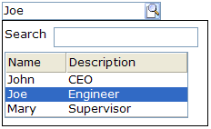
Unlike comboboxes, the popup window of a bandbox can contain anything as it is designed to give developers maximum flexibility. A typical use is to provide a search dialog.
<bandbox id="bd">
	<bandpopup>
		<vbox>
			<hbox>
				Search
				<textbox />
			</hbox>
			<listbox width="200px"
				onSelect="bd.value=self.selectedItem.label;    bd.closeDropdown();">
				<listhead>
					<listheader label="Name" />
					<listheader label="Description" />
				</listhead>
				<listitem>
					<listcell label="John" />
					<listcell label="CEO" />
				</listitem>
				<listitem>
					<listcell label="Joe" />
					<listcell label="Engineer" />
				</listitem>
				<listitem>
					<listcell label="Mary" />
					<listcell label="Supervisor" />
				</listitem>
			</listbox>
		</vbox>
	</bandpopup>
</bandbox>
Mouseless Entrybandbox
- Alt+DOWN to pop up the list.
- Alt+UP or ESC to close the list.
- UP and DOWN to change the selection of the items from the list.
The closeDropdown Method
A popup window could contain any components, so it is the developer’s job to close the popup and copy any needed value from it.
<listbox width="200px"
   onSelect="bd.value=self.selectedItem.label; bd.closeDropdown();">
In the above example, we copy the selected item's label to the bandbox, and then close the popup.
The autodrop Property
By default, the popup window won't be opened until user clicks the button, or presses Alt+DOWN on the keyboard. However, you can set the autodrop property to true and as soon as the user types a character the popup will be opened. This is helpful for novice users, but it might be annoying for experienced users.
<zk>
	<bandbox id="bd" autodrop="true">
		<bandpopup>
			...
		</bandpopup>
	</bandbox>
</zk>
The onOpen Event
If the user opens the popup window the onOpen event is sent to the application. By using the fulfill attribute with the onOpen value as shown below, you can defer the creation of the popup window.
<bandbox id="test">
    <bandpopup fulfill="test.onOpen">
     ...
    </bandpopup>
</bandbox>
Alternatively, you can prepare the popup window in Java by listening to the onOpen event, as depicted below.
<zk>
	<bandbox id="band" onOpen="prepare()"/>

	<zscript>
	     void prepare()
	     {
	         if (band.getPopup() == null) {
	             //create child elements
	         }
	     }
	</zscript>
</zk>
The onChanging Event
Since a bandbox is also a text box, you are also able to listen to an onChanging event. By listening to this event, you can manipulate the popup window in any fashion. The code below illustrates capturing the user key and displaying information accordingly.
<zk>
	<bandbox id="band" autodrop="true" onChanging="suggest()"/>
	<zscript>
	     void suggest()
	     {
	         if (event.value.startsWith("A")) {
	             //do something
	         } else if (event.value.startsWith("B")) {
	             //do another
	         }
	     }
	</zscript>
</zk>
Notice that, when the onChanging event is received, the content of the bandbox has not changed. Therefore, you cannot use the value property of the bandbox. Instead, you should use the value property of the event (org.zkoss.zk.ui.event.InputEvent).
Input Controls
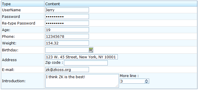
The following input controls are supported in the XUL component set: textbox, intbox, decimalbox, doublebox, datebox, timebox, spinner, combobox, and bandbox. These controls allow users to input different types of data.
<grid fixedLayout="true">
	<columns>
		<column label="Type" width="150px" />
		<column label="Content" />
	</columns>
	<rows>
		<row>
			<label value="UserName" width="150px" />
			<textbox value="Jerry" width="150px" />
		</row>
		<row>
			Password
			<textbox type="password" value="123456789" width="150px" />
		</row>
		<row>
			Re-type Password
			<textbox type="password" value="123456789" width="150px" />
		</row>
		<row>
			Age:
			<intbox value="19" constraint="no negative,no zero"
				width="150px" />
		</row>
		<row>
			Phone:
			<intbox constraint="no negative,no zero" width="150px"
				value="12345678" />
		</row>
		<row>
			Weight:
			<decimalbox format="###.##" value="154.32" width="150px" />
		</row>
		<row>
			Birthday:
			<hbox>
				<datebox id="db" width="150px" />
			</hbox>
		</row>
		<row>
			Address
			<vbox>
				<textbox width="250px"
					value="123 W. 45 Street, New York, NY 10001" />
				<hbox>
					<label value="Zip code :" />
					<intbox constraint="no negative,no zero"
						width="150px" />
				</hbox>
			</vbox>
		</row>
		<row>
			E-mail:
			<textbox width="150px" value="[email protected]"
				constraint="/.+@.+\.[a-z]+/: Please enter an e-mail address" />
		</row>
		<row>
			Introduction:
			<hbox>
				<textbox id="intro" rows="3" width="250px">
					<attribute name="value">I think ZK is the best! </attribute>
				</textbox>
				<vbox>
					More line :
						<spinner value="3" constraint="no negative,no zero" />
				</vbox>
			</hbox>
		</row>
	</rows>
</grid>
Tip: The combobox and bandbox are special input boxes and share common properties. These unique features will be discussed later in the Combobox and Bandbox sections.
The type Property
The type attribute can be used with the textbox based components and can be given the value password. By setting the type as password the text that is entered into the box cannot be viewed and is replaced by stars.
Username: <textbox/>
Password: <textbox type="password"/>
The format Property
You are able to format the field by providing specifying the attribute with a formatting string. The default value is null. When the formatting of the datebox is null, it means the date will be outputted using the format yyyy/MM/dd. With regard to the intbox and decimalbox, it means no formatting will be applied.
<datebox format="MM/dd/yyyy"/>
<decimalbox format="#,##0.##"/>
Like any other properties, you are able change the format dynamically, as depicted below.
<datebox id="db"/>
<button label="set MM-dd-yyyy" onClick="db.setFormat("MM-dd-yyyy")"/>
Mouseless Entry datebox
- Alt+DOWN to show the calendar
- LEFT, RIGHT, UP and DOWN to change the selected day on the calendar
- ENTER to activate the selection by copying the selected day to the datebox control
- Alt+UP or ESC to give up the selection and close the calendar
Constraints
You could specify what value to accept for input controls by use of the constraint property. It could be a combination of no positive, no negative, no zero, no empty, no future, no past, no today, and/or a regular expression. The first three constraints are applicable only to the intbox and decimalbox. The constraints of no future, no past, and no today are only applicable to the datebox. The constraint of no empty is applicable to any type of component. A regular expressions constraint is only applicable to String-type input components, such as the textbox., combobox and bandbox.
To specify two or more constraints, use comma to separate them as follows.
<intbox constraint="no negative,no zero"/>
To specify a regular expression, you may have to use the character / to enclose the regular expression as follows.
<textbox constraint="/.+@.+\.[a-z]+/"/>
Notes:
- The above statement is XML, so do not use \\ to specify a backslash. However typing \\ is necessary, if writing in Java.
new Textbox().setConstraint("/.+@.+\\.[a-z]+/");
- You are allowed to mix regular expressions with other constraints by separating them with a comma.
If you prefer to display different message to the default one, you can append the error message to the constraint with a colon.
<textbox constraint="/.+@.+\.[a-z]+/: e-mail address only"/>
<datebox constraint="no empty, no future: now or never"/>
Notes:
- The error message, if specified, must be the last element and start with colon.
- To support multiple languages, you could use the 「l」 function as depicted in the Internationalization chapter.
<textbox constraint="/.+@.+\.[a-z]+/: ${c:l('err.email.required')}"/>
Constraints for Datebox
In addition to the constraints described in the above section (such as no future and regular expressions), the datebox supports a wide range of dates. For example,
<datebox constraint="between 20071225 and 20071203"/>
<datebox constraint="before 20071225"/>
<datebox constraint="after 20071225"/>
Notices
- The format of the date in the constraint is yyyMMdd. It is independent of the locale.
- The date specified in the constraint is included. For example, "before 20071225" includes December 25, 2007 and every day before it.
- The constraint is actually represented with an instance of the org.zkoss.zul.SimpleDateConstraint class. You can retrieve the parsed beginning and ending date with the getBeginDate and getEndDate methods.
((SimpleDateConstraint)datebox.getConstraint()).getBeginDate();
Custom Constraints
If you want to use more sophisticated constraints, you can specify an object which implements the org.zkoss.zul.Constraint interface.
<window title="Custom Constraint">
	<zscript><![CDATA[
 		Constraint ctt = new Constraint() {
     	public void validate(Component comp, Object value) throws WrongValueException {
        	if (value =e= null || ((Integer)value).intValue() < 100)
				throw new WrongValueException(comp, "At least 100 must be specified");
     		}
 		}
    ]]>
    </zscript>
	<intbox constraint="${ctt}" />
</window>
You create a Java class to contain your constraint, say my.EmailValidator, then reference it in the markup:
<?taglib uri="http://www.zkoss.org/dsp/web/core" prefix="c"?>
<textbox constraint="${c:new('my.EmailValidator')}"/>
org.zkoss.zk.ui.WrongValueException
<textbox>
    <attribute name="onChange">
         if (!self.value.equals("good")) {
             self.value = "try again";
             throw new WrongValueException(self, "Not a good answer!");
         }
    </attribute>
</textbox>
In the above example, we use the class org.zkoss.zk.ui.WrongValueException to denote an error. As depicted, you have to specify the first argument, which is the component that caused the error, and the second argument which is the error message.
You could throw this exception anytime, such as when an onChange event is received as shown below.
Custom Way to Display the Error Messages
Instead of the default error box, you are able to provide a custom look by implementing the org.zkoss.zul.CustomConstraint interface with Constraint. CustomConstraint has one method, showCustomError, which is called when an exception is thrown or when the validation is incorrect. Here is an example,
<window title="Custom Constraint" border="normal">
	<zscript><![CDATA[
		class MyConst implements Constraint, CustomConstraint {
			//Constraint//
			public void validate(Component comp, Object value) {
	        	if (value == null || ((Integer)value).intValue() < 100)
					throw new WrongValueException(comp, "At least 100 must be specified");
			}
	     	//CustomConstraint//
			public void showCustomError(Component comp, WrongValueException ex) {
				errmsg.setValue(ex != null ? ex.getMessage(): "");
			}
 		}
		Constraint ctt = new MyConst();
    ]]>
    </zscript>
	<hbox>
		Enter a number at least 100:
		<intbox constraint="${ctt}" />
		<label id="errmsg" />
	</hbox>
</window>
Improve Responsiveness
Responsiveness can be improved by validating more constraints client side. To do this, you have to implement the org.zkoss.zul.ClientConstraint interface with Constraint. If you have done all validations client side, you can return true for the isClientComplete method, and then there will be no server callback at all.
You can also customize the display of the error message with pure JavaScript codes a the client by providing a function called Validate_errorbox. For example,
<script type="text/javascript"><![CDATA[
    //Running at the browser
    window.Validate_errorbox = function (id, boxid, msg) {
        var html = '<div style="display:none;position:absolute" id="'
        +boxid+'">'+zk.encodeXML(msg, true)+'</div>';
		document.body.insertAdjacentHTML("afterbegin", html);
		return $e(boxid);
    }
]]>
</script>
Note: script specifies the script codes running at the browser, while zscript specifies codes running at the server.
Note: If CustomConstraint is also implemented, ClientConstraint will be ignored since all validations are done at the server. In other words, if you want to use ClientConstraint to improve responsiveness, overriding Validate_errorbox is the only way to customize the display of the error message.
The onChange Event
An input control notifies the application with the onChange event if its content is changed by the user.
Notice that, when the onChange's event listener is invoked, the value has been set. Thus, it is too late if you want to reject illegal value in the onChange's event listener, unless you restore the value properly. Rather, it is recommended to use a constraint as described in the Custom Constraints section.
The onChanging event
An input control also notifies the application with the onChanging event, when user is changing the content.
Notice that, when the onChanging's listener is invoked, the value is not set yet. In other worlds, the value property is still the old value. To retrieve what the user is entering, you have to access the value property of the event as follows.
<grid>
    <rows>
        <row>The onChanging textbox:
            <textbox onChanging="copy.value = event.value"/></row>
        <row>Instant copy:
            <textbox id="copy" readonly="true"/></row>
    </rows>
</grid>
It is too early to reject an illegal value in the onChanging』s event listener, because the user may not have completed the change. Rather, it is recommended to use a constraint as described in the Custom Constraints section.
See Also
From ZK Forum:
- onChanging event not everytime fired in Combobox
- Datebox Problem in ZK 3.5.0
- onChange-Event in Textbox doesn't get fired
Notes
| Copyright © Potix Corporation. This article is licensed under GNU Free Documentation License. |

