Grids, Trees and Listbox
![]() This documentation is for an older version of ZK. For the latest one, please click here.
This documentation is for an older version of ZK. For the latest one, please click here.
Paging
A paging component is used to separate long content into multiple pages. For example, assume that you have 100 items and prefer to show 20 items at a time, you can use the paging components as follows.
<zk>
	<paging totalSize="100" pageSize="20"/>
</zk>
When a user clicks the paging component, the onPaging event is sent along with an instance of org.zkoss.zul.event.PagingEvent to the paging component. To decide which portion of your 100 items are visible, you can add a listener to the paging component. Please note that the code below is pseudo code, you can find a real world example here.
<zk>
	<paging id="paging" />

	<zscript>
	List result = new SearchEngine().find("ZK");
	//assume SearchEngine.find() will return a list of items.

	paging.setTotalSize(result.size());
	paging.addEventListener("onPaging", new org.zkoss.zk.ui.event.EventListener() {
		public void onEvent(Event event) {
			int pgno = event.getPaginal().getActivePage();
			int ofs = pgno * event.getPaginal().getPageSize();


			new Viewer().redraw(result, ofs, ofs + event.getPaginal().
				getPageSize() - 1);
			//assume redraw(List result, int b, int e) will display
			//from the b-th item to the e-th item
			}
		}
	);
	</zscript>
</zk>
Paging supports OS mold.
For those who prefer the legacy layout of ZK 3.0』s Button component, please use OS mold as follows:
<zk>
	<paging mold="os" totalSize="100" pageSize="10"/>
</zk>
Paging with List Boxes and Grids
The listbox and grid component supports paging intrinsically, therefore you don't need to specify a paging component explicitly as above, unless you want to have different visual layout or to control multiple list boxes and grids with one paging component.
Please refer to the Grids section for more details.
Paging with Tree
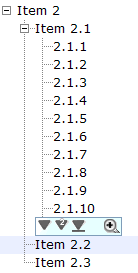
To use paging with trees, you have to set the mold="paging". Related attributes pageSize and pagingPosition are optional.
<zk>
	<tree mold="paging" pageSize="4" pagingPosition="both">
	</tree>
</zk>
Tree Controls
Components: tree, treechildren, treeitem, treerow, treecell, treecols and treecol.
A tree consists of two parts, the set of columns and the tree body. The set of columns is defined by the number of treecol components. Each column will appear as a header at the top of the tree. The second part, the tree body, contains the data to appear in the tree and is created using a treechildren component.
An example of a tree control is as follows.
<tree id="tree" rows="5">
    <treecols>
        <treecol label="Name"/>
        <treecol label="Description"/>
    </treecols>
    <treechildren>
        <treeitem>
            <treerow>
                <treecell label="Item 1"/>
                <treecell label="Item 1 description"/>
            </treerow>
        </treeitem>
        <treeitem>
            <treerow>
                <treecell label="Item 2"/>
                <treecell label="Item 2 description"/>
            </treerow>
            <treechildren>
                <treeitem>
                    <treerow>
                        <treecell label="Item 2.1"/>
                    </treerow>
                    <treechildren>
                        <treeitem>
                            <treerow>
                                <treecell label="Item 2.1.1"/>
                            </treerow>
                        </treeitem>
                        <treeitem>
                            <treerow>
                                <treecell label="Item 2.1.2"/>
                            </treerow>
                        </treeitem>
                    </treechildren>
                </treeitem>
                <treeitem>
                    <treerow>
                        <treecell label="Item 2.2"/>
                        <treecell label="Item 2.2 is something who cares"/>
                    </treerow>
                </treeitem>
            </treechildren>
        </treeitem>
        <treeitem label="Item 3"/>
    </treechildren>
</tree>
- tree: This is the outer component of a tree control.
- treecols: This component is a placeholder for a collection of treecol components.
- treecol: This is used to declare a column of the tree. By using this column, you can specify additional information such as the column header.
- treechildren: This contains the main body of the tree, which contain a collection of treeitem components.
- treeitem: This component contains a row of data (treerow), and optionally treechildren.
- If the component doesn't contain a treechildren component, it is a leaf node that doesn't accept any child items.
- If it contains treechildren, it is a branch node that might contain other items.
- For a branch node, a +/- button will appear at the beginning of the row, such that the user could open and close the item by clicking on the +/- button.
- treerow: A single row in the tree which needs to be placed inside a treeitem component.
- treecell: A single cell in a tree row which is placed inside a treerow component.
Mouseless Entry tree
- Press UP and DOWN to move the selection up and down by one tree item.
- Press PgUp and PgDn to move the selection up and down by one page.
- Press HOME to move the selection to the first item, and END to the last item.
- Press RIGHT to open a tree item, and LEFT to close a tree item.
- Press Ctrl+UP and Ctrl+DOWN to move the focus up and down by one tree item without changing the selection.
- Press SPACE to select the item in focus.
The open Property and the onOpen Event
Each tree item contains the open property which is used to control whether to display its』 child items. The default value is true. By setting this property to false, you are able to control what part of the tree is invisible.
<treeitem open="false">
When a user clicks on the +/- button, he opens the tree item and makes its』 children visible. The onOpen event is then sent to the server to notify the application.
For sophisticated applications, you can defer the creation of the content of the tree item or manipulate its content dynamically until the onOpen event is received. Refer to the Load on Demand section in the ZK User Interface Markup Language chapter for details.
Multiple Selection
When user clicks on a tree item, the whole item is selected and the onSelect event is sent back to the server to notify the application. You can control whether a tree control allows multiple selections by setting the multiple attribute to true. The default value is false.
Paging
The pageSize attribute controls the number of tree items to display at once. By default, it is 10. That is, at most 10 tree items are displayed client side for each level.
A user can click to see more tree items (i.e., enlarge pageSize), or click to scroll up and down.
If you want to display all the tree items, simply set the pageSize to -1. However, it is not recommended if the tree control is large as the browser is too slow to handle a tree with a large number of items.
In addition to the pageSize attribute of a tree control, you can change the page size of each treechildren instance by modifying the treechildren』s pageSize property.
Note: The function had deprecated as of release ZK 3.0.7. Please use the paging mold instead.
The onPaging and onPageSize Event
When a user clicks to scroll up and down the page, the onPaging event is sent along with a org.zkoss.zul.event.PagingEvent instance. Similarly, the onPageSize event is sent along with an org.zkoss.zul.event.PageSize instance.
Special Properties
The rows Property
The rows attribute is used to control how many rows are visible. By setting it to zero, the tree control will resize itself to hold as many as items as possible.
The checkmark Property
The checkmark attribute controls whether to display a checkbox or a radio button in front of each tree item. If the multiple attribute is set to true and the checkmark is set to true then a checkbox will be displayed in front of every item. However, if multiple is set to false then a radio button will be displayed instead.
The vflex Property
The vflex attribute controls whether to grow or shrink vertically to fit their given space. It is so-called vertical flexibility. For example, if the tree is too big to fit in the browser window, it will shrink to make the whole tree visible in the browser window.
This property is ignored if the rows attribute is specified.
The maxlength Property
The maxlength attribute defines the maximal allowed characters being visible at the browser. By setting this property, you can make a narrower tree control.
Sizable Columns
Like columns, you can set the sizable attribute of treecols to true in order to allow users to resize the width of the tree headers. Similarly, the onColSize event is sent when a user resizes the widths.
Create-on-Open for Tree Controls
As illustrated below, you could listen to the onOpen event, and then load the children of a tree item. You can do the same thing using group boxes.
<zk>
	<tree width="200px">
	    <treecols>
	        <treecol label="Subject"/>
	        <treecol label="From"/>
	    </treecols>
	    <treechildren>
	        <treeitem open="false" onOpen="load()">
	            <treerow>
	                <treecell label="Intel Snares XML"/>
	                <treecell label="David Needle"/>
	            </treerow>
	            <treechildren/>
	        </treeitem>
	    </treechildren>
	    <zscript>
			void load() {
				Treechildren tc = self.getTreechildren();
				if (tc.getChildren().isEmpty()) {
					Treeitem ti = new Treeitem();
					ti.setLabel("New added");
					ti.setParent(tc);
				}
			}
	    </zscript>
	</tree>
</zk>
Grids
Components: grid, columns, column, rows and row.
A grid contains components that are aligned in rows like tables. Inside a grid, you declare two things, the columns and the rows. Within the columns you define the header and the column attributes and then provide the row content.
To declare row data use the rows component which is a child element of grid. Inside that you should add row components, which are used for each row. Inside the row element, you should place the content that you want inside that row. Each child is a column of the specific row.
Similarly, the columns are declared with the columns component, which should be a child element of grid. column declares the common attributes of each column, such as the width and alignment, and optional headers, i.e., label and/or image.
<grid>
    <columns>
        <column label="Type"/>
        <column label="Content"/>
    </columns>
    <rows>
        <row>
            <label value="File:"/>
            <textbox width="99%"/>
        </row>
        <row>
            <label value="Type:"/>
            <hbox>
                <listbox rows="1" mold="select">
                    <listitem label="Java Files,(*.java)"/>
                    <listitem label="All Files,(*.*)"/>
                </listbox>
                <button label="Browse..."/>
            </hbox>
        </row>
    </rows>
</grid>
Scrollable Grid
A grid can be scrollable if you specify the height attribute and there is not enough space to display all data.
<grid width="500px" height="130px">
    <columns>
        <column label="Head 1"/>
        <column label="Head 2" align="center"/>
        <column label="Head 3" align="right"/>
    </columns>
    <rows>
        <row>
            <listbox mold="select">
                <listitem label="Faster"/>
                <listitem label="Fast"/>
                <listitem label="Average"/>
            </listbox>
            <datebox/>
            <textbox rows="2"/>
        </row>
        <row>
            <checkbox checked="true" label="Option 1"/>
            <checkbox label="Option 2"/>
            <radiogroup>
                <radio label="Apple"/>
                <radio label="Orange" checked="true"/>
                <radio label="Lemon"/>
            </radiogroup>
        </row>
        <row>
            <checkbox checked="true" label="Option 1"/>
            <checkbox label="Option 2"/>
            <radiogroup orient="vertical">
                <radio label="Apple"/>
                <radio label="Orange" checked="true"/>
                <radio label="Lemon"/>
            </radiogroup>
        </row>
    </rows>
</grid>
Sizable Columns
If you allow users to resize the width of your columns, you can set the sizable attribute of your columns as true. Once allowed, users can resize the widths of columns by dragging the border between adjacent column components.
<window>
    <grid>
        <columns id="cs" sizable="true">
            <column label="AA"/>
            <column label="BB"/>
            <column label="CC"/>
        </columns>
        <rows>
            <row>
                <label value="AA01"/>
                <label value="BB01"/>
                <label value="CC01"/>
            </row>
            <row>
                <label value="AA01"/>
                <label value="BB01"/>
                <label value="CC01"/>
            </row>
            <row>
                <label value="AA01"/>
                <label value="BB01"/>
                <label value="CC01"/>
            </row>
        </rows>
    </grid>
    <checkbox label="sizeable" checked="true" onCheck="cs.sizeable = self.checked"/>
</window>
The onColSize Event
Once a user resizes the width, the onColSize event is sent with an instance of org.zkoss.zul.event.ColSizeEvent. Notice that the column's width is adjusted before the onColSize event is sent. In other words, the event serves as a notification that you can ignore. Of course, you can do whatever you want in the event listener.
Grids with Paging
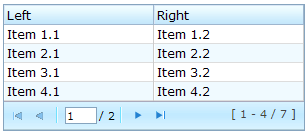
There are two ways to handle large content in a grid, scrolling and paging. Scrolling is enabled by setting the height attribute as discussed in the previous section. Paging is enabled by setting the mold attribute to paging. Once paging is enabled, the grid separates the content into several pages and displays one page at a time as depicted below.
<grid width="300px" mold="paging" pageSize="4">
    <columns>
        <column label="Left"/>
        <column label="Right"/>
    </columns>
    <rows>
        <row>
            <label value="Item 1.1"/><label value="Item 1.2"/>
        </row>
        <row>
            <label value="Item 2.1"/><label value="Item 2.2"/>
        </row>
        <row>
            <label value="Item 3.1"/><label value="Item 3.2"/>
        </row>
        <row>
            <label value="Item 4.1"/><label value="Item 4.2"/>
        </row>
        <row>
            <label value="Item 5.1"/><label value="Item 5.2"/>
        </row>
        <row>
            <label value="Item 6.1"/><label value="Item 6.2"/>
        </row>
        <row>
            <label value="Item 7.1"/><label value="Item 7.2"/>
        </row>
    </rows>
</grid>
Once the paging mold is set, the grid creates an instance of the paging component as a child of the grid and the paging component in turn handles the grid』s paging. Therefore, the number of the grid』s children includes the paging component. Also, if you remove all children of the grid, the paging is also removed.
The pageSize Property
Having set the paging mold, you can specify how many rows are visible at a time (i.e., the page size) by setting the pageSize attribute to a numeric value. By default, it is 20.
The paginal Property
If you prefer to place the paging component in a different location or you want to control two or more grids with the same paging component, you can assign the paginal attribute explicitly. Note: if it is not set explicitly, it is the same as the paging property.
<vbox>
	<paging id="pg" pageSize="4"/>
	<hbox>
	    <grid width="300px" mold="paging" paginal="${pg}">
	        <columns>
	            <column label="Left"/><column label="Right"/>
	        </columns>
	        <rows>
	            <row>
	                <label value="Item 1.1"/><label value="Item 1.2"/>
	            </row>
	            <row>
	                <label value="Item 2.1"/><label value="Item 2.2"/>
	            </row>
	            <row>
	                <label value="Item 3.1"/><label value="Item 3.2"/>
	            </row>
	            <row>
	                <label value="Item 4.1"/><label value="Item 4.2"/>
	            </row>
	            <row>
	                <label value="Item 5.1"/><label value="Item 5.2"/>
	            </row>
	            <row>
	                <label value="Item 6.1"/><label value="Item 6.2"/>
	            </row>
	            <row>
	                <label value="Item 7.1"/><label value="Item 7.2"/>
	            </row>
	        </rows>
	    </grid>
	    <grid width="300px" mold="paging" paginal="${pg}">
	        <columns>
	            <column label="Left"/><column label="Right"/>
	        </columns>
	        <rows>
	            <row>
	                <label value="Item A.1"/><label value="Item A.2"/>
	            </row>
	            <row>
	                <label value="Item B.1"/><label value="Item B.2"/>
	            </row>
	            <row>
	                <label value="Item C.1"/><label value="Item C.2"/>
	            </row>
	            <row>
	                <label value="Item D.1"/><label value="Item D.2"/>
	            </row>
	            <row>
	                <label value="Item E.1"/><label value="Item E.2"/>
	            </row>
	            <row>
	                <label value="Item F.1"/><label value="Item F.2"/>
	            </row>
	        </rows>
	    </grid>
	</hbox>
</vbox>
The paging Property
It is a read-only attribute representing the child paging component that is created automatically. It is null if you assign external paging via the paginal attribute. You rarely need to access this attribute as it is generally better to use the paginal attribute.
The onPaging Event and Method
Once a user clicks the page number of the paging component, an onPaging event is sent the grid. It is then processed by the onPaging method. By default, the method invalidates, i.e., redraws, the content of rows.
If you want to implement "create-on-demand" feature, you can add a event listener to the grid for the onPaging event. The line below demonstrates how to add an EventListener.
grid.addEventListener(org.zkoss.zul.event.ZulEvents.ON_PAGING, new MyListener());
Sorting
Grids support the direct sorting of rows. To enable ascending order sorting for a particular column, you need to assign a java.util.Comparator instance to the sortAscending attribute of the column. Similarly, you assign a comparator to the sortDescending property to enable the descending order.
As illustrated below, you first implement a comparator that compares any two rows of the grid, and then assign its instances to the sortAscending and/or sortDescending attributes. Notice: the compare method is passed two org.zkoss.zul.Row instances.
<zk>
    <zscript>
         class MyRowComparator implements Comparator {
             public MyRowComparator(boolean ascending) {
             ...
             }
             public int compare(Object o1, Object o2) {
                 Row r1 = (Row)o1, r2 = (Row)o2;
                 ....
             }
         }
         Comparator asc = new MyRowComparator(true);
         Comparator dsc = new MyRowComparator(false);
    </zscript>
    <grid>
        <columns>
            <column sortAscending="${asc}" sortDescending="${dsc}"/>
 ...
The sortDirection Property
The sortDirection property controls whether to show an icon to indicate the order of a particular column. If rows are sorted before being added to the grid, you should set this property explicitly.
<column sortDirection="ascending"/>
It is then maintained automatically by the grid as long as you assign the comparators to the corresponding column.
The onSort Event
When you assign at least one comparator to a column, an onSort event is sent to the server if user clicks on it. The column component implements a listener to automatically sort rows based on the assigned comparator.
If you prefer to handle this manually, you can add your own listener to the column for the onSort event. To prevent the default listener to invoking the sort method, you have to call the stopPropagation method for the event being received. Alternatively, you can override the sort method, see below.
The sort Method
The sort method is the underlying implementation of the default onSort event listener. It is also useful if you want to sort the rows using Java code. For example, you might have to call this method after adding rows (assuming they not in the proper order).
Row row = new Row();
row.setParent(rows);
row.appendChild(...);
...
if (!"natural".column.getSortDirection())
	column.sort("ascending".equals(column.getSortDirection()));
The default sorting algorithm is quick-sort (by use of the sort method from the org.zkoss.zk.ui.Components class). You can override it with your own implementation.
Note: the sort method checks the sort direction (by calling getSortDirection). It sorts the rows only if the sort direction is different. To enforce the sorting, do as follows.
column.setSortDirection("natural");
sort(myorder);
The above code is equivalent to the following.
sort(myorder, true);
Update: see more about sorting Multiple Field Sorting on Listbox.
Live Data
Like list boxes, grids support live data. With live data, developers are able to separate the data from the view. In other words, developers only need to provide the data by implementing the org.zkoss.zul.ListModel interface, rather than manipulating the grid directly. The benefits are twofold.
- It is easier to use different views to show the same set of data.
- The grid sends the data to the client only if it is visible. It saves a lot of network traffic if the amount of data is large.
There are three steps to make use of live data.
1 Prepare the data in the form of a ListModel. ZK has a concrete implementation called org.zkoss.zul.SimpleListModel for representing an array of objects. 2 Implement the org.zkoss.zul.RowRenderer interface for rendering a row of data into the grid.
- This is optional. If it is not specified the default renderer is used to render the data into the first column.
- You can implement different renderers for representing the same data in different views.
3 Set the data in the model attribute and, optionally, the renderer in the rowRenderer attribute.
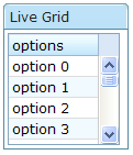
In the following example, we prepared a list model called strset, assign it to a grid using the model attribute. Then, the grid will do the rest.
<window title="Live Grid" border="normal">
<zscript>
String[] data = new String[30];
for(int j=0; j < data.length; ++j) {
data[j] = "option "+j;
}
ListModel strset = new SimpleListModel(data);
</zscript>
<grid width="100px" height="100px" model="${strset}">
<columns>
<column label="options"/>
</columns>
</grid>
</window>
Sorting with Live Data
If you allow users to sort a grid with live data, you have to implement the interface, org.zkoss.zul.ListModelExt, in addition to the org.zkoss.zul.ListModel.
class MyListModel implements ListModel, ListModelExt {
	public void sort(Comparator cmpr, boolean ascending) {
		//do the real sorting
		//notify the grid (or listbox) that data is changed by use of ListDataEvent
	}
}
When a user wants to sort the grid, the grid will invoke the sort method of ListModelExt to sort the data. In other words, the sorting is done by the list model, rather than the grid.
After sorting, the list model will notify the grid by invoking the onChange method of the grid』s registered org.zkoss.zul.event.ListDataListener instances. These are registered by the addListDataListener method. In most cases, all the data is changed, so the list model usually sends the following event:
new ListDataEvent(this, ListDataEvent.CONTENTS_CHANGED, -1, -1)
Auxiliary Headers
In addition to columns, you can specify auxiliary headers with the auxhead and auxheader components as follows.
<grid>
    <auxhead>
        <auxheader label="H1'07" colspan="6"/>
        <auxheader label="H2'07" colspan="6"/>
    </auxhead>
    <auxhead>
        <auxheader label="Q1" colspan="3"/>
        <auxheader label="Q2" colspan="3"/>
        <auxheader label="Q3" colspan="3"/>
        <auxheader label="Q4" colspan="3"/>
    </auxhead>
    <columns>
        <column label="Jan"/><column label="Feb"/><column label="Mar"/>
        <column label="Apr"/><column label="May"/><column label="Jun"/>
        <column label="Jul"/><column label="Aug"/><column label="Sep"/>
        <column label="Oct"/><column label="Nov"/><column label="Dec"/>
    </columns>
    <rows>
        <row>
        <label value="1,000"/><label value="1,100"/><label value="1,200"/>
        <label value="1,300"/><label value="1,400"/><label value="1,500"/>
        <label value="1,600"/><label value="1,700"/><label value="1,800"/>
        <label value="1,900"/><label value="2,000"/><label value="2,100"/>
        </row>
    </rows>
</grid>
The auxiliary headers support the colspan and rowsspan attributes that the column header don't. However, as its』 name suggests, the auxiliary headers must be placed within a column.
Unlike column/columns, which can only be used with grid, auhead/auxheader can be used with grid, listbox and tree.
Special Properties
The spans Property
It is a list of comma separated integers, controlling whether to span a cell over several columns. The first number in the list denotes the number of columns the first cell shall span. The second number denotes the number of columns the second cell will span and so on. If a number is omitted, 1 is assumed.
For example,
<grid>
    <columns>
        <column label="Left" align="left"/><column label="Center" align="center"/>
        <column label="Right" align="right"/><column label="Column 4"/>
        <column label="Column 5"/><column label="Column 6"/>
    </columns>
    <rows>
        <row>
            <label value="Item A.1"/><label value="Item A.2"/>
            <label value="Item A.3"/><label value="Item A.4"/>
            <label value="Item A.5"/><label value="Item A.6"/>
        </row>
        <row spans="1,2,2">
            <label value="Item B.1"/><label value="Item B.2"/>
            <label value="Item B.4"/><label value="Item B.6"/>
        </row>
        <row spans="3">
            <label value="Item C.1"/><label value="Item C.4"/>
            <label value="Item C.5"/><label value="Item C.6"/>
        </row>
        <row spans=",,2,2">
            <label value="Item D.1"/><label value="Item D.2"/>
            <label value="Item D.3"/><label value="Item D.5"/>
        </row>
    </rows>
</grid>
List Boxes
Components: listbox, listitem, listcell, listhead and listheader.
A list box is used to display a number of items in a list. The user may select an item from the list.
The simplest format is as follows. It is a single-column and single-selection list box.
<zk>
	<listbox>
	    <listitem label="Butter Pecan"/>
	    <listitem label="Chocolate Chip"/>
	    <listitem label="Raspberry Ripple"/>
	</listbox>
</zk>
The Listbox has two molds: default and select. If the select mold is used, the HTML's SELECT tag is generated instead.
<listbox mold="select">...</listbox>
Note: if the mold is "select", rows is "1", and none of the items are marked as selected, the browser will display the listbox as if the first item is selected. Worst of all, if user selects the first item in this case, no onSelect event is sent. To avoid this confusion, developers should select at least one item when using mold="select" and rows="1".
In addition to each item』s label, you can assign an application-specific value to each item using the setValue method.
Mouseless Entry listbox
- Press UP and DOWN to move the selection up and down by one list item.
- Press PgUp and PgDn to move the selection up and down by one page.
- Press HOME to move the selection to the first item, and END to move to the last item.
- Press Ctrl+UP and Ctrl+DOWN to move the focus up and down by one list item without changing the selection.
- Press SPACE to select the item in focus.
Multi-Column List Boxes
The list box also supports multiple columns. When a user selects an item, the entire row is selected.
To define a multi-column list, the number of listcells must match the number of columns with a row. For example if there are 4 columns then each row must contain 4 listcells.
<zk>
	<listbox width="200px">
		<listitem>
	        <listcell label="George"/>
	        <listcell label="House Painter"/>
	    </listitem>
	    <listitem>
	        <listcell label="Mary Ellen"/>
	        <listcell label="Candle Maker"/>
	    </listitem>
	    <listitem>
	        <listcell label="Roger"/>
	        <listcell label="Swashbuckler"/>
	    </listitem>
	</listbox>
</zk>
Column Headers
You can specify column headers by using listhead and listheader, please see the code below[1]. In addition to label, you can specify an image as the header by use of the image attribute.
<zk>
	<listbox width="200px">
		<listhead>
	                <listheader label="Name"/>
	                <listheader label="Occupation"/>
    	        </listhead>

                ...

	</listbox>
</zk>
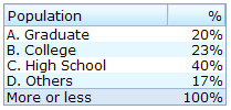
You could specify the column footers by using listfoot and listfooter. Please note, each time a listhead instance is added to a list box, it must be the first child, and a listfoot instance the last child.
<zk>
	<listbox width="200px">
	    <listhead>
	        <listheader label="Population"/>
	        <listheader align="right" label="%"/>
	    </listhead>
	    <listitem id="a" value="A">
	        <listcell label="A. Graduate"/>
	        <listcell label="20%"/>
	    </listitem>
	    <listitem id="b" value="B">
	        <listcell label="B. College"/>
	        <listcell label="23%"/>
	    </listitem>
	    <listitem id="c" value="C">
	        <listcell label="C. High School"/>
	        <listcell label="40%"/>
	    </listitem>
	    <listitem id="d" value="D">
	        <listcell label="D. Others"/>
	        <listcell label="17%"/>
	    </listitem>
	    <listfoot>
	        <listfooter label="More or less"/>
	        <listfooter label="100%"/>
	    </listfoot>
	</listbox>
</zk>
Drop-Down List
You can create a drop-down list by setting the listbox』s mold to select and making the box a single row. Notice you cannot use multi-column for the drop-down list.
<zk>
	<listbox mold="select" rows="1">
	    <listitem label="Car"/>
	    <listitem label="Taxi"/>
	    <listitem label="Bus" selected="true"/>
	    <listitem label="Train"/>
	</listbox>
</zk>
Multiple Selection
When a user clicks on a list item, the whole row is selected and the onSelect event is sent back to the server to notify the application. You are able to control whether a list box allows multiple selections by setting the multiple attribute to true. The default value is false.
Scrollable List Boxes
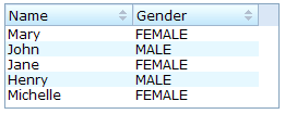
A list box will be scrollable if you specify the rows attribute or the height attribute and there is not enough space to display all list items.
<zk>
	<listbox width="250px" rows="4">
	    <listhead>
	        <listheader label="Name" sort="auto"/>
	        <listheader label="Gender" sort="auto"/>
	    </listhead>
	    <listitem>
	        <listcell label="Mary"/>
	        <listcell label="FEMALE"/>
	    </listitem>
	    <listitem>
	        <listcell label="John"/>
	        <listcell label="MALE"/>
	    </listitem>
	    <listitem>
	        <listcell label="Jane"/>
	        <listcell label="FEMALE"/>
	    </listitem>
	    <listitem>
	        <listcell label="Henry"/>
	        <listcell label="MALE"/>
	    </listitem>
	    <listitem>
	        <listcell label="Michelle"/>
	        <listcell label="FEMALE"/>
	    </listitem>
	</listbox>
</zk>
The rows Property
The rows attribute is used to control how many rows are visible. By setting it to zero, the list box will resize itself to hold as many as items if possible.
Sizable List Headers
Like columns, you can set the sizable attribute of the listhead to true to allow users to resize the width of list headers. The onColSize event is also sent when a user resizes listbox.
List Boxes with Paging
Like grids, you can use multiple pages to represent large content by setting the mold to paging. Similarly, you can control how many items each page displays, whether to use an external paging component and whether to customize the behavior when a page is selected. Please refer to the Grids section for more details.
Sorting
List boxes support sorting of list items directly. There are a few ways to enable the sorting of a particular column. The simplest way is to set the sort attribute of the list header to auto as demonstrated by the code below. Then, the column that the list header is associated with is sort-able based on the label of each list cell of the that column.
<zk>
    <listbox width="200px">
        <listhead>
            <listheader label="name" sort="auto"/>
            <listheader label="gender" sort="auto"/>
        </listhead>
        <listitem>
            <listcell label="Mary"/>
            <listcell label="FEMALE"/>
        </listitem>
        <listitem>
            <listcell label="John"/>
            <listcell label="MALE"/>
        </listitem>
        <listitem>
            <listcell label="Jane"/>
            <listcell label="FEMALE"/>
        </listitem>
        <listitem>
            <listcell label="Henry"/>
            <listcell label="MALE"/>
        </listitem>
    </listbox>
</zk>
The sortAscending and sortDescending Properties
If you prefer to sort list items in different ways, you can assign a java.util.Comparator instance to the sortAscending and/or sortDescending attributes. Once assigned, the list items can be sorted in the ascending and/or descending order with the specified comparator.
The invocation of the sort attribute with auto automatically assigns two comparators to the sortAscending and sortDescending attributes. You can override any of them by assigning another comparator.
For example, assume you want to sort based on the value of list items, rather than list cell's label, then you assign an instance of ListitemComparator to these attributes as follows.
<zscript>
	Comparator asc = new ListitemComarator(-1, true, true);
	Comparator dsc = new ListitemComarator(-1, false, true);
</zscript>
<listbox>
    <listhead>
        <listheader sortAscending="${asc}" sortDescending="${dsc}"/>
 ...
The sortDirection Property
The sortDirection attribute controls whether to display an icon to indicate the order of a particular column. If list items are sorted before adding to the list box, you should set this attribute explicitly.
<listheader sortDirection="ascending"/>
The sorting is maintained automatically by the listboxes as long as you assign the comparator to the corresponding list header.
The onSort Event
When you assign at least one comparator to a list header, an onSort event is sent to the server if user clicks on it. The list header implements a listener to automatically the sorting.
If you prefer to handle this manually, you can add your own listener to the list header for the onSort event. To prevent the default listener invoking the sort method, you have to call the stopPropagation method. Alternatively, you can override the sort method, please see below.
The sort Method
The sort method is the underlying implementation of the default onSort event listener. It is also useful if you want to sort the list items using Java code. For example, you may have to call this method after adding items (assuming that they are not added in the proper order).
new Listem("New Stuff").setParent(listbox);
if (!"natural".header.getSortDirection())
	header.sort("ascending".equals(header.getSortDirection()));
The default sorting algorithm is quick-sort (by use of the sort method from the org.zkoss.zk.ui.Components class). You can override it with your own implementation or listen to the onSort event as described in the previous section.
Tip: Sorting a large amount of live data could degrade the performance significantly. It is better to intercept the onSort event or the sort method to handle it effectively. Please refer to the Sort Live Data section further down.
Special Properties
The checkmark Property
The checkmark attribute controls whether to display a checkbox or a radio button in front of each list item.
In the following example, you will notice how a checkbox is added automatically when you move a list item from the left listbox to the right one. The checkbox is then removed when you move a list item from the right listbox to the left listbox.
<zk>
<hbox>
<listbox id="src" rows="0" multiple="true" width="200px">
<listhead>
<listheader label="Population"/>
<listheader label="Percentage"/>
</listhead>
<listitem id="a" value="A">
<listcell label="A. Graduate"/>
<listcell label="20%"/>
</listitem>
<listitem id="b" value="B">
<listcell label="B. College"/>
<listcell label="23%"/>
</listitem>
<listitem id="c" value="C">
<listcell label="C. High School"/>
<listcell label="40%"/>
</listitem>
<listitem id="d" value="D">
<listcell label="D. Others"/>
<listcell label="17%"/>
</listitem>
</listbox>
<vbox>
<button label="=>" onClick="move(src, dst)"/>
<button label="<=" onClick="move(dst, src)"/>
</vbox>
<listbox id="dst" checkmark="true" rows="0" multiple="true" width="200px">
<listhead>
<listheader label="Population"/>
<listheader label="Percentage"/>
</listhead>
<listitem id="e" value="E">
<listcell label="E. Supermen"/>
<listcell label="21%"/>
</listitem>
</listbox>
<zscript>
void move(Listbox src, Listbox dst) {
Listitem s = src.getSelectedItem();
if (s == null)
Messagebox.show("Select an item first");
else
s.setParent(dst);
}
</zscript>
</hbox>
</zk>
Note: If the multiple attribute is false, radio buttons are displayed instead, as demonstrated by the right hand listbox.
The vflex Property
The vflex property controls whether the listbox will grow or shrink vertically to fit the given space. It is named vertical flexibility. For example, if the list is too big to fit in the browser window, its』 height will decrease to make the whole list control visible in the browser window.
This property is ignored if the rows attribute is specified.
The maxlength Property
The maxlength property defines the maximum number of characters visible at the browser. By setting this attribute, you are able to create a narrower list box.
Live Data
Like grids[2], list boxes support live data. With live data, developers can separate data from the view. In other words, developers need only to provide the data by implementing the org.zkoss.zul.ListModel interface, rather than manipulating the list box directly.
The benefits are twofold:
- It is easier to use different views to display the same set of data.
- The list box sends the data to the client only if it is visible. This saves a lot of network traffic if there is a large amount of data.
There are three steps to make use of live data.
1 Prepare the data in the form of a ListModel. ZK has a concrete implementation called org.zkoss.zul.SimpleListModel for representing an array of objects. 2 Implement the org.zkoss.zul.RowRenderer interface for rendering a row of data into the grid.
- This is optional. If it is not specified the default renderer is used to render the data into the first column.
- You can implement different renderers for representing the same data in different views.
3 Set the data in the model attribute and, optionally, the renderer in the rowRenderer attribute.
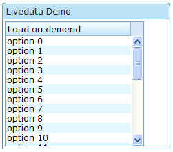
In the following example, we prepared a list model called strset, assigned it to a list box through the model attribute. Then, the list box will do the rest.
<window title="Livedata Demo" border="normal">
<zscript>
String[] data = new String[30];
for(int j=0; j < data.length; ++j) {
data[j] = "option "+j;
}
ListModel strset = new SimpleListModel(data);
</zscript>
<listbox width="200px" rows="10" model="${strset}">
<listhead>
<listheader label="Load on demend"/>
</listhead>
</listbox>
</window>
Sorting with Live Data
If you allow users to sort a grid with live data, you have to implement the interface, org.zkoss.zul.ListModelExt, in addition to the org.zkoss.zul.ListModel.
class MyListModel implements ListModel, ListModelExt {
	public void sort(Comparator cmpr, boolean ascending) {
		//do the real sorting
		//notify the listbox (or grid) that data is changed by use of ListDataEvent
	}
}
When a user wants to sort the listbox, the listbox will invoke the sort method of ListModelExt to sort the data. In other words, the sorting is done by the list model, rather than the listbox.
After sorting, the list model will notify the listbox by invoking the onChange method of the listbox』s registered org.zkoss.zul.event.ListDataListener instances. These are registered by the addListDataListener method. In most cases, all the data is changed, so the list model usually sends the following event:
new ListDataEvent(this, ListDataEvent.CONTENTS_CHANGED, -1, -1)
Note: the implementation of the ListModel and ListModelExt is independent of the visual presentation. In other words, they can be used with grids, listboxes and any other components supporting ListModel.
If you require maximum flexibility, you should not assume the component to used, instead use ListDataEvent to communicate.
List Boxes Contain Buttons
In theory, a list cell can contain any other components, as demonstrated below.
<zk>
	<listbox width="250px">
	    <listhead>
	        <listheader label="Population"/>
	        <listheader label="Percentage"/>
	    </listhead>
	    <listitem value="A">
	        <listcell><textbox value="A. Graduate"/></listcell>
	        <listcell label="20%"/>
	    </listitem>
	    <listitem value="B">
	        <listcell><checkbox label="B. College"/></listcell>
	        <listcell><button label="23%"/></listcell>
	    </listitem>
	    <listitem value="C">
	        <listcell label="C. High School"/>
	        <listcell><textbox cols="8" value="40%"/></listcell>
	    </listitem>
	</listbox>
</zk>
Notes:
- Don't use a list box, when a grid is a better choice. The appearances of list boxes and grids are similar, but the listbox should only be used to represent a list of selectable items.
- Users are usually confused if a listbox contains editable components such as a textbox or a checkbox.
- Due to the limitation of the browsers, users cannot select a range of characters from text boxes.
Paging
A paging component is used to separate large amounts of content into multiple pages. For example, assume that you have 100 items and prefer to show 20 items at a time, you can use the paging components as follows.
<paging totalSize="100" pageSize="20"/>
When a user clicks on the hyperlinks, the onPaging event is sent to the paging component along with an instance of org.zkoss.zul.event.PagingEvent. To decide which portion of your 100 items are visible, you should add a listener to the paging component.
<paging id="paging"/>
<zscript><![CDATA[
	List result = new SearchEngine().find("ZK");
	//assume SearchEngine.find() will return a list of items.
	paging.setTotalSize(result.size());
	paging.addEventListener("onPaging", new EventListener() {
		public void onEvent(Event event) {
			int pgno = event.getPaginal().getActivePage();
			int ofs = pgno * event.getPaginal().getPageSize();
			new Viewer().redraw(result, ofs, ofs + event.getPaginal().getPageSize() - 1);
			//assume redraw(List result, int b, int e) will display
			//from the b-th item to the e-th item
		}
	});
]]>
</zscript>
Paging with List Boxes and Grids
The listbox and grid components support the paging intrinsically, so you don't need to specify a paging component explicitly as above unless you want to have different visual layout or to control multiple listbox and gridcontrols with one paging component.
Please refer to the Grids section for more details.
See Also
From Other Chapter:
From smalltalk:
From ZK forum:
- Retrieving selected items from a listBox
- Add rows manually in Live Data grid
- Best practice and performance for menu tree | zul vs. java
- Refresh Listbox Model after button click
- How can i access a dinamyc field in a grid row
- listbox dependent on other listbox
- Scrollable Windows or Grids
- Million Record Challenge
- Listbox not showing data?
- How to capture a grid cell select event?
- How to catch click events on Treeitem
- Listbox forgets checkbox selection
- Listbox problem
- Problem with Listbox selectedItem
Notes

