Layout and Windows
![]() This documentation is for an older version of ZK. For the latest one, please click here.
This documentation is for an older version of ZK. For the latest one, please click here.
Windows
A window is similar to a HTML DIV tag and is used to group components. Unlike other components, a window has the following characteristics:
- A window is an owner of an ID space. Any component contained in a window, including itself, could be found by use of the getFellow method if it is assigned with an identifier.
- A window can be overlapped, popped-up and embedded.
- A window can be a modal dialog.
Titles and Captions
A window might have a title, a caption and a border. The title is specified by the title attribute. The caption is specified by declaring a child component called caption. All children of the caption component will appear on right hand side of the title.
<zk>
	<window title="Demo" border="normal" width="350px">
		<caption>
			<toolbarbutton label="More" />
			<toolbarbutton label="Help" />
		</caption>
		<toolbar>
			<toolbarbutton label="Save" />
			<toolbarbutton label="Cancel" />
		</toolbar>
		What is your favorite framework?
		<radiogroup>
			<radio label="ZK" />
			<radio label="JSF" />
		</radiogroup>
	</window>
</zk>
You are also able to specify a label and an image within a caption, and then the appearance is as follows.
<zk>
	<window id="win" title="Main" border="normal" width="200px">
	    <caption image="/images/ZK-Logo.PNG" label="Hi there!"/>
	    <checkbox label="Hello, World!"/>
	</window>
</zk>
The closable Property
By setting the closable attribute to true, a close button is shown for the window, which enables a to close the window by clicking the button. Once user clicks on the close button, an onClose event is sent to the window which is processed by the onClose method of the Window component. Then, onClose, by default, detaches the window itself.
You can override it to do whatever you want. Or, you can register your own listener to change the default behavior. For example, you might choose to hide the window rather than close it.
<zk>
	<window closable="true" title="Detach on Close" border="normal" width="200px"
 		onClose="self.visible = false; event.stopPropagation();">
     In this example, this window hides itself when the close button is clicked.
	</window>
</zk>
Notice that event.stopPropagation() must be called to prevent Window.onClose() being called.
Tip: If the window is a popup, the onOpen event will be sent to the window with open=false, when the popup is closed due to the user clicking outside of the window, or pressing ESC.
The onClose is sent to ask the server to detach or to hide the window. By default, the window is detached. Of course, the application can override this behaviour and do whatever it wants as described above.
On the other hand, onOpen is a notification. It is sent to notify the application that the client has hidden the window. The application cannot prevent it from hiding, or change the behavior to be detached.
The sizable Property
If you allow users to resize the window, you can set the sizable attribute to true as follows.
<zk>
	<window id="win" title="Sizable Window" border="normal" width="200px" sizable="true">
	    This is a sizable window.
	    <button label="Change Sizable" onClick="win.sizable = !win.sizable"/>
	</window>
</zk>
Once allowed, users can resize the window by dragging the borders.
The onSize Event
Once a user resizes the window, the onSize event is sent with an instance of the org.zkoss.zul.event.SizeEvent. Notice that the window is resized before the onSize event is sent. In other words, the event serves as a notification that you generally ignore. Of course, you can do whatever you want in the event listener.
Note: If the user drags the upper or left border, the onMove event is also sent since the position has changed, too.
The contentStyle Property
You can customize the look and feel of window』s content block by specifying the contentStyle property.
<zk>
	<window title="My Window" border="normal" width="200px" contentStyle="background:yellow">
		Hello, World!
	</window>
</zk>
Scrollable Window
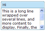
A typical use of the contentStyle attribute is to make a window scrollable as follows.
<zk>
	<window id="win" title="Hi" width="150px" height="100px" contentStyle="overflow:auto" border="normal">
		 This is a long line wrapped over several lines, and more content to display.
		 Finally, the scrollbar becomes visible.
		 This is another line.
	</window>
</zk>
Borders
The border attribute specifies whether to display a border for window. The default style sheets support only normal and none. The default value is none.
Of course, you can provide an additional style class. For example,
<zk>
    <style>
		div.wc-embedded-dash {
		padding: 2px; border: 3px dashed #aab;
		}
    </style>
    <window title="My Window" border="dash" width="200px">
		Hello, World!
    </window>
</zk>
wc-embedded-dash defines the style of the inner box of the window. The style class is named by concatenating wc[1], the sclass property and the border property together and separating them with dash (-). In this example, sclass is embedded since it is an embedded window and no explicit sclass is assigned (so the default sclass is used).
Overlapped, Popup, Modal, Highlighted and Embedded
A window could be in one of five different modes: overlap, popup, modal, highlighted and embedded. The default mode is the embedded mode. You can change the mode by use of the doOverlapped, doPopup, doModal, doHighlighted, and doEmbedded methods, depicted as follows.
<zk>
    <window id="win" title="Hi!" border="normal" width="200px">
        <caption>
            <toolbarbutton label="Close" onClick="win.setVisible(false)"/>
        </caption>
        <checkbox label="Hello, Wolrd!"/>
    </window>

    <button label="Overlap" onClick="win.doOverlapped();"/>
    <button label="Popup" onClick="win.doPopup();"/>
    <button label="Modal" onClick="win.doModal();"/>
    <button label="Embed" onClick="win.doEmbedded();"/>
    <button label="Highlighted" onClick="win.doHighlighted();"/>
</zk>
Embedded
An embedded window is placed in line with other components. In this mode, you cannot change its position, since the position is decided by the browser.
Overlapped
An overlapped window can be overlapped by other components, such that users are able to drag it around and the developer can set its position using setLeft and setTop methods.
In addition to doOverlapped, you can use the mode property as follows.
<window title="My Overlapped" width="300px" mode="overlapped">
</window>
Popup
A popup window is similar to overlapped windows, except it is automatically closed when user clicks on any component other than the popup window itself or any of its descendants. As its』 name suggests, it is designed to implement popup windows.
Modal
A modal window (aka. a modal dialog) is similar to overlapped windows, except it suspends the execution until one of the endModal, doEmbedded, doOverlapped, doHighlighted, or doPopup methods is called.
In addition to suspending the execution, it disables components not belonging to the modal window.
A modal window is positioned automatically at the center of the browser, so you cannot control its position.
Highlighted
A highlighted window is similar to the overlapped windows, except the visual effect is the same as the modal windows. In other words, a highlighted window is positioned at the center of the browsers, and components not belonging to the highlighted window are disabled.
However, it does not suspend the execution. Like the overlapped windows, the execution continues to the next statement once the mode is changed. For example, f1() is called only after win1 is closed, while g() is called immediately after win2 becomes highlighted.
win1.doModal(); //the execution is suspended until win1 is closed
f1();

win2.doHighlighted(); //the execution won't be suspended
g1()
The highlighted window is aimed to substitute the modal window, if you prefer not to use or suspend the event processing thread. Refer to the Use the Servlet Thread to Process Events section in the Advanced Features chapter.
Modal Windows and Event Listeners
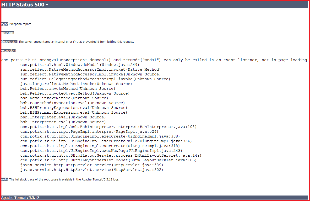
Unlike other modes, you can only put a window in modal mode in an event listener. In other words, you can only invoke doModal() or setMode("modal") in an event listener.
<zk>
    <window id="wnd" title="My Modal" visible="false" width="300px">
        <button label="close" onClick="wnd.visible = false"/>
    </window>
    <button label="do it" onClick="wnd.doModal()"/>
</zk>
On the other hand, the following is wrong if it executes in the Component Creation Phase[2].
//t1.zul
<window title="My Modal" width="300px" closable="true" mode="modal">
</window>
It will cause the following result[3] if you directly go to it.
The following code will cause the same result.
//t2.zul
<zk>
	<window title="My Modal" width="300px" closable="true">
		<zscript>
			self.doModal();
		</zscript>
	</window>
</zk>
If you need to create a modal window in the page loading event, you can post the onModal event as follows.
//t3.zul
<zk>
	<window title="My Modal" width="300px" closable="true">
	    <zscript>
			Events.postEvent("onModal", self, null);
	    </zscript>
	</window>
</zk>
Note: the following codes execute correctly even if t1.zul sets the window's mode to modal directly (as shown above). Why? It executes in an event listener (for onClick).
<zk>
	<button label="do it">
		<attribute name="onClick">
			Executions.createComponents("t1.zul", null, null);
			//it loads t1.zul in this event listener for onClick
		</attribute>
	</button>
</zk>
The position Property
In addition to the left and top properties, you can control the position of an overlapped/popup/modal window by use of the position attribute. For example, the following code snippet positions the window to the right-bottom corner.
<window width="300px" mode="overlapped" position="right,bottom">
 ...
The value of the position attribute can be a combination of the following constants by separating them with comma (,).
| Position the window at the center. If left or right is also specified, it means the vertical center. If top or bottom is also specified, it means the horizontal center. If none of left, right, top and bottom is specified, it means the center in both directions.
Both the left and top property are ignored. | |
| Position the window at the left edge.
The left property is ignored. | |
| Position the window at the right edge.
The left property is ignored. | |
| Position the window at the top.
The top property is ignored. | |
| Position the window at the bottom.
The top property is ignored. |
By default, its value is null. That is, the overlapped and popup window is positioned by the left and top properties, while the modal window is positioned at the center.
Common Dialogs
The XUL component set supports the following common dialogs to simplify some common tasks.
Panel
Panel is a container that has specific functionality and structural components that make it the perfect building block for application-oriented user interfaces. Unlike window, Panel is not an independent ID space (by implementing IdSpace), so the ID of each child can be used throughout the panel.
title, border, and frameable
A panel might have a title and a border. The title is specified by the title property. And Use border property to define the border style of panel.
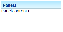
<panel height="100px" width="200px" border="normal"
    title="Panel1" >
    <panelchildren>PanelContent1</panelchildren>
</panel>
If you prefer a rounded layout, you can specify framable as true, the layout of panel would be rounded.
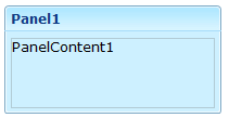
<panel height="100px" width="200px" border="normal"
    title="Panel1"  framable="true">
    <panelchildren>PanelContent1</panelchildren>
</panel>
collapsible, and open
The content of panel could be hidden using collapsible property.
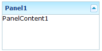
<panel height="100px" width="200px" border="normal"
    title="Panel1" collapsible="true">
    <panelchildren>PanelContent1</panelchildren>
</panel>
Along with collapsible property, you can set it to be opened or not using open property.
![]()
<panel height="100px" width="200px" border="normal"
    title="Panel1" collapsible="true" open="false">
    <panelchildren>PanelContent1</panelchildren>
</panel>
maximizable, and maximized
You can make panel's body expansible by specify maximizable property to be true.
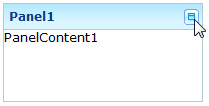
<panel height="100px" width="200px" border="normal"
    title="Panel1"  maximizable="true">
    <panelchildren>PanelContent1</panelchildren>
</panel>
Whether to expand it can be configured using maximized property.

<panel height="100px" width="200px" border="normal"
    title="Panel1"  maximizable="true" maximized="false">
    <panelchildren>PanelContent1</panelchildren>
</panel>
minimizable, minimized, and closable
You can allow the user to minimize the panel by specify minimizable property to be true.
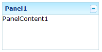
<panel height="100px" width="200px" border="normal"
    title="Panel1"  minimizable="true" >
    <panelchildren>PanelContent1</panelchildren>
</panel>
Or you can control whether to minimize it using minimized property.
<panel height="100px" width="200px" border="normal"
    title="Panel1"  minimizable="true" minimized="false">
    <panelchildren>PanelContent1</panelchildren>
</panel>
Even, you can make it closable using closable property.
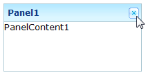
<panel height="100px" width="200px" border="normal"
    title="Panel1"  closable="true">
    <panelchildren>PanelContent1</panelchildren>
</panel>
floatable, and moveable
You can define whether to make the panel floatable to be displayed inline to its parent component using floatable property.
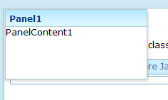
<panel height="100px" width="200px" border="normal"
    title="Panel1"  floatable="true">
    <panelchildren>PanelContent1</panelchildren>
</panel>
Even, when the panel is floatable, you can make it draggable using movable property.
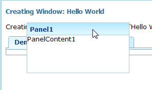
<panel height="100px" width="200px" border="normal"
    title="Panel1"  floatable="true" movable="true">
    <panelchildren>PanelContent1</panelchildren>
</panel>
Tab Boxes
Components: tabbox, tabs, tab, tabpanels and tabpanel.
A tab box allows developers to separate a large number of components into several groups, and show one group at a time simplifying the user interface. There is only one grouping component (aka. a panel) that is visible at the same time. Once the tab of an invisible group is clicked, it becomes visible and the previous displayed group becomes invisible.
The generic syntax of tab boxes is as follows.
<zk>
	<tabbox>
	    <tabs>
	        <tab label="First"/>
	        <tab label="Second"/>
	    </tabs>
	    <tabpanels>
	        <tabpanel>The first panel.</tabpanel>
	        <tabpanel>The second panel</tabpanel>
	    </tabpanels>
	</tabbox>
</zk>
- tabbox: The outer box that contains the tabs and tab panels.
- tabs: The container for the tabs, i.e., a collection of tab components.
- tab: A specific tab, clicking on the tab brings the tab panel to the front. You can place a label and an image on it.
- tabpanels: The container for the tab panels, i.e., a collection of tabpanel components.
- tabpanel: The body of a single tab panel. You would place the content for a group of components within a tab panel. The first tabpanel corresponds to the first tab, the second tabpanel corresponds to the second tab and so on.
The currently selected tab component is given an additional selected property which is set to true. This is used to give the currently selected tab a different appearance making it appear selected. Only one tab will have a true value for this property at a time.
There are two ways to change the selected tab using Java. They are shown below.
tab1.setSelected(true);
tabbox.setSelectedTab(tab1);
Of course, you can assign true to the selected property directly.
<tab label="My Tab" selected="true"/>
If none of tabs are selected, the first one is selected automatically.
Nested Tab Boxes
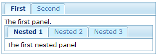
A tab panel could contain anything including other tab boxes.
<zk>
	<tabbox>
		<tabs>
			<tab label="First" />
			<tab label="Second" />
		</tabs>
		<tabpanels>
			<tabpanel>
				The first panel.
				<tabbox>
					<tabs>
						<tab label="Nested 1" />
						<tab label="Nested 2" />
						<tab label="Nested 3" />
					</tabs>
					<tabpanels>
						<tabpanel>The first nested panel</tabpanel>
						<tabpanel>The second nested panel</tabpanel>
						<tabpanel>The third nested panel</tabpanel>
					</tabpanels>
				</tabbox>
			</tabpanel>
			<tabpanel>The second panel</tabpanel>
		</tabpanels>
	</tabbox>
</zk>
The Accordion Tab Boxes
Tab boxes support two molds: default and accordion. The effect of the accordion mold is as follows.
<zk>
	<tabbox mold="accordion">
		<tabs>
			<tab label="First" />
			<tab label="Second" />
		</tabs>
		<tabpanels>
			<tabpanel>The first panel.</tabpanel>
			<tabpanel>The second panel</tabpanel>
		</tabpanels>
	</tabbox>
</zk>
The orient Property
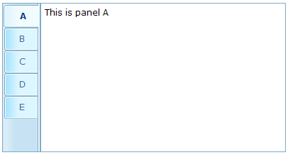
Developers can control where the tabs are located by use of the orient attribute. By default, it is horizontal, however, you can change it to vertical, and the effect is as follows.
<zk>
	<tabbox width="400px" orient="vertical">
		<tabs>
			<tab label="A" />
			<tab label="B" />
			<tab label="C" />
			<tab label="D" />
			<tab label="E" />
		</tabs>
		<tabpanels>
			<tabpanel>This is panel A</tabpanel>
			<tabpanel>This is panel B</tabpanel>
			<tabpanel>This is panel C</tabpanel>
			<tabpanel>This is panel D</tabpanel>
			<tabpanel>This is panel E</tabpanel>
		</tabpanels>
	</tabbox>
</zk>
The align Property of Tabs
Developers can control the alignment of a tab by use of the tabs』 align attribute. By default, it is set to start (leftmost or uppermost) but you are able to change it to center or end (rightmost or bottommost), and the effect is as follows.
<tabbox width="250px">
	<tabs align="end">
		<tab label="Tab 1" />
		<tab label="Tab 2" />
	</tabs>
	<tabpanels>
		<tabpanel>This is panel 1</tabpanel>
		<tabpanel>This is panel 2</tabpanel>
	</tabpanels>
</tabbox>
The closable Property
By setting the closable property to true, a close button is shown on the tab enabling the user to close the tab and the corresponding tab panel. Once the user clicks on the close button, an onClose event is sent to the tab. It is processed by the onClose method of Tab and then the onClose event, by default, detaches the tab itself and the corresponding tab panel.
Please also see the window's closable property.
The disabled Property
By setting the disabled property of tab to be true, the user could not select or close the corresponding tab by clicking the tab or close button. However, developers can still control the selection or close the tab via code.
<zk>
	<tabbox width="300px" id="tbx">
		<tabs>
			<tab label="Step 1" id="tb1" disabled="true" />
			<tab label="Step 2" id="tb2" disabled="true" />
			<tab label="Step 3" id="tb3" disabled="true" />
		</tabs>
		<tabpanels>
			<tabpanel>
				<button label="to Step2" onClick="tbx.selectedTab=tb2" />
			</tabpanel>
			<tabpanel>
				<button label="to Step3" onClick="tbx.selectedTab=tb3" />
			</tabpanel>
			<tabpanel>This is panel 3</tabpanel>
		</tabpanels>
	</tabbox>
</zk>
Load-on-Demand for Tab Panels
Like many other components, you can load the content of the tab panel only when it becomes visible. The simplest way is to use the fulfill attribute to defer the creation of the children of a tab panel.
<zk>
	<tabbox>
		<tabs>
			<tab label="Preload" selected="true" />
			<tab id="tab2" label="OnDemand" />
		</tabs>
		<tabpanels>
			<tabpanel> T
				his panel is pre-loaded since no fulfill specified
			</tabpanel>
			<tabpanel fulfill="tab2.onSelect">
				This panel is loaded only tab2 receives
				the onSelect event
			</tabpanel>
		</tabpanels>
	</tabbox>
</zk>
If you prefer to create the children manually or manipulate the panel dynamically, you can listen to the onSelect event, and then fulfill the content of the panel when it is selected, as depicted below.
<zk>
	<tabbox id="tabbox" width="400" mold="accordion">
		<tabs>
			<tab label="Preload" />
			<tab label="OnDemand" onSelect="load(self.linkedPanel)" />
		</tabs>
		<tabpanels>
			<tabpanel>
				This panel is pre-loaded.
			</tabpanel>
			<tabpanel>
			</tabpanel>
		</tabpanels>
		<zscript><![CDATA[
			void load(Tabpanel panel) {
			    if (panel != null && panel.getChildren().isEmpty())
			        new Label("Second panel is loaded").setParent(panel);
			}
	    ]]>
	    </zscript>
	</tabbox>
</zk>
The Box Model
Components: vbox, hbox and box.
The XUL box model is used to divide a portion of the display into a series of boxes. Components inside a box will orient themselves horizontally or vertically. By combining a series of boxes and separators, you can control the layout of the visual presentation.
A box can lay out its children in one of two orientations, either horizontally or vertically. A horizontal box lines up its components horizontally and a vertical box orients its components vertically. You can think of a box as one row or one column from an HTML table.
Some examples are shown as follows.
<zk>
    <vbox>
        <button label="Button 1"/>
        <button label="Button 2"/>
    </vbox>
    <hbox>
        <button label="Button 3"/>
        <button label="Button 4"/>
    </hbox>
</zk>
The hbox component is used to create a horizontally oriented box. Each component placed in the hbox will be placed horizontally in a row. The vbox component is used to create a vertically oriented box. Added components will be placed underneath each other in a column.
There is also a generic box component which defaults to horizontal orientation, meaning that it is equivalent to the hbox. However, you can use the orient attribute to control the orientation of the box. You can set this property to the value horizontal to create a horizontal box and vertical to create a vertical box.
Thus, the two lines below are equivalent:
<vbox>
<box orient="vertical">
You can add as many components as you want inside a box, including other boxes. In the case of a horizontal box, each additional component will be placed to the right of the previous one. The components will not wrap at all so the more components you add, the wider the window will be. Similarly, each element added to a vertical box will be placed underneath the previous one.
The spacing Property
You can control the spacing among children of the box control. For example, the following example puts 5em at both the upper margin and the lower margin. Notice: the total space between two input fields is 10em.
<vbox spacing="5em">
    <textbox/>
    <datebox/>
</vbox>
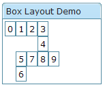
Another example illustrated an interesting layout by use of zero spacing.
<window title="Box Layout Demo" border="normal">
	<hbox spacing="0">
		<window border="normal">0</window>
		<vbox spacing="0">
			<hbox spacing="0">
				<window border="normal">1</window>
				<window border="normal">2</window>
				<vbox spacing="0">
					<window border="normal">3</window>
					<window border="normal">4</window>
				</vbox>
			</hbox>
			<hbox spacing="0">
				<vbox spacing="0">
					<window border="normal">5</window>
					<window border="normal">6</window>
				</vbox>
				<window border="normal">7</window>
				<window border="normal">8</window>
				<window border="normal">9</window>
			</hbox>
		</vbox>
	</hbox>
</window>
The widths and heights Properties
You can specify the width for each cell of the hbox using the widths attribute as follows.
<zk>
	<hbox width="100%" widths="10%,20%,30%,40%">
	    <label value="10%"/>
	    <label value="20%"/>
	    <label value="30%"/>
	    <label value="40%"/>
	</hbox>
</zk>
The value is a comma separated list of widths. If any value is missed, no width is generated for the corresponding cell and the real width is up to the browser.
Similarly, you can specify the heights for each cell of the vbox using the heights attribute. These two properties are the same since the orientation of a box can be horizontal or vertical depending on the orient property.
Splitters
Components: splitter.
There may be times when you want to make two sections of a window resizable. This feature is accomplished by using a component called a splitter. It creates a bar between two sections which allows either side to be resized.
A splitter must be put inside a box. When a splitter is placed inside a horizontal box (hbox), it allows horizontal resizing. When a splitter is placed inside a vertical box (vbox), it allows vertical resizing. For example,
<zk>
	<hbox spacing="0" style="border: 1px solid grey" width="100%">
		<vbox height="200px">
			Column 1-1: The left-top box. To know whether a splitter is collapsed,
			you can listen to the onOpen event.
			<splitter collapse="after" />
			Column 1-2: You can enforce to open or collapse programming by calling
			setOpen method.
		</vbox>
		<splitter collapse="before" />
		Column 2: Whether a splitter allows users to open or collapse depending
		on the collapse attribue.
	</hbox>
</zk>
Note: If you would like to use the original 「os」 style, you can specify the class name of splitter with 「splitter-os」. Example Of splitter-os
The collapse Property
The collapse property specifies which side of the splitter is collapsed when its grippy (button) is clicked. If this property is not specified, the splitter will not cause a collapse (and the grippy/button won't appear).
Allowed values and their meaning are as follows.
| none | No collapsing occurs. |
| before | When the grippy is clicked, the element immediately before the splitter in the same parent is collapsed so that its width or height is 0. |
| after | When the grippy is clicked, the element immediately after the splitter in the same parent is collapsed so that its width or height is 0. |
The open Property
To know whether a splitter is collapsed, you can check the value of the open property (i.e., the isOpen method). To open or collapse programmatically, you are able to set the value of the open property (i.e., the setOpen method).
The onOpen Event
When a splitter is collapsed or opened by a user, the onOpen event is sent to the application.
The Layout Components
Components: borderlayout, north, south, center,west,east
The layout component is a nested component. The parent component is a borderlayout, and its』 children components include north, south, center, west, and east. The combination of children components of borderlayout is left up to the developer. For example, if you want to divide the area into three regions (veritically), you could try the following combination,
<zk>
	<borderlayout height="500px">
	    <east>
	        The East
	    </east>
	    <center>
	        The Center
	    </center>
	    <west>
	        The West
	    </west>
	</borderlayout>
</zk>
or, you could divide the area into three regions (horizontally) as follows,
<zk>
	<borderlayout height="500px">
	    <north>
	        The North
	    </north>
	    <center>
	        The Center
	    </center>
	    <south>
	        The South
	    </south>
	</borderlayout>
</zk>
And you could embed any kind of ZK components into each of these regions according to your requirements.
A Nested borderlayout Component
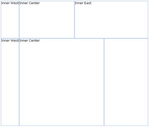
Moreover, you can embed one layout component into another to divide the area into more regions as follows,
<zk>
	<borderlayout height="500px">
		<north size="30%">
			<borderlayout height="250px">
				<west border="normal"> Inner West</west>
				<center> Inner Center</center>
				<east size="50%" border="normal"> Inner East</east>
			</borderlayout>
		</north>
		<center border="normal">
			<borderlayout>
				<west border="normal"> Inner West</west>
				<center border="normal"> Inner Center</center>
				<east size="30%" border="normal">
				</east>
			</borderlayout>
		</center>
	</borderlayout>
</zk>
The size and border Properties
You are able to specify the size attribute of the following children components (north,south,east,west) to determine their sizes. However, the functionality of size attribute depends on the type of children components (vertically or horizontally). For horizontal components (north, and south), the size attribute determines their height. As for vertically components (east, and west), the size attribute determines their width.
The border attribute determines whether the layout components jave a border, this includes all children components of borderlayout. . The following table specifies values of the border attribute.
| none (default) | Without border |
| normal | With border |
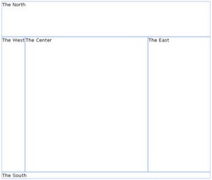
Here is an example.
<zk>
	<borderlayout height="500px">
		<north size="30%" border="normal"> The North</north>
		<east size="30%" border="normal"> The East</east>
		<center border="normal"> The Center</center>
		<west border="normal"> The West</west>
		<south border="normal"> The South </south>
	</borderlayout>
</zk>
The splittable and collapsible Properties
If you would like to make your layout components splittable, you can set the splittable attribute as true.
In addition, you can make a layout component collapsible by setting the collapsible attribute to true.
<zk>
	<borderlayout height="500px">
		<north size="20%" splittable="true" collapsible="true" />
		<east size="20%" splittable="true" collapsible="true" />
		<center border="normal" />
		<west size="20%" splittable="true" collapsible="true" />
		<south size="30%" border="normal" splittable="true" collapsible="true" />
	</borderlayout>
</zk>
The maxsize and minisize Properties
When you make a layout component splittable, you can use the maxsize and minisize attributes to set the maximum and minimum size of the area.
<north splittable="true" maxsize="500" minisize="200"/>
The flex property
If the size of browser has been changed, the layout components will re-size themselves automatically to fit the size of the browser. If you would like the ZK components embedded within these layout components to be auto-resized as well, you can set the flex attribute of the layout component to true.
The open Property
To know whether a layout is collapsed, you can check the value of the open attribute (i.e. use the isOpen method). To open or collapse programmatically, you can set the value of the open attribute (i.e., use the setOpen method).
The onOpen Event
When a layout is collapsed or opened by a user, the onOpen event is sent to the application.
More Layout Components
Portallayout
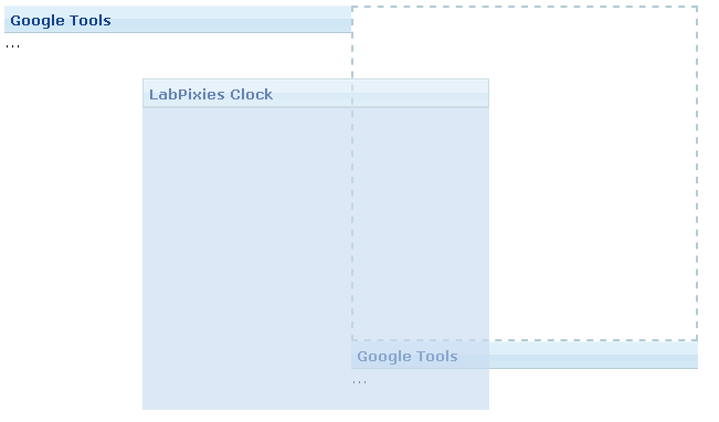
The Portallayout allows developers to create a similar user experience to iGoogle which provides ways to drag-and-drop panels into other portalchildren. Users can also change the position of portalchildren.
Portallayout is a nested component whose child component is Portalchildren, with panel being the child of Portalchildren. One thing of note is that developers must specify the width (either percentage or pixel) for each portal child or the ZK engine cannot determine the size of it.
<zk>
	<portallayout>
		<portalchildren width="30%">
			<panel height="150px" title="Google Tools">
				<panelchildren>...</panelchildren>
			</panel>
			<panel height="300px" title="LabPixies Clock">
				<panelchildren>...</panelchildren>
			</panel>
		</portalchildren>
		<portalchildren width="30%">
			<panel height="150px" title="Google Tools">
				<panelchildren>...</panelchildren>
			</panel>
		</portalchildren>
	</portallayout>
</zk>
The position property
If you would like to know the position of a specific panel, you need to use the position property to get the location.
The onPortalMove Event
When any portal child is moved, the onPortalMove event is sent to the Portallayout component.
Columnlayout
A columnlayout is a container with multiple columns, each of these columns can contain one or more panels. columnlayout is a nested component whose child component is Columnchildren. One thing of note is that the width (either percentage or pixel) must be set for each column child, or the ZK engine cannot determine its』 size
<zk>
	<columnlayout>
		<columnchildren width="30%" style="padding: 5px">
			<panel height="100px" title="colum 1-1"
				style="margin-bottom:10p" border="normal" maximizable="true"
				collapsible="true">
				<panelchildren>Panel</panelchildren>
			</panel>
			<panel height="100px" framable="true" title="column1-2"
				maximizable="true" style="margin-bottom:10px">
				<panelchildren>Panel</panelchildren>
			</panel>
			<panel height="100px" title="column1-3" border="normal"
				closable="true">
				<panelchildren>Panel</panelchildren>
			</panel>
		</columnchildren>
		<columnchildren width="30%" style="padding: 5px">
			<panel height="100px" style="margin-bottom:10p"
				title="column 2-1" border="normal" maximizable="true"
				collapsible="true">
				<panelchildren>Panel</panelchildren>
			</panel>
			<panel height="100px" framable="true" title="column2-2"
				maximizable="true" style="margin-bottom:10px">
				<panelchildren>Panel</panelchildren>
			</panel>
		</columnchildren>
	</columnlayout>
</zk>
Tablelayout
A Tablelayout is a container with rows, and columns. It's pretty much like an html table tag. The Tablelayout has child components called Tablechildren which in turn have Panels as their children.

<zk>
	<tablelayout id="tbl" columns="3">
		<tablechildren id="tc1">
			<panel title="table1" border="normal">
				<panelchildren>Panel</panelchildren>
			 </panel>
		</tablechildren>
		<tablechildren>
			<panel title="table2" border="normal">
				<panelchildren>Panel</panelchildren>
			 </panel>
		</tablechildren>
		<tablechildren >
			<panel title="table3" border="normal">
				<panelchildren>Panel</panelchildren>
			 </panel>
		</tablechildren>
		<tablechildren>
			<panel title="table4" border="normal">
				<panelchildren>Panel</panelchildren>
			 </panel>
		</tablechildren>
		<tablechildren >
			<panel title="table5" border="normal">
				<panelchildren>Panel</panelchildren>
			 </panel>
		</tablechildren>
		<tablechildren>
			<panel title="table6" border="normal">
				<panelchildren>Panel</panelchildren>
			 </panel>
		</tablechildren>
	</tablelayout>
</zk>
The columns property
The arrangement of Tablechildren depends on the columns property of the Tablelayout component. If set the number of columns to 2, the result is as follows:
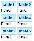
<tablelayout id="tbl" columns="2">
rowspan, and colspan properties
Another approach to changing the arrangement of the Tablechildren is to use either the rowspan or colspan property on the Tablechilder.
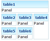
<zk>
	<tablelayout id="tbl" columns="3">
		<tablechildren id="tc1" colspan="3">
			<panel title="table1" border="normal">
				<panelchildren>Panel</panelchildren>
			 </panel>
		</tablechildren>
		<tablechildren>
			<panel title="table2" border="normal">
				<panelchildren>Panel</panelchildren>
			 </panel>
		</tablechildren>
		<tablechildren >
			<panel title="table3" border="normal">
				<panelchildren>Panel</panelchildren>
			 </panel>
		</tablechildren>
		<tablechildren rowspan="2">
			<panel title="table4" border="normal" height="90px">
				<panelchildren>Panel</panelchildren>
			 </panel>
		</tablechildren>
		<tablechildren >
			<panel title="table5" border="normal">
				<panelchildren>Panel</panelchildren>
			 </panel>
		</tablechildren>
		<tablechildren>
			<panel title="table6" border="normal">
				<panelchildren>Panel</panelchildren>
			 </panel>
		</tablechildren>
	</tablelayout>
</zk>
Separators and Spaces
Components: separator and space.
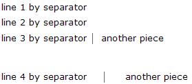
A separator is used to insert a space between two components. There are several ways to customize the separator.
- By use of the orient attribute, you are able to specify whether the separator is vertical or horizontal. By default it is a horizontal separator, which inserts a line break. On the other hand, a vertical separator inserts white space. In addition, space is a variant of separator whose default orientation is vertical.
- By use of the bar attribute, you can control whether to show a horizontal or vertical line between components.
- By use of the spacing attribute, you can control the size of spacing.
<window>
	line 1 by separator
	<separator />
	line 2 by separator
	<separator />
	line 3 by separator
	<space bar="true" />
	another piece
	<separator spacing="20px" />
	line 4 by separator
	<space bar="true" spacing="20px" />
	another piece
</window>
Group boxes
Components: groupbox.
A group box is used to group components together. A border is typically drawn around the components to show that they are related.
The label across the top of the group box can be created by using the caption component. It works in a similar manner to the HTML legend element.
Unlike windows, a group box is not an owner of the ID space. It cannot be overlapped or popped-up.
<zk>
	<groupbox width="250px">
		<caption label="Fruits" />
		<radiogroup>
			<radio label="Apple" />
			<radio label="Orange" />
			<radio label="Banana" />
		</radiogroup>
	</groupbox>
</zk>
In addition to the default mold, the group box also supports the 3d mold. If the 3d mold is used, it works in a similar fashion to a simple-tab tab box. Firstly, you can control whether its』 content is visible using open attribute. Similarly, you can create the content of a group box when the onOpen event is received.
<zk>
	<groupbox mold="3d" open="true" width="250px">
		<caption label="fruits" />
		<radiogroup>
			<radio label="Apple" />
			<radio label="Orange" />
			<radio label="Banana" />
		</radiogroup>
	</groupbox>
</zk>
The contentStyle Property and Scrollable Groupbox
The contentStyle attribute is used to specify the CSS style for the content block of the groupbox. Thus, you can make a groupbox scrollable by specifying overflow:auto (or overflow:scroll) as follows.
<zk>
	<groupbox mold="3d" width="150px" contentStyle="height:50px;overflow:auto">
		<caption label="fruits" />
		<radiogroup onCheck="fruit.value = self.selectedItem.label"
			orient="vertical">
			<radio label="Apple" />
			<radio label="Orange" />
			<radio label="Banana" />
		</radiogroup>
	</groupbox>
</zk>
Note: The contentStyle attribute is ignored if the default mold is used.
The height specified in the contentStyle attribute means the height of the content block, excluding the caption. Thus, if the groupbox is dismissed (i.e., the content block is not visible), the height of the whole groupbox will shrink to contain only the caption. On the other hand, if you specify the height for the whole groupbox (by use of the height attribute), only the content block disappears and the whole height remains intact, when dismissing the groupbox.
Toolbars
Components: toolbar and toolbarbutton.
A toolbar is used to place a series of buttons. The toolbar buttons can be used without toolbars, so a toolbar can also be used without toolbar buttons. However, toolbar buttons change their appearance if they are placed inside a toolbar.
The toolbar has two orientations: horizontal and vertical. It controls how the buttons are placed.
<zk>
	<toolbar>
	    <toolbarbutton label="button1"/>
	    <toolbarbutton label="button2"/>
	</toolbar>
</zk>
See Also
From ZK Forum:
- problem with filfull on Tabpanel
- Generating content in Panels dynamically
- ZK 3.5.0 Tabbox and Listbox weird behavior
- Minimize Panel
Notes


