Adaptive Design"
| (5 intermediate revisions by the same user not shown) | |||
| Line 36: | Line 36: | ||
=MVVM media queries and Shadow components= | =MVVM media queries and Shadow components= | ||
{{versionSince|8.0.2}} | {{versionSince|8.0.2}} | ||
| + | |||
The same structure can be created following the MVVM pattern using the [http://books.zkoss.org/zk-mvvm-book/8.0/syntax/matchmedia.html @MatchMedia] annotation introduced in ZK 8.0.2 and [http://books.zkoss.org/zk-mvvm-book/8.0/syntax/shadow_elements.html Shadow Elements] introduced in ZK 8.0.0 | The same structure can be created following the MVVM pattern using the [http://books.zkoss.org/zk-mvvm-book/8.0/syntax/matchmedia.html @MatchMedia] annotation introduced in ZK 8.0.2 and [http://books.zkoss.org/zk-mvvm-book/8.0/syntax/shadow_elements.html Shadow Elements] introduced in ZK 8.0.0 | ||
| Line 59: | Line 60: | ||
=Full responsiveness: Integrating Fluid with Adaptive Design= | =Full responsiveness: Integrating Fluid with Adaptive Design= | ||
| − | Fluid and | + | Fluid and adaptive designs can be integrated to create a more granular UI experience. A template generated using responsive design can incorporate fluid design elements to subdivide this template’s display options. |
For example, based on the [[ZK Developer's Reference/Responsive Design/Fluid Design|fluid design examples]], we can add bootstrap grid entries for extra-small, small and medium states to the small layout generated in ZK. | For example, based on the [[ZK Developer's Reference/Responsive Design/Fluid Design|fluid design examples]], we can add bootstrap grid entries for extra-small, small and medium states to the small layout generated in ZK. | ||
| Line 65: | Line 66: | ||
[[File:3-BSintegrationschema.png|center|auto|zk responsive integration schema]] | [[File:3-BSintegrationschema.png|center|auto|zk responsive integration schema]] | ||
| − | In this case, we add fluid transitions to the MVVM | + | In this case, we add fluid transitions to the MVVM adaptive example to build three fluid state on top of two adaptive states. |
The same adaptive code is implemented to switch between a large template using dropdown and a small template using radio buttons. | The same adaptive code is implemented to switch between a large template using dropdown and a small template using radio buttons. | ||
In turn, the small template is subdivided into 3 fluid states based on Bootstrap Grid. These three states are extra small, small and medium and use the notation xs, sm and md. | In turn, the small template is subdivided into 3 fluid states based on Bootstrap Grid. These three states are extra small, small and medium and use the notation xs, sm and md. | ||
| − | This effectively creates four | + | This effectively creates four responsive states: |
| + | * Big template | ||
| + | * Small template - bootstrap medium | ||
| + | * Small template - bootstrap small | ||
| + | * Small template - bootstrap extra small | ||
The transition between these states is handled either by requesting page information from the server (adaptive) or by rearranging view elements at client side (fluid). | The transition between these states is handled either by requesting page information from the server (adaptive) or by rearranging view elements at client side (fluid). | ||
| − | The | + | The adaptive transition is more powerful, as the page structure and components can be completely recreated to match the device needs. However, doing so requires a request cycle to the server. On the other hand, fluid transition have localized effects but is performed entirely at client side. |
| + | |||
| + | Integrating both fluid and adaptive design to build a fully responsive document: | ||
| − | |||
<source lang="xml" highlight="3,11"> | <source lang="xml" highlight="3,11"> | ||
<div id="content" height="80px" sclass="panel"> | <div id="content" height="80px" sclass="panel"> | ||
| Line 98: | Line 104: | ||
Full example available on [https://github.com/zkoss/zkbooks/blob/master/developersreference/developersreference/src/main/webapp/responsiveDesign/adaptiveDesign/3-mvvmbootstrapintegration.zul Github] | Full example available on [https://github.com/zkoss/zkbooks/blob/master/developersreference/developersreference/src/main/webapp/responsiveDesign/adaptiveDesign/3-mvvmbootstrapintegration.zul Github] | ||
| − | {{ | + | {{ZKDevelopersReferencePageFooter}} |
| − | |||
| − | }} | ||
Latest revision as of 09:51, 23 April 2024
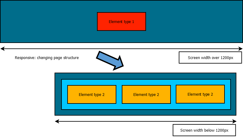
While a fluid layout make a UI usable in any screen resolution, some user experiences may require widely different layout and designs depending on the type or size of the devices used to browse the application. In this case, adaptive design is recommended as it can be used to switch between layouts based on browser width.
This is different from a fluid design. An adaptive design changes the structure of the page. A fluid page will simply change the display properties of its content without changing the content organization or nature. Responsiveness through an adaptive design requires more design effort to generate a full set of page states. The result is a much wider range of possibilities to adapt the page design to be relevant on any device type and/or size.
ZK MVC Client Info event and composer
The onClientInfo event is used to relay client information such as device dimensions, orientation, and pixel ratio to the server. The event also sends updates if these values change while browsing the page. This event will fire during page initialization and whenever the client properties change, for example, change of tablet orientation or when desktop browser resized. More information of this event can be found in the ClientInfoEvent documentation.
This event can be leveraged in the MVC pattern, using a controller to alter the page structure based on the information returned from the client.
Below is an implementation example based on the following requirement:
- User will select a value through a 3-choices control.
- The control will be a drop-down on large desktop screens.
- The control will not be a drop-down on mobile devices or smaller desktop screens.
As designers, we can choose that a dropdown component will displayed on “large” devices (width >= 1200px), but will be replaced by 3 radio buttons on smaller devices. The underlying data model is reused between these two UI states. When transitioning to a different state we can use this technique to initialize the new UI objects based on the previous UI state data. This is possible because the page's state is stored in the controller. When templates are created, they are reuse the same model object as the previous template.
In the MVC pattern, the component tree is modified directly by the composer. When the onClientInfo listener is triggered, the composer will test if the responsive state has changed. If necessary, it will remove children from the anchor component and add the relevant new structure to the page.
Registering the ClientInfo event listener on the page's root component to define actions upon changes on client properties:
//ClientInfoEvent is used to perform actions when client size (or orientation) is changed
comp.addEventListener(Events.ON_CLIENT_INFO, new EventListener<ClientInfoEvent>() {
	public void onEvent(ClientInfoEvent event) throws Exception {
	...
});
Full example available on Github
MVVM media queries and Shadow components
Since 8.0.2
The same structure can be created following the MVVM pattern using the @MatchMedia annotation introduced in ZK 8.0.2 and Shadow Elements introduced in ZK 8.0.0
The MVVM is a natural fit for this task, since it already provides a clear separation between data and view. On the ViewModel side, the @MatchMedia annotation will trigger whenever the associated media query condition is fulfilled.
More information on Media Queries
The UI state is represented by a single ViewModel field and control the view. On the view side, Shadow Elements are used to instantiate and cleanup the relevant UI elements for each state.
The MVVM design pattern provides a clear separation between the View (the different UI templates to be used) and the ViewModel (the state of the page). As the ViewModel is not replaced when switching between templates, this greatly simplifies the effort on maintaining the client state. Any bound value stored in the ViewModel is available to every possible template.
Using @MatchMedia to perform actions when media query conditions are fulfilled:
	@NotifyChange("layoutState")
	@MatchMedia("all and (min-width: 1200px)")
	public void handleBigLayout(){
		//Action to perform when media query is fullfiled
		...
	}
Full example available on Github
Full responsiveness: Integrating Fluid with Adaptive Design
Fluid and adaptive designs can be integrated to create a more granular UI experience. A template generated using responsive design can incorporate fluid design elements to subdivide this template’s display options.
For example, based on the fluid design examples, we can add bootstrap grid entries for extra-small, small and medium states to the small layout generated in ZK.
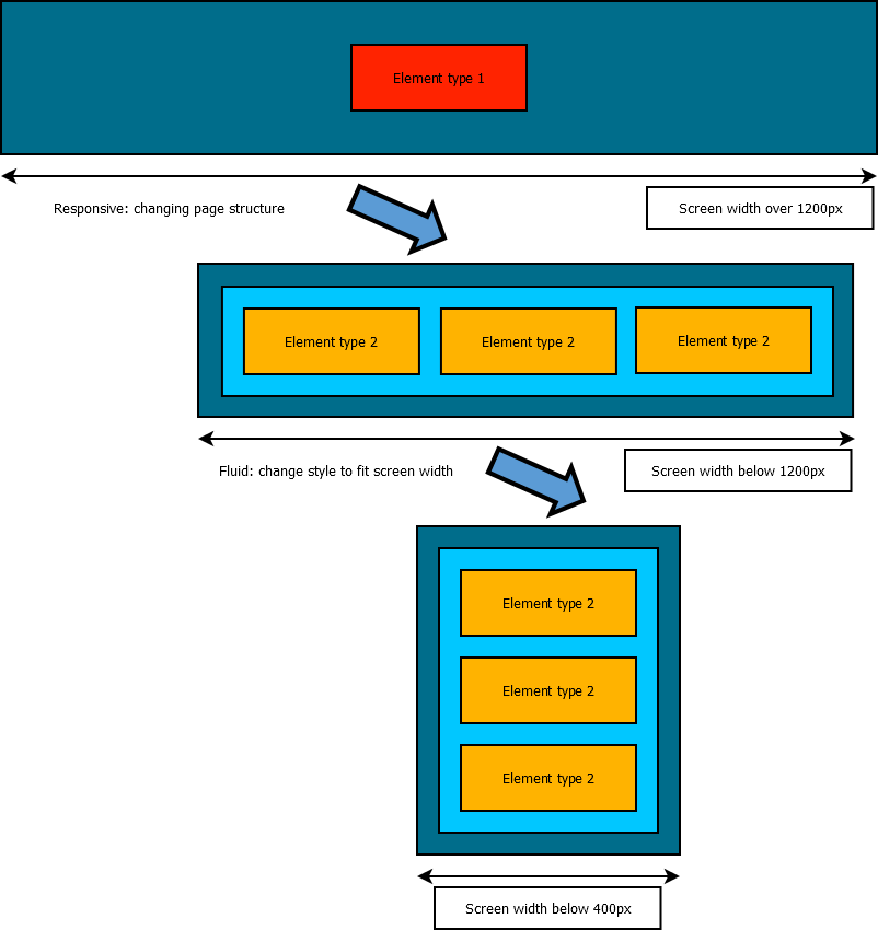
In this case, we add fluid transitions to the MVVM adaptive example to build three fluid state on top of two adaptive states. The same adaptive code is implemented to switch between a large template using dropdown and a small template using radio buttons.
In turn, the small template is subdivided into 3 fluid states based on Bootstrap Grid. These three states are extra small, small and medium and use the notation xs, sm and md.
This effectively creates four responsive states:
- Big template
- Small template - bootstrap medium
- Small template - bootstrap small
- Small template - bootstrap extra small
The transition between these states is handled either by requesting page information from the server (adaptive) or by rearranging view elements at client side (fluid).
The adaptive transition is more powerful, as the page structure and components can be completely recreated to match the device needs. However, doing so requires a request cycle to the server. On the other hand, fluid transition have localized effects but is performed entirely at client side.
Integrating both fluid and adaptive design to build a fully responsive document:
<div id="content" height="80px" sclass="panel">
	<!-- 	Replacing templates: responsive design -->
	<apply template="@load(vm.layoutState)">
		<template name="bigLayout">
			<listbox model="@init(vm.selectionModel)" mold="select"/>
		</template>
		<template name="smallLayout">
			<radiogroup sclass="panel" height="60px" model="@init(vm.selectionModel)">
					<template name="model">
						<!-- 	Integrating Bootsrtrap grid system: fluid design -->
						<radio sclass="col-xs-12 col-sm-6 col-md-4" label="@load(each)" value="@load(each)"></radio>
					</template>
			</radiogroup>
		</template>
	</apply>
</div>
Full example available on Github

