Displaying the Data
![]() This article is out of date, please refer to http://books.zkoss.org/zkessentials-book/master/ for more up to date information.
This article is out of date, please refer to http://books.zkoss.org/zkessentials-book/master/ for more up to date information.
Data presentation in ZK involves preparing the Model and Controller in association with the View (ZK components). Once an association is established among these three parts, the data presented in ZK components are automatically updated whenever the data model is changed. In the previous section, we declared the basic UI skeleton, now we'll look into how to prepare a data model and use Template component to populate the Grid component in our Product View.
Associate View and Model in Controller
To associate our Product View (Grid component) with a Model, we'll implement a controller class which extends the ZK utility class SelectorComposer. In its SelectorComposer.doAfterCompose(Component) method, the ZK components declared in mark up are wired with the component instances declared in the controller for our manipulation, while the events fired are automatically forwarded to this controller for event handling. Therefore, in our controller class, we override and call SelectorComposer.doAfterCompose(Component) method of its super class and implement the code that assigns a model and renderer to our Product View Grid.
For more information on the intracacies of this relationship please refer to link needed here.
public class ProductViewCtrl extends SelectorComposer<Div> {

	@Wire
	private Grid prodGrid;


	@Override
	public void doAfterCompose(Div comp) throws Exception {
		super.doAfterCompose(comp);

		List<Product> prods = DAOs.getProductDAO().findAllAvailable();

		ListModelList<Product> prodModel = new ListModelList<Product>(prods);
		prodGrid.setModel(prodModel);
	}

	...

}
Notice that the Grid reference "prodGrid" in ProductViewCtrl.java is auto-wired with the Grid declared in mark up whose ID is "prodGrid".
<div id="PrdoDiv" apply="demo.web.ui.ctrl.ProductViewCtrl">
	<grid id="prodGrid">
		<columns sizable="true">
			<column image="/image/Bullet-10x10.png"
						align="center" width="100px" />
			<column label="Name" width="100px" />
			<column label="Price" width="50px" />
			<column label="Quantity" width="50px" />
			<column label="Arrive Date" width="110px" />
			<column label="operation" />
		</columns>
                <template name="model">
                ...
                </template>
	</grid>
</div>
Wrapping Data Object with ListModel
The implementations of ZK's ListModel interface provide a wrapper for Java Collections to work with ZK's data modeling mechanisms. For Grid and Listbox components, we use the ListModelList implementation; adding or removing entries in the ListModelList would cause the associated Listbox to update its content accordingly.
In the snippet below, the ListModelList takes in a product list fetched from a DAO object as its argument. At line 6, we assign the ListModelList object as the model for the Product View Grid by using Grid's setModel method.
ProductViewCtrl.java
public void doAfterCompose(Component comp) throws Exception {

		List<Product> prods = DAOs.getProductDAO().findAllAvailable();

		ListModelList<Product> prodModel = new ListModelList<Product>(prods);
		prodGrid.setModel(prodModel);

        ...
		});
	}
Using The Template Component to Populate Rows in Grid
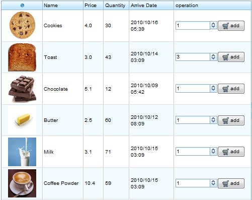
Now that the model is prepared, we'll make use of the Template component which affords developers the ability to define ZUML fragments which will be used when rendering each row. In this case our ZUML fragment needs to contain a row and then a control for each column. Here is the final template to recreate the interface.
<grid id="prodGrid">
	<columns sizable="true">
		...
	</columns>
	<template name="model">
		<row value="${each}">
			<image height="70px" width="70px"
				src="${each.imgPath}" />
			<label value="${each.name}" />
			<label value="${each.price}" />
			<label value="${each.quantity}" />
			<label value="${each.createDate}" />
			<productOrder maximumQuantity="${each.quantity}" product="${each}" />
		</row>
	</template>
</grid>
A template is a ZUML fragment that defines how to render data model in its children components and can contain any ZUML element you would like including other templates. It is generally used within a Listbox, Grid, Tree and Combobox to describe how repeating items are displayed. In this case the template defines the layout of each row. The row value is assigned as "each" where each refers to a bean provided by the model.
The syntax of the template looks incredibly similar to what one observed in the databinding chapter except using a $ instead of an @. This is because the markup below makes use of EL. EL expressions differ from databinding in the fact that they are only interpreted once, whereas databidning will be re-interpreted whenever it is notified a value has changed. Seeing as the product list will remain relatively constant, we'll use EL here.
For more information on EL please visit link needed here
In this case, the Template component's output is relatively simple, however, one interesting item in the Template is the productOrder component. This is in fact a composite control which is created by developers which we'll look into in the next secion.
