Component Based UI
From Documentation
![]() This article is out of date, please refer to http://books.zkoss.org/zkessentials-book/master/ for more up to date information.
This article is out of date, please refer to http://books.zkoss.org/zkessentials-book/master/ for more up to date information.
Component Based UI
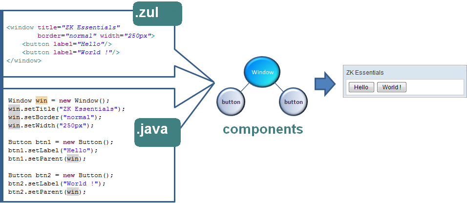
In ZK, we work with the UI components to assemble together our application GUI. Take the below for an example:

Here we declared a Window component, enabled the border (border="normal"), and set its width to a definite 250 pixels. Enclosed in the Window is a Label component, which we set the background color to light blue and its font size to 20 pixels.
Where We Declare the Components
The components are declared in files with the extension ".zul". A ZUL page is