Using ZK Borderlayout
![]() This article is out of date, please refer to http://books.zkoss.org/zkessentials-book/master/ for more up to date information.
This article is out of date, please refer to http://books.zkoss.org/zkessentials-book/master/ for more up to date information.
Using ZK Border Layout
Suppose in our shopping cart application, we have the following requirements:
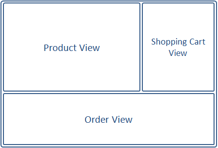
- Product View - A table displaying the available products to purchase
- Shopping Cart View - A list of items placed in the shopping cart
- Order View - A record of all the orders placed
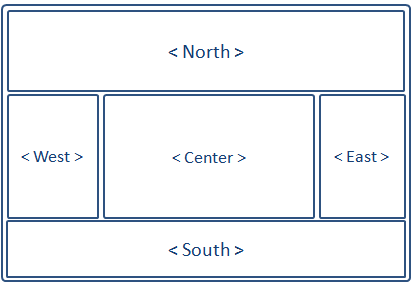
The borderlayout divides a page into five sections: North, East, Center, West, South.

Border Layout Attributes
The attributes involved in the configuration of border layout is listed in the table below:
| Attributes | Sample | Description |
|---|---|---|
| size | <north size="20%">...</north> <south size="180px">...</south> | set size in pixels or a percentage relative to its parent component |
| border | <east border="normal">...</east> | show/hide border; "normal" shows border, while "none" hides border |
| collapsible | <west collapsible="true">...</west> | allow the whole division to show/hide |
| maxsize/minsize | <south splitter="true" maxsize="500px" minisize="200px">...</south> | set the maximum and minimum allowable size for a component; |
| splittable | <north splittable="true">...</north> | allow the contents area size to be adjustable |
Borderlayout Configuration Notes
Some rules to oblige to when working with the border layout:
- The center component does not take size attributes; its height is dependent on the north and south components, while its width is dependent on the east and west components
- Each children component of borderlayout, ie. north, east, center, west, and south, are allowed only one child component; therefore, wrap multiple components in container components such as Div or Window when placing them in borderlayout's children components.
- The borderlayout component itself (not its children: north, west, etc..) do not have the "border" attribute
Why Use Borderlayout
Border Layout stands out as the obvious choice because it supports:
- splittable, so we could adjust the dimensions of the views by dragging the splitters.
- collapsible, so views could be collapsed to make room for other views.
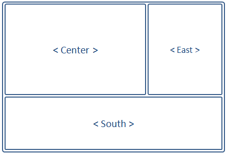
Using the Borderlayout, we could outline the shopping cart application like the following:

The borders can be made adjustable (splittable="true"), and the east and south components can be collapsed to give room to the center component displaying the Product View.
Implementing the Views
<window title="You are using ZK: ${desktop.webApp.version}" border="normal" width="100%" height="900px">

<borderlayout>

	<center border="0">
		<div id="PrdoDiv" style="background:#D9E5EF; height:100%" apply="demo.web.ui.ctrl.ProductViewCtrl">
			<grid id="prodGrid">
				<columns sizable="true">
				   <column image="/image/Bullet-10x10.png" align="center"  width="100px"/>
			       <column label="Name" width="100px"/>
			       <column label="Price" width="50px"/>
			       <column label="Quantity" width="50px"/>
			       <column label="Arrive Date" width="110px" />
			       <column label="operation" />
			    </columns>
			</grid>
		</div>
	</center>

	<east  title="Shopping Cart" size="30%" flex="true" splittable="true" collapsible="true">
		<div style="background:#D9E5EF; height:100%" apply="demo.web.ui.ctrl.ShoppingCartViewCtrl">

			<listbox id="shoppingCartListbox">
				<listhead sizable="true">
					<listheader label="Name" />
					<listheader label="Price" />
					<listheader label="Amount" />
					<listheader label="subTotal"/>
					<listheader align="center"/>
				</listhead>
				<listfoot>
					<listfooter span="2" id="subtotalFooter"></listfooter>
					<listfooter><button id="submitOrderBtn" label="submit"/></listfooter>
					<listfooter><button id="clearBtn" label="clear"/></listfooter>
				</listfoot>
			</listbox>
			<textbox id="descTxb" rows="10" width="200px" value="Note for this order." />
			<image id="cartItemImage" />
		</div>
	</east>

	<south  size="250px" flex="true" border="0"
		splittable="true" collapsible="true" style="overflow:scroll">
		<div style="background:#D9E5EF; height:100%" apply="demo.web.ui.ctrl.OrderViewCtrl" >
			<grid id="orderGrid" >
				<columns sizable="true">
				   <column label=""  width="17px"/>
			       <column label="info" width="200px"/>
			       <column label="description" width="50%"/>
			       <column label="Sub Total" />
			       <column label="operation" />
			    </columns>
			</grid>

			<button id="myBtn" label="Click me!"/>
		</div>
	</south>

</borderlayout>

</window>
