Using ZK Borderlayout
![]() This article is out of date, please refer to http://books.zkoss.org/zkessentials-book/master/ for more up to date information.
This article is out of date, please refer to http://books.zkoss.org/zkessentials-book/master/ for more up to date information.
Using ZK Border Layout
Suppose in our shopping cart application, we have the following requirements:
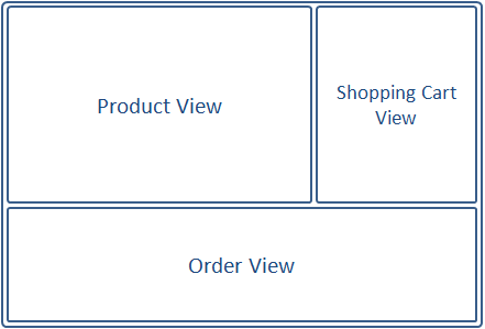
- Product View - A table displaying the available products to purchase
- Shopping Cart View - A list of items placed in the shopping cart
- Order View - A record of all the orders placed
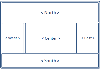
The borderlayout divides a page into five sections: North, East, Center, West, South.

Border Layout Attributes
The attributes involved in the configuration of border layout is listed in the table below:
| Attributes | Sample | Description |
|---|---|---|
| size | <north size="20%">...</north> <south size="180px">...</south> | set size in pixels or a percentage relative to its parent component |
| border | <east border="normal">...</east> | show/hide border; "normal" shows border, while "none" hides border |
| collapsible | <west collapsible="true">...</west> | allow the whole division to show/hide |
| maxsize/minsize | <south splitter="true" maxsize="500px" minisize="200px">...</south> | set the maximum and minimum allowable size for a component; |
| splittable | <north splittable="true">...</north> | allow the contents area size to be adjustable |
Why Use Borderlayout
Border Layout stands out as the obvious choice because it supports:
- splittable, so we could adjust the dimensions of the views by dragging the splitters.
- collapsible, so views could be collapsed to make room for other views.
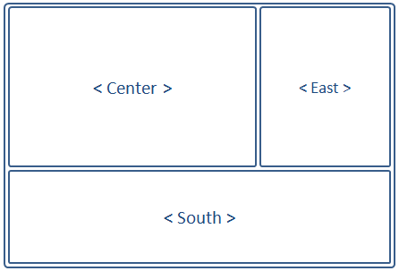
Using the Borderlayout, we could outline the shopping cart application like the following:

The borders can be made adjustable (splittable="true"), and the east and south components can be collapsed to give room to the center component displaying the Product View.
Implementing the Views
We start implementing the Views for our shopping cart sample application by first making the divisions of the Views using borderlayout:
<window border="normal" width="100%" height="900px">

   <borderlayout>

	<center border="0">
		<div id="PrdoDiv" style="background:#D9E5EF; height:100%" apply="demo.web.ui.ctrl.ProductViewCtrl">
			//Product View Implementation
		</div>
	</center>

	<east  title="Shopping Cart" size="30%" flex="true" splittable="true" collapsible="true">
		<div style="background:#D9E5EF; height:100%" apply="demo.web.ui.ctrl.ShoppingCartViewCtrl">
		       //Shopping Cart View Implementation
		</div>
	</east>

	<south  size="250px" flex="true" border="0" splittable="true" collapsible="true" style="overflow:scroll">
		<div style="background:#D9E5EF; height:100%" apply="demo.web.ui.ctrl.OrderViewCtrl" >
			//Order View Implementation
		</div>
	</south>

   </borderlayout>
Here we note a few key implementations:
- The size of the borderlayout is not specified, so its dimensions will assume that of its parent component Window.
- The borderlayout component itself does not have the "border" attribute, only its children (north, west, etc..) do.
- The center component does not take any size attributes; its height is dependent on the dimensions of north/south, while its width is dependent east/west.
- north, east, center, west, and south, are allowed only one child component; therefore, use container components such as Div or Windowwrap multiple components in c when placing them in borderlayout's children components.
