Default
From Documentation
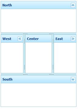
This is the Default mold for Borderlayout.
Source
The CSS source for {{{control}}} from GitHub
Structure
Events
| CSS\Action | Normal (Open) | Hover | Click, Select, and Drag. | Focus | Focus and Hover | Disable |
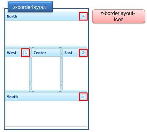
| Naming: | .z-border-layout | |||||
| Supported: | V |
| CSS\Action | Normal (Open) | Hover | Click, Select, and Drag. | Focus | Focus and Hover | Disable |
| Naming: | .z-border-layout-icon | |||||
| Supported: | V |
Note: An exclamation mark(!) means that the action effect is done by CSS background , not CSS background-position
CSS Specification
| Class Name | Description | Default Values |
| .z-border-layout | Background and color | width:100%; height:100%; overflow:hidden; background-color:#CDE6F5; border:0 none; position: relative; visibility: hidden; |
| .z-border-layout-icon | Background of tool icons | overflow: hidden;
width: 16px; height: 16px; float: right; margin-left: 2px; cursor: pointer; background: transparent no-repeat 0 0; background-image : url(${c:encodeURL('~./zkex/zul/img/layout/borderlayout-btn.gif')}); |

