Default"
From Documentation
m (→Events) |
m (→Structure) |
||
| (9 intermediate revisions by 2 users not shown) | |||
| Line 6: | Line 6: | ||
=Source= | =Source= | ||
| − | |||
{{CSSSource | {{CSSSource | ||
| − | |url= | + | | url=zul/src/archive/web/js/zul/db/css/calendar.css.dsp |
| + | | control=Calendar | ||
|}} | |}} | ||
=Structure= | =Structure= | ||
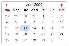
| − | [[Image:Calendar1. | + | [[Image:Calendar1.PNG]] |
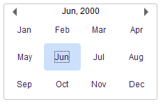
| − | [[Image:Calendar2. | + | [[Image:Calendar2.PNG]] |
| + | |||
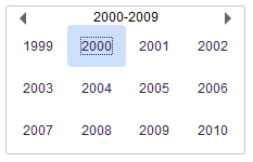
| + | [[Image:Calendar3.PNG]] | ||
| + | |||
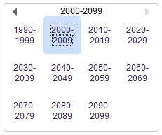
| + | [[Image:Calendar4.PNG]] | ||
=Events= | =Events= | ||
| − | + | ||
{{Template:Style Guide Event | {{Template:Style Guide Event | ||
|.z-calendar | |.z-calendar | ||
| Line 34: | Line 38: | ||
=CSS Specification= | =CSS Specification= | ||
| − | + | ||
{{Template:ZK Style Guide CSS}} | {{Template:ZK Style Guide CSS}} | ||
| + | |.z-calendar | ||
| + | |||
| + | |Background and font size | ||
| + | |||
| + | |background: white; border: 1px solid #C5C5C5; font-family: ${fontFamilyC}; font-size: ${fontSizeM}; font-weight: normal; width: 215px; padding: 2px; | ||
| + | |- | ||
| + | |.z-calendar-seld | ||
| + | |Selected background | ||
| − | + | |background: #CCE0FB; | |
| + | |} | ||
Latest revision as of 06:38, 16 September 2010
This is the Default mold for Calendar.
Source
The CSS source for Calendar from GitHub
Structure
Events
| CSS\Action | Normal (Open) | Hover | Click, Select, and Drag. | Focus | Focus and Hover | Disable |
| Naming: | .z-calendar | -over | -seld | -over-seld | -disd | |
| Supported: | V | ! | ! | ! | ! |
Note: An exclamation mark(!) means that the action effect is done by CSS background , not CSS background-position
CSS Specification
| Class Name | Description | Default Values |
| .z-calendar | Background and font size | background: white; border: 1px solid #C5C5C5; font-family: ${fontFamilyC}; font-size: ${fontSizeM}; font-weight: normal; width: 215px; padding: 2px; |
| .z-calendar-seld | Selected background | background: #CCE0FB; |


