Chosenbox
From Documentation
Revision as of 08:39, 5 April 2012 by Benbai (talk | contribs) (Created page with "{{ZKStyleGuidePageHeader}} __TOC__ This is the '''Default''' mold for '''Chosenbox'''. =Structure= Image:CompREF_Chosenbox_02.png [[Image:CompREF_Chosenbox_03.png ...")
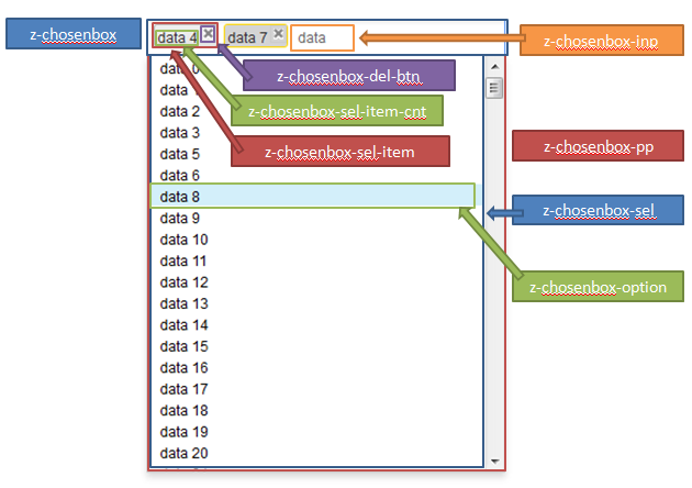
This is the Default mold for Chosenbox.
Structure
Events
| CSS\Action | Normal (Open) | Hover | Click, Select, and Drag. | Focus | Focus and Hover | Disable |
| Naming: | .z-chosenbox | -focus | ||||
| Supported: | V |
Note: An exclamation mark(!) means that the action effect is done by CSS background , not CSS background-position
CSS Specification
| Class Name | Description | Default Values |
| .z-chosenbox | Main layout | |
| .z-chosenbox-focus | Focused | |
| .z-chosenbox-sel | Selected items | |
| .z-chosenbox-sel-item | Selected item | |
| .z-chosenbox-sel-item-focus | Selected item focused | |
| .z-chosenbox-inp | Input field | |
| .z-chosenbox-pp | Drop down list | |
| .z-chosenbox-option | Option | |
| .z-chosenbox-option-over | Mouseover option |

