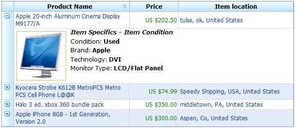
Default"
From Documentation
m |
Jumperchen (talk | contribs) (→Source) |
||
| Line 4: | Line 4: | ||
This is the '''Default''' mold for '''Detail'''. | This is the '''Default''' mold for '''Detail'''. | ||
| − | |||
| − | |||
| − | |||
| − | |||
| − | |||
| − | |||
=Structure= | =Structure= | ||
Latest revision as of 10:26, 13 September 2010
This is the Default mold for Detail.
Structure
Events
| CSS\Action | Normal (Open) | Hover | Click, Select, and Drag. | Focus | Focus and Hover | Disable |
| Naming: | .z-detail | |||||
| Supported: | V |
Note: An exclamation mark(!) means that the action effect is done by CSS background , not CSS background-position
CSS Specification
| Class Name | Description | Default Values |
| tr.z-row .z-detail-outer | Background | background: #C6E8FC repeat-y left;
border-top: none; border-left: 1px solid white; border-right: 1px solid #C0C0C0; border-bottom: 1px solid #D0D0D0; vertical-align: top; background-image: url(${c:encodeURL('~./zul/img/grid/detail-bg.png')}); |
| .z-detail-img | Background of image icon | cursor:pointer;
width: 100%; height: 18px; background: transparent no-repeat 4px 3px; background-image: url(${c:encodeURL('~./zul/img/grid/row-expand.png')}); |

