Default"
From Documentation
m (→Structure) |
m (→Events) |
||
| Line 27: | Line 27: | ||
<br /> | <br /> | ||
{{Template:Style Guide Event | {{Template:Style Guide Event | ||
| − | | | + | |.z-panel |
| − | |- | + | | |
| − | |- | + | | |
| − | | | + | | |
| − | | | + | | |
| − | | | + | | |
| − | | | + | |V |
| − | | | + | | |
| − | | | + | | |
| − | | | + | | |
| − | | | + | | |
| − | | | + | | |
| + | |display=none | ||
| + | }} | ||
| + | |||
| + | |||
| + | {{Template:Style Guide Event | ||
| + | |.z-panel-close <br /> | ||
| + | .z-panel-max<br /> | ||
| + | .z-panel-maxd<br /> | ||
| + | .z-panel-min<br /> | ||
| + | .z-panel-exp | ||
| + | |-over | ||
| + | | | ||
| + | | | ||
| + | | | ||
| + | | | ||
| + | |V | ||
| + | |V | ||
| + | | | ||
| + | | | ||
| + | | | ||
| + | | | ||
}} | }} | ||
Revision as of 02:44, 9 September 2010
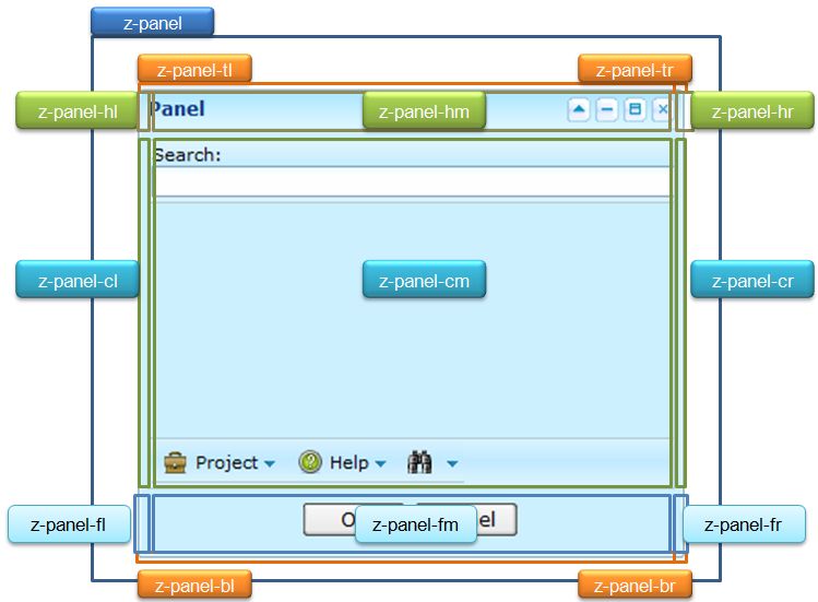
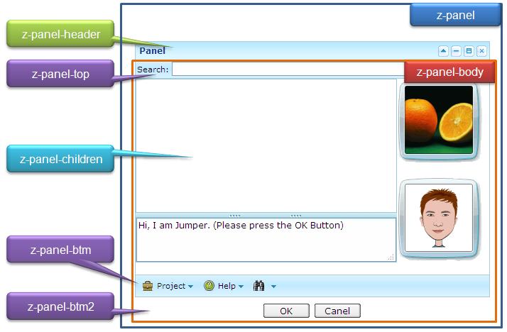
This is the Default mold for Panel.
Source
The CSS source for from GitHub
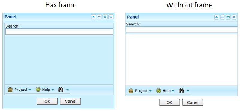
Structure
| Has Frame | Without Frame |
|---|---|

|

|
Events
| CSS\Action | Normal (Open) | Hover | Click, Select, and Drag. | Focus | Focus and Hover | Disable |
| Naming: | .z-panel | |||||
| Supported: | V |
| CSS\Action | Normal (Open) | Hover | Click, Select, and Drag. | Focus | Focus and Hover | Disable |
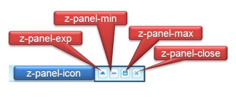
| Naming: | .z-panel-close .z-panel-max |
-over | ||||
| Supported: | V | V |
Note: An exclamation mark(!) means that the action effect is done by CSS background , not CSS background-position
CSS Specification
| Class Name | Description | Default Values |
| Copyright © Potix Corporation. This article is licensed under GNU Free Documentation License. |

