accordion-lite"
From Documentation
m (Created page with '{{ZKStyleGuidePageHeader}} __TOC__ This is the '''accordion-lite''' mold for '''Tabbox'''. =Source= <br /> {{CSSSource | url= | control= |}} =Structure= =Events= <br /> {{…') |
m (→Structure) |
||
| Line 13: | Line 13: | ||
=Structure= | =Structure= | ||
| + | [[Image:Tabbox-accordion-lite1.jpg]] | ||
| − | + | [[Image:Tabbox-accordion-lite2.jpg]] | |
=Events= | =Events= | ||
Revision as of 06:32, 9 September 2010
This is the accordion-lite mold for Tabbox.
Source
The CSS source for from GitHub
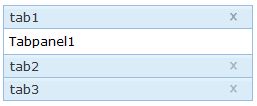
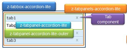
Structure
Events
| CSS\Action | Normal (Open) | Hover | Click, Select, and Drag. | Focus | Focus and Hover | Disable |
| Naming: | - | - | - | - | - | |
| Supported: | ! | ! | ! | ! | ! | ! |
Note: An exclamation mark(!) means that the action effect is done by CSS background , not CSS background-position
CSS Specification
| Class Name | Description | Default Values |
| Copyright © Potix Corporation. This article is licensed under GNU Free Documentation License. |

