Panel"
From Documentation
m |
Jumperchen (talk | contribs) (→Source) |
||
| Line 7: | Line 7: | ||
=Source= | =Source= | ||
{{CSSSource | {{CSSSource | ||
| − | | url= | + | | url=zul/src/archive/web/js/zul/wgt/css/toolbar.css.dsp |
| − | | control= | + | | control=Toolbar |
|}} | |}} | ||
Revision as of 03:36, 13 September 2010
This is the Panel mold for Toolbar.
Source
The CSS source for Toolbar from GitHub
Structure
Events
| CSS\Action | Normal (Open) | Hover | Click, Select, and Drag. | Focus | Focus and Hover | Disable |
| Naming: | .z-toolbar | |||||
| Supported: | V |
Note: An exclamation mark(!) means that the action effect is done by CSS background , not CSS background-position
CSS Specification
| Class Name | Description | Default Values |
| .z-toolbar | Background image | border-color: #a9bfd3; border-style: solid; border-width: 0 0 1px 0; display: block; padding: 2px; background: #D0DEF0 url(${c:encodeURL('~./zul/img/button/tb-bg.png')}) repeat-x top left; position: relative; zoom: 1; |
| .z-toolbar-body, .z-toolbar-body span | Font size | font-size: ${fontSizeS}; |
| .z-toolbar a, .z-toolbar a:visited, .z-toolbar a:hover | Font size of A tag | font-family: ${fontFamilyT}; font-size: ${fontSizeS}; font-weight: normal; color: black; background: #D0DEF0; border: 1px solid #D0DEF0; text-decoration: none; |
| .z-toolbar-start | Align to start | float: left; clear: none; |
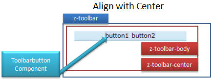
| .z-toolbar-center | Align to center | margin: 0 auto; |
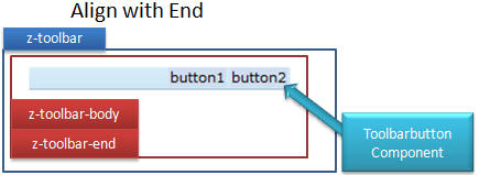
| .z-toolbar-end | Align to end | float: right; clear: none; |


