Default"
From Documentation
Jumperchen (talk | contribs) (→Events) |
Jumperchen (talk | contribs) |
||
| Line 35: | Line 35: | ||
=CSS Specification= | =CSS Specification= | ||
{{Template:ZK Style Guide CSS}} | {{Template:ZK Style Guide CSS}} | ||
| − | |.z- | + | |.z-toolbarbutton-cnt |
|Font size | |Font size | ||
| − | |font-family: ${fontFamilyT}; font-size: ${ | + | | padding: 2px 2px; position: relative; zoom: 1; font-family: ${fontFamilyT}; font-size: ${fontSizeS}; font-weight: normal; |
|} | |} | ||
{{ZKStyleGuidePageFooter}} | {{ZKStyleGuidePageFooter}} | ||
Revision as of 03:43, 13 September 2010
This is the Default mold for Toolbarbutton.
Source
The CSS source for Toolbarbutton from GitHub
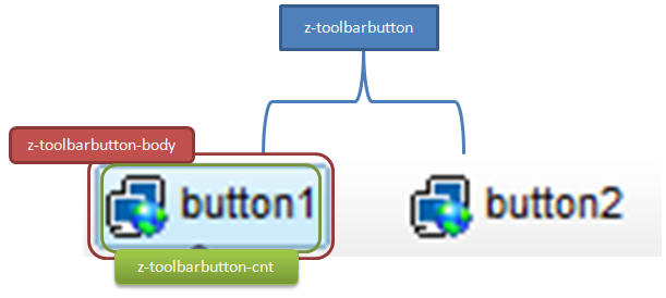
Structure
Events
| CSS\Action | Normal (Open) | Hover | Click, Select, and Drag. | Focus | Focus and Hover | Disable |
| Naming: | .z-toolbarbutton | -disd | ||||
| Supported: | V | ! |
Note: An exclamation mark(!) means that the action effect is done by CSS background , not CSS background-position
CSS Specification
| Class Name | Description | Default Values |
| .z-toolbarbutton-cnt | Font size | padding: 2px 2px; position: relative; zoom: 1; font-family: ${fontFamilyT}; font-size: ${fontSizeS}; font-weight: normal; |
