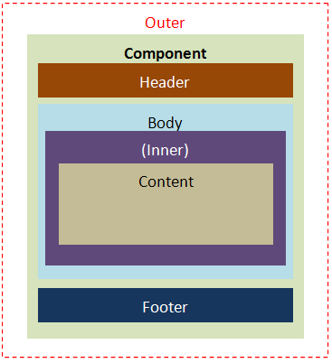
- -outer:
- the exterior of the specified component like splitter in vbox and hbox
- -body:
- the body content, like grid, tree, listbox, and so on.
- -header:
- the header content, like grid, tree, listbox, and so on.
- -inner:
- the interior of the specified component, like slider and tab.
- -cnt:
- like window's contentSclass or groupbox's contentSclass
- -footer:
- describes the footer content, like grid, tree, listbox, and so on.
Negative option
- -noheader:
- no header element.
- -noborder:
- no border element.
- -nofooter:
- no footer element.
|
|
