Enrich the Layout of ZK with Ext JS
Jumper Chen, Engineer, Potix Corporation
August 23, 2007
Applicable to zk-2.5.0-FL-2007-08-21 and later.
- Applicable to yuiextz 0.6.0.
Introduction
Layout design is a nightmare for most developer. There are many techniques to learn, including JavaScript, CSS, DOM and so forth. In addition, it's an headache to deal with the problem of incomparability among browsers. So, it takes very much time on designing the layout of your project. Ext Layout is a famous and powerful library to resolve many web developers or designers on designing layout. Therefore, we take that idea into consideration and implement the Layout component (we will call it Y-Layout for convenience). Y-Layout reinforce the layout design of ZK.
Live Demo
Let's take a look at a real case, a mail application which uses many layout designs in one page. We use several original ZK components in this demo, including listbox, tree, tabbox, popup, and so on. And we use the function of powerful databinding and fulfill too.
Note:'The mail materials are borrowed from GWT Mail Demo.
Architecture
The architecture of Y-Layout could be separated into two parts, one for layout designer, and one for web developer.
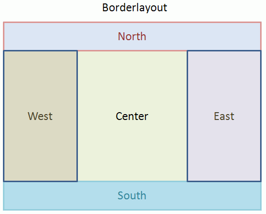
For designer, they will have better understanding about the layout design which is separated with five regions in the layout structure, including north, south, east, west, and center as Figure 1. As you can see in our live demo, we use the north region as header, the south region as footer, the west region as navigation tree, and center region as mail body.
- Figure 1: Design Layout.
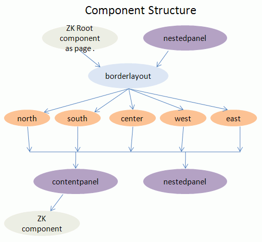
For developer, they will have to know how to use the Y-Layout component set. Y-Layout component set contains three type of components. First, borderlayout can be embedded into ZK root component such as page. And it can be embedded into nestedpanel too, which is used to create a nested borderlayout. Second, region—north, south, center, west, and east— can be embedded into borderlayout only. Last, there are a couple of panels, contentpanel and nestedpanel. The contentpanel and nestedpanel can be embedded into region only. And contentpanel can allow any kind of ZK component as its child (only one child, so you can use div or top component to include other components). You can see the Figure 2.
- Figure 2: Component Structure.
How to build a mail application with Y-Layout.
We will guide you to develop a mail web application with Y-Layout, and explain it step by step.
- Step 1. Design Root Layout.
- We need to map out the page presentation as index.zul file, which can be found in zk-yui-ext-demo-0.6.0.war.
<?page title="Y-Layout Demo" style="height:100%"?>
...
<y:borderlayout xmlns:y="http://www.zkoss.org/2007/yui">
<y:north split="false" initialSize="100" titlebar="false">
... // header
</y:north>
<y:south split="false" initialSize="30">
... // footer
</y:south>
<y:west>
... // a nested borderlayout with navigation tree and tabbox.
</y:west>
<y:center>
... // here is two nested layouts with mail body of listbox and y-grid.
</y:center>
</y:borderlayout>
As you can see, the borderlayout is embedded into ZK Root as page; therefore, we need to specify the page height to be 100% so Ext JS can compute the height of layout DOM.
- Step 2. Specify Configuration for Layout.
We provide two ways to specify multiple configurations. All of configuration parameters for Y-Layout are based on those of Ext Layout.
Specifying attribute one by one. i.g. Parameter=Value
<y:south split="false" initialSize="30">
...
</y:south>
Using config attribute to specify multiple attributes. i.g. Parameter1=Value1,Parameter2=Value2
<y:west>
<attribute name="config">
margins= '{1,5,5,1}', initialSize= 220, titlebar= true,
collapsible= true, animate= true, title='Mail'
</attribute>
...
</y:west>
Note: The margins method has four parameters, so you need to specify the format as '{param1,param2,param3,param4}' and it equals to <y:west margins="{1,5,5,1}">. The title is specified 'Mail'. (Equal to Mail)
If you would like to know more details with Y-Layout configuration, please refer to yuiextz JavaDoc.
- Step 3. Combining with ZK component.
As you can see in Step 1, they are regions where you can combine with another nested borderlayout or a orginal ZK component. We will describe them as follows.
- Simple Layout: We use the north region to show the mail application header like this.
<y:north split="false" initialSize="100" titlebar="false">
  <y:contentpanel fitToFrame="true"
	onCreate="self.setResizeEl(np)">
	<include id="np" sclass="header" src="header.zul" />
  </y:contentpanel>
</y:north>
Note: We use the trick onCreate="self.setResizeEl(np)" that Ext Layout will use the HTML Dom of np component on browser side to compute its width and height. (same with Ext layout API)
As above example, we use the include component to include other page "header.zul".
Here is header.zul file example code.
<zk>
  <hbox style="padding-top: 10px">
	<label value="ZK" sclass="h1" style=" padding-left: 50px" />
	<label value="TM" sclass="h1"
	  style="width:5px;font-size: x-small;float: left;padding: 40px 20px 0 0" />
	<label value="Simply Rich"
	  style="color:#8B9818;font-size:16px;font-weight:500;
		vertical-align:middle;float: left;padding-top: 35px" />
  </hbox>
  <div align="center" style="float: center">
	<label sclass="h2" value="ZK Mail" />
  </div>
</zk>
In the header.zul file just a common zul file.
- Nested Layout: We use the nestedpanel in west region as follows.
<y:west>
  <attribute name="config">
	margins= '{1,5,5,1}', initialSize= 220, titlebar= true,
	collapsible= true, animate= true, title='Mail'
   </attribute>
  <y:nestedpanel> <!-- nestedpanel begin -->
	<y:borderlayout> <!-- inner borderlayout begin -->
	  <y:center autoScroll="true">
		<y:contentpanel fitToFrame="true"
		  onCreate="self.setResizeEl(wp)">
		  <include id="wp" src="wp.zul" /> <!-- tabbox and tree components.-->
		</y:contentpanel>
	  </y:center>
	  <y:south>
	  <attribute name="config">
		  title=Calendar, collapsedTitle=Calendar,
		  split=true, initialSize= 180, minSize= 100,
		  maxSize= 200, autoScroll=true,
		  collapsible=true, titlebar= true
		</attribute>
		<y:contentpanel>
		  <calendar width="200px" /> <!-- calendar component -->
		</y:contentpanel>
	  </y:south>
	</y:borderlayout> <!-- inner borderlayout end -->
  </y:nestedpanel><!-- nestedpanel end -->
</y:west>
As you can see, we use another borderlayout in the nestedpanel so you can design your layout inside.
Note: The entire source code is in the zk-yui-ext-demo-0.6.0.war, you can download it to run this application.
Download
- Download the zk-yui-ext-demo-0.6.0.war for the article here.
- Download the yuiextz-0.6.0 version.
Summary
In this small talk, we have demonstrated you the power of Y-Layout, and it is simple to use with other ZK components. No more JavaScript is required for your project. ZK framework enables you to use pure Java codes to operate the Ext Layout, and it's the core value of ZK-- simplicity. If you come up with any problem, please feel free to ask us on ZK forum.
| Copyright © Potix Corporation. This article is licensed under GNU Free Documentation License. |

