Responsive Design
From Documentation
(Redirected from ZK Developer's Reference/UI Patterns/Responsive Design)
This section describes general concepts regarding responsive design, and how to apply these concepts to ZK pages and components.
Sections
Introduction
Designers need to make their web pages accessible regardless of the user’s device or configuration. With an ever-wider array of resolutions and screen size, it becomes increasingly difficult to craft a single experience matching all possible users. Most common approach is to segment the UI experience into multiple parts. These UI fragments would then be arranged based on the client's properties such as client width or device type.
All examples can be found here : Git sources
Definitions
- Layout: “Layout” in responsive design refer to the logical relationships between UI elements. Notable relationships in this context are:
- Parent – Child: an element located inside another.
- Ancestor – Descendant: a structurally superior of inferior element along a chain of Parent-Child relationships.
- Sibling – Sibling: two (or more) elements located in the logical structure as children of the same Parent element.
- Fluid design: Any UI designed to adapt to the current viewing device by resizing some of its elements to provide a suitable experience. Its characteristics are:
- Adaptive: Changes the UI experience based on the screen size.
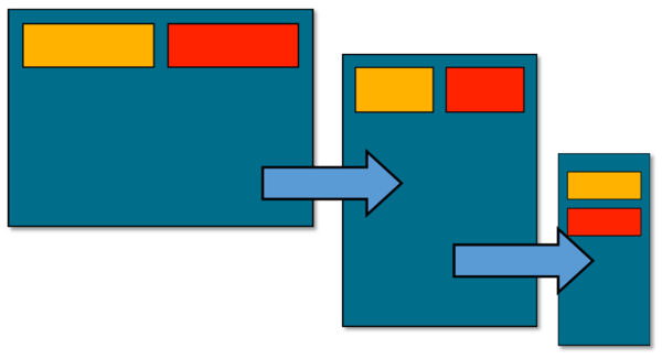
- Static layout: Fluid design changes properties of elements, but the layout doesn’t change. The relationship between the elements are not altered between versions of this design.
- Responsive design: Any UI designed to adapt to the current viewing device by providing a different layout for the page elements. Its Characteristics are:
- Adaptive: Changes the UI experience based on the screen size.
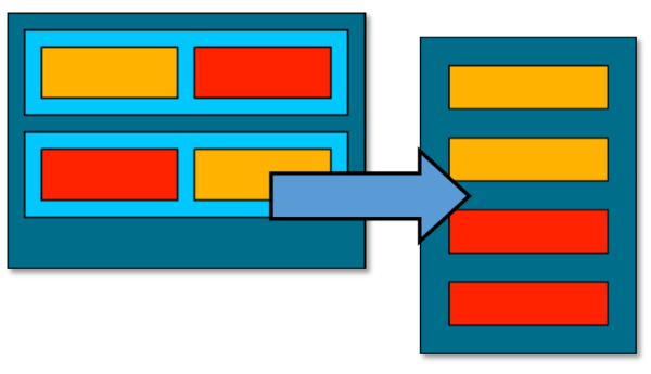
- Dynamic layout: Responsive designs will provide different layouts and even different components altogether depending on the current screen size.
Illustrations
- Fluid design: Elements are resized, but their layout does not change.
- Responsive design: A different layout is generated based on the size of screen.

