Borderlayout
From Documentation
Component Reference
Component Reference: Borderlayout, North, South, Center, West, East
DOM Structure
<div class="z-borderlayout">
    <!-- North -->
    <div>
        <div class="z-north">
            <div class="z-north-header">
                <i class="z-borderlayout-icon z-icon-chevron-up"></i>
            </div>
            <div class="z-north-body"></div>
        </div>
        <div class="z-north-splitter">
            <span class="z-north-splitter-button">
                <i class="z-north-icon z-icon-ellipsis-horizontal"></i>
                <i class="z-north-icon z-icon-caret-up"></i>
                <i class="z-north-icon z-icon-ellipsis-horizontal"></i>
            </span>
        </div>
        <div class="z-north-collapsed">
            <i class="z-borderlayout-icon z-icon-chevron-down"></i>
        </div>
    </div>
    <!-- South (same as North) -->
    <!-- East (same as North) -->
    <!-- West (same as North) -->
    <!-- Center -->
    <div>
        <div class="z-center">
            <div class="z-center-header"></div>
            <div class="z-center-body"></div>
        </div>
    </div>
</div>
- Line 6: Chevron-direction Icon Font used for North, South, East and West.
- North: Chevron-up
- South: Chevron-down
- West: Chevron-left
- East: Chevron-right
- Line 12, 14: Ellipsis-horizontal Icon Font used for North and South, Ellipsis-vertical Icon Font used for East and West.
- Line 13: Caret-direction Icon Font used forNorth, South, East and West.
- North: Caret-up
- South: Caret-down
- West: Caret-left
- East:Caret-right
- Line 18: Chevron-direction Icon Font used for Collapsed North, South, East and West.
- South: Chevron-up
- North: Chevron-down
- East: Chevron-left
- West: Chevron-right
LESS Source
Basically, LESS source is correspondent to its DOM structure. North, South, East and West have different styles.
/* borderlayout and it's icon */
.z-borderlayout {
    &-icon {}
}
/* North, South, East, West and Center style */
.z-north,
.z-south,
.z-west,
.z-east,
.z-center {
    &-header {}
    &-body {}
}
.z-north,
.z-south,
.z-west,
.z-east {
    &-collapsed {}
    &-splitter {}
    &-icon {}
}
Check complete LESS source for Borderlayout from Github.
LESS Variables
The following LESS variables are used for Splitter between North, South, East and West components. Check other variables from here.
| Variables | Default Value |
|---|---|
| @splitterGradientStart | #FDFDFD |
| @splitterGradientEnd | #F1F1F1 |
Customize Sample
Target Design
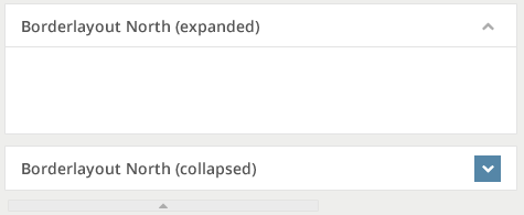
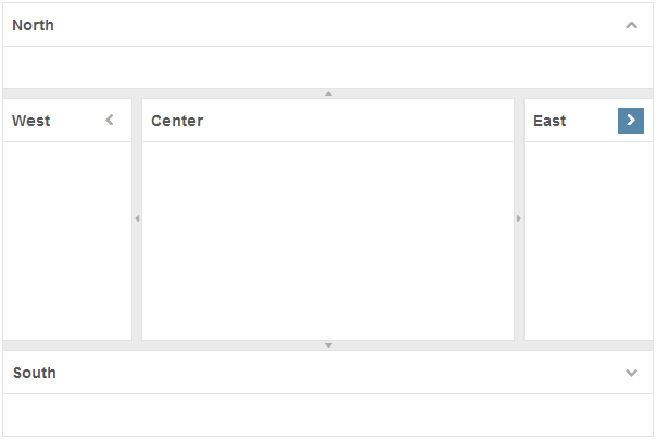
Assume the image below is our target design for Borderlayout component and Splitter component.
Implementation Details
Setup environment and Analyze design
- Check the instruction to setup component customization environment.
- Analyze the design
- Used Color for Borderlayout (include North, South, East, West, and Center)
- Title Text: 14px, #555555
- Border: #E3E3E3
- Background: #FFFFFF
- Icon: 12px, #ACACAC
- Icon Background: #FFFFFF
- Icon Hover: 12px, #FFFFFF
- Icon Hover Background: #5687A8
- Used Color for Splitter
- Background: #EBEBEB
- Icon: 12px, #ACACAC
- Borderlayout Size
- Height (North and South): 40px
- Width (East and West): 40px
- Horizontal Padding: 8px
- Vertical Padding: 8px
- Icon: 24px * 24px
- Splitter Size
- Height (North and South): 8px
- Width (East and West): 8px
- Used Color for Borderlayout (include North, South, East, West, and Center)
Modify borderlayout.less file to achieve target design
Refer here for built-in zk less functions.
- Modify Borderlayout Icon color and size.
.z-borderlayout {
	/* omitted */

	&-icon {
		.iconFontStyle(12px, #ACACAC);
		.displaySize(block, 24px, 24px);
		line-height: 24px;
		.opacity(1);
		position: absolute;
		right: 8px; /* horizontal padding */
		/* omitted */

		&:hover {
			color: #FFFFFF;
			background: #5687A8;
		}
	}
}
- Modify Borderlayout Title (North, South, East, West and Center) color and size.
.z-north,
.z-south,
.z-west,
.z-center,
.z-east {
	border: 1px solid #E3E3E3;
	/* omitted */

	&-header {
		.fontStyle(@baseTitleFontFamily, 14px, bold, #555555);
		height: 40px;
		border-bottom: 1px solid #E3E3E3;
		padding: 8px 8px 7px;
		line-height: 24px;
		.verGradient(#FFFFFF, #FFFFFF); /* no gradient, pass the same color arguments for the function */
		/* omitted */
	}

	&-collapsed {
		.size(40px, 40px);
		border: 1px solid #E3E3E3;
		padding: 8px;
		background: #FFFFFF;
		/* omitted */
	}

	&-caption {
		height: 40px;
	}
}
- Modify Splitter (North, South, East, West and Center) color and size.
.z-east,
.z-west,
.z-north,
.z-south {
	&-splitter {
		.size(8px, 8px);
		.horGradient(#EBEBEB, #EBEBEB); /* no gradient, pass the same color arguments for the function */
		/* omitted */

		// splitter-button
		&-button {
			color: #ACACAC;
			border: 0; /* no border */
			/* omitted */
		}
		&-button-disabled {
			border: 0;
		}
	}

	&-icon {
		font-size: 12px;
		.opacity(1);
		/* omitted */
	}
}
.z-north-splitter,
.z-south-splitter {
	border-left: 1px solid #E3E3E3;
	border-right: 1px solid #E3E3E3;
	.verGradient(#EBEBEB, #EBEBEB); /* no gradient, pass the same color arguments for the function */
	/* omitted */
}

/* don't need Ellipsis icons  */
.z-west-icon.z-icon-ellipsis-vertical,
.z-east-icon.z-icon-ellipsis-vertical {
	display: none;
}
.z-north-icon.z-icon-ellipsis-horizontal,
.z-south-icon.z-icon-ellipsis-horizontal {
	display: none;
}
Final result
Additional Customization
The collapsed bar position is decide by LayoutRegion.getCmargins(). Therefore, it is not possible to change the position of collpased bar by CSS. However, it can still be customized by LayoutRegion.setCmargins(String) like the following.
<borderlayout width="600px" height="400px">
	<east title="East" size="20%" collapsible="true" splittable="true" cmargins="0, 3, 0, 0">
	</east>
</borderlayout>
Version History
| Version | Date | Content |
|---|---|---|

