Hflex and Vflex"
| Line 116: | Line 116: | ||
The result is | The result is | ||
| − | [[Image: | + | [[Image:DrGridFlex.png]] |
Notice that we also specify <tt>hflex="1"</tt> to the textbox, so it will take up the whole space. | Notice that we also specify <tt>hflex="1"</tt> to the textbox, so it will take up the whole space. | ||
Revision as of 07:31, 22 December 2010
Hflex (HtmlBasedComponent.setHflex(String)) and vflex (HtmlBasedComponent.setVflex(String)) indicate the flexibility of the component, which indicates how an component's parent distributes remaining empty space among its children. Hflex controls the flexibility in the horizontal direction, while vflex the vertical direction.
Flexible components grow and shrink to fit their given space. Components with larger flex values will be made larger than components with lower flex values, at the ratio determined by the two components. The actual value is not relevant unless there are other flexible components within the same container. Once the default sizes of components in a box are calculated, the remaining space in the box is divided among the flexible components, according to their flex ratios. Specifying a flex value of 0 has the same effect as leaving the flex attribute out entirely.
Fit-the-Rest Flexibility
The simplest use of flex is to have one component to take the rest of the space of its parent (or the page, if it is the root component). For example,
<zk>
  <datebox/>
  <div vflex="1" style="background: yellow"/>
</zk>
And, the result
Notice that, if the parent has no predefined height (i.e., its height is decided by this children), the flexible component won't take any space. For example, the inner div (with vflex) takes no space in the following example:
<div>
  <datebox/>
  <div vflex="1" style="background: yellow"/><!-- height will be zero since height not specified in parent div -->
</div>
To solve it, you have to specify the height in the outer div, such as <div height="100%">, <div height="200px">, or <div vflex="1">.
Proportional Flexibility
The absolute value of the vflex/hflex is not that important. It is used to determine the proportion among flexible components. That is, you can give different integer to different child components so they will take space proportionally per the given vflex/hflex value. For example,
<div width="200px" height="50px">
	<div style="background: blue" vflex="1" hflex="1"/>
	<div style="background: yellow" vflex="2" hflex="1"/>
</div>
And, the result is
Here is another example (hflex):
<hlayout width="200px">
	<div style="background: blue" hflex="1">1</div>
	<div style="background: yellow" hflex="2">2</div>
</hlayout>
Minimum Flexibility
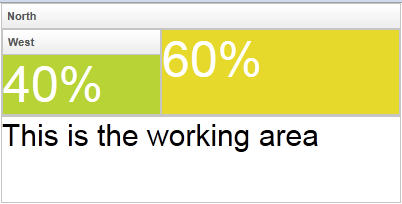
Sometimes, you might wish that the parent component's size is determined by its children. Or I shall say, the size of the parent component is just high/wide enough to hold all of its child components. We also support that. Just specify vflex/hflex="min".
<borderlayout height="100%">
  <north title="North" collapsible="true" vflex="min">
    <borderlayout  vflex="min">
      <west title="West" size="25%" flex="true" maxsize="250" splittable="true" collapsible="true" vflex="min">
        <div style="background:#B8D335">
        <label value="25%" style="color:white;font-size:50px" />
    </div>
    </west>
      <center border="none" flex="true" vflex="min">
        <div style="background:#E6D92C">
          <label value="25%" style="color:white;font-size:50px" />
        </div>
      </center>
      <east size="50%" border="none" flex="true" vflex="min">
        <label value="Here is a non-border" style="color:gray;font-size:30px" />
      </east>
    </borderlayout>
  </north>
  <center border="0">
    <box pack="center" align="center" width="100%" height="100%">
      <label value="This is the working area"
        style="font-size:30px" />
    </box>
  </center>
</borderlayout>
As you can see, the height of the north region of the outer borderlayout is determined by its child borderlayout. And the height of the inner borderlayout, in this example, is determined by the height of its west child region.
Also notice that the flex property (LayoutRegion.setFlex(boolean)) is unique to borderlayout (north and others). Don't confuse it with hflex or vflex.
Grid's Column and Flexibility
If hflex is specified in the header of grid, listbox and tree, it is applied to the whole column (including the header and contents).
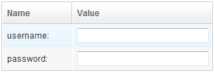
For example, we could assign 33% to the first column and 66% to the second as follows.
<grid width="300px">
	<columns>
		<column label="Name" hflex="1"/>
		<column label="Value" hflex="2"/>
	</columns>
	<rows>
		<row>username:<textbox hflex="1"/></row>
		<row>password:<textbox hflex="1"/></row>
	</rows>
</grid>
The result is
Notice that we also specify hflex="1" to the textbox, so it will take up the whole space.
Flexibility versus Percentage
Flexibility and Resizing
Vflex and hflex support resizing. If the parent component or the browser window changes its size which increase or decrease the extra space, the child components with vflex/hflex will recalculate themselves to accommodate the new size.
<zk>
	<zscript><![CDATA[
		int[] str = new int[100];
		for(int i=0;i<100;i++){
			str[i]=i;
		}
	]]></zscript>

	<div height="100%" width="300px">
		Top of the Tree
		<tree vflex="1">
			<treechildren>
				<treeitem forEach="${str}" label="item${each}"/>
			</treechildren>
		</tree>
		<tree vflex="2">
			<treechildren>
				<treeitem forEach="${str}" label="item${each}"/>
			</treechildren>
		</tree>
		Bottom of the Tree
	</div>
</zk>
Note that the height proportion between the two trees are always 1 : 2, when we change the browser height.
Limitations
Spna Ignores Width and Height
Span ignores the width and height, so hflex and vflex has no effect on them (unless you specify display:block -- but it makes it div eventually).
<!-- this example does not work -->
<div width="200px">
	<span style="background: blue" hflex="1">1</span>
	<span style="background: yellow" hflex="2">2</span>
</div>
And, the result is as follows - the width has no effect:
This limitation can be solved by use of hlayout and div as follows.
<!-- this is correct -->
<hlayout width="200px">
	<div style="background: blue" hflex="1">1</div>
	<div style="background: yellow" hflex="2">2</div>
</hlayout>
Hflex Must Align Correctly
Hflex will be wrong if a component is aligned in the same row with its siblings. For example,
<div width="200px">
  <div style="background: blue" hflex="1">1</div><!-- not work since it won't be aligned with sibling div -->
  <div style="background: yellow" hflex="2">2</div>
</div>
As shown below, the second div is not aligned vertically with the first div, so is the width not as expected:
This limitation can be solved by use of hlayout and div as show in the previous subsection.
Version History
| Version | Date | Content |
|---|---|---|


