Useful Java Utilities"
| Line 66: | Line 66: | ||
Scrolls the parent of the given component, so the given one becomes visible in the view. | Scrolls the parent of the given component, so the given one becomes visible in the view. | ||
| − | + | {{versionSince| 9.5.0}} | |
[http://www.zkoss.org/javadoc/latest/zk/org/zkoss/zk/ui/util/Clients.html#scrollIntoView(java.lang.String) Clients.scrollIntoView(String selector)] | [http://www.zkoss.org/javadoc/latest/zk/org/zkoss/zk/ui/util/Clients.html#scrollIntoView(java.lang.String) Clients.scrollIntoView(String selector)] | ||
Revision as of 01:08, 14 December 2021
In this section we introduce some of the most commonly used Java utility classes.
Executions
getCurrent
Retrieves the current execution (request/response).
createComponents
With this method, you can create components defined in another zul file and attach them to the current page.
sendRedirect
Redirects to another URL. If the parameter is left null, it will redirect to the current page.
Sessions
getCurrent
Retrieves the current session.
Clients
This class offers a collection of methods which manipulate client side via AU Response.
evalJavaScript
This method sends an AU Response to execute the given JavaScript on client side, which is the standard way of calling JavaScript from server side in ZK. For example,
Clients.evalJavaScript("zk.log('Hi.');");
[since 9.6.0]
To handle javascript error while triggered evalJavascript, org.zkoss.zk.ui.ScriptErrorListener.class is provided.
focus
[since 9.5.0]
Clients.focus(Component component)
Clients.focus(String selector)
Focus the given component or the selector matched component.
scrollIntoView
Clients.scrollIntoView(Component cmp)
Scrolls the parent of the given component, so the given one becomes visible in the view.
Since 9.5.0
Clients.scrollIntoView(String selector)
Scrolls the parent of the selector matched component, so the given one becomes visible in the view.
showBusy/clearBusy
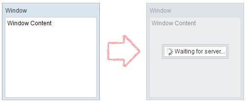
Display/dismiss a busy icon, so user knows server is working or has finished working on something. For example,
Clients.showBusy(window, "Waiting for server...");
showNotification
[since 6.0.1]
[since 9.0.0]
It is advised to use Notification class which was introduced in ZK 9 instead.
Shows a notification box, which is dismissed upon left click (like a Popup). You can either display a global notification (bigger) or a notification specific to another component (smaller with an arrow pointing to the target component).
Clients.showNotification(msg); // display a global notification box
Clients.showNotification(msg, component); // display a notification box pointing to a component
You can also specify its position, style, and duration (for auto-dismiss):
Clients.showNotification(msg, type, component, position, duration);
Type determines the style of the notification box.
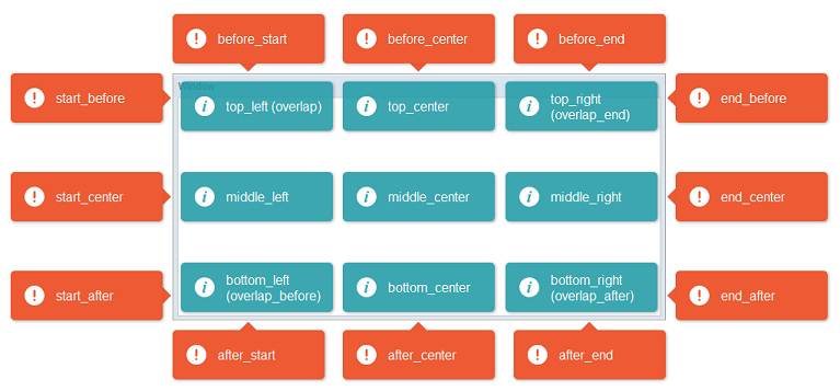
Here are the available positions:
Closable
[since 6.5.0]
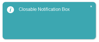
Notification now supports closable to let user close the notification box manually.
// add close icon on the top right corner of notification box
Clients.showNotification(msg, closable);
Multiline
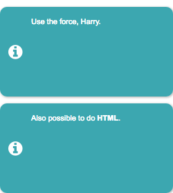
To show a multiline message, just append <br/> in the message string.
Clients.showNotification("msg1 <br/> msg2 <br/>");
Notification
[since 9.0.0]
org.zkoss.zk.ui.util.Notification
This class offers a collection of methods showing a notification box, which is dismissed upon left click (like a Popup). You can either display a global notification (bigger) or a smaller notification specific to another component (smaller with an arrow pointing to the target component).
Notification.show(msg); // display a global notification box
Notification.show(msg, component); // display a notification box pointing to a component
Toast
- Available for ZK:
-

[since 9.0.0]
This class offers a collection of methods showing a toast notification, which is dismissed upon left click (like a Popup). Unlike Notification, Toast is stackable.
Toast.show(msg); // display a toast notification
Toast.show(msg, "warning", "top_right"); // display a toast notification on top-right of the browser viewport
You can also specify its position, style, duration (for auto-dismiss) and closable:
Toast.show(msg, type, position, duration, closable);
Here are the available positions:
| left | center | right | |
|---|---|---|---|
| top | top_left | top_center | top_right |
| middle | middle_left | middle_center | middle_right |
| bottom | bottom_left | bottom_center | bottom_right |
Animation Speed
To specify the duration of opening and closing animation, org.zkoss.zkmax.ui.util.Toast.animationSpeed is provided.
<library-property>
	<name>org.zkoss.zkmax.ui.util.Toast.animationSpeed</name>
	<value>500</value>
</library-property>
Loadingbar
- Available for ZK:
-

Since 9.0.0
org.zkoss.zkmax.ui.util.Loadingbar
A Loadingbar behaves like a Progressmeter that provides information on the progress of a task.
You can control a loadingbar with the LoadingbarControl.
// create a LoadingbarControl for control the loadingbar
LoadingbarControl loadingbarCtrl = Loadingbar.createLoadingbar("myId");
loadingbarCtrl.start();
loadingbarCtrl.update(20); // update the value to 20
loadingbarCtrl.finish();
You can also specify its value(0~100), position(top/bottom) and indeterminate(true/false):
loadingbarCtrl.start(20, "top", false);
You can turn on/off the indeterminate animation by control the loadingbar:
loadingbarCtrl.update(true); // set loadingbar indeterminate true
Animation Speed
To specify the Loadingbar animation speed, org.zkoss.zkmax.ui.util.Loadingbar.animationSpeed is provided.
<library-property>
	<name>org.zkoss.zkmax.ui.util.Loadingbar.animationSpeed</name>
	<value>500</value>
</library-property>
Version History
| Version | Date | Content |
|---|---|---|
| 6.0.1 | March 2012 | Add Clients.showNotification() |
| 6.5.0 | July 2012 | ZK-1145: Notification supports closable |
| 9.0.0 | Sep 2019 | ZK-4371: Provide a Toast utility |
| 9.0.0 | Sep 2019 | ZK-4372: Extract Notification functionalities from Clients |
| 9.0.0 | Nov 2019 | ZK-4379: Provide a Loadingbar utility |
| 9.5.0 | Sep 2020 | ZK-4624: Clients API support scrollIntoView and focus by using selector string |


