Cardlayout"
m ((via JWB)) |
|||
| Line 40: | Line 40: | ||
=Supported Events= | =Supported Events= | ||
| − | {| | + | {| class='wikitable' | width="100%" |
! <center>Name</center> | ! <center>Name</center> | ||
! <center>Event Type</center> | ! <center>Event Type</center> | ||
| Line 53: | Line 53: | ||
=Use Cases= | =Use Cases= | ||
| − | {| | + | {| class='wikitable' | width="100%" |
! Version !! Description !! Example Location | ! Version !! Description !! Example Location | ||
|- | |- | ||
| Line 63: | Line 63: | ||
=Version History= | =Version History= | ||
{{LastUpdated}} | {{LastUpdated}} | ||
| − | {| | + | {| class='wikitable' | width="100%" |
! Version !! Date !! Content | ! Version !! Date !! Content | ||
|- | |- | ||
Revision as of 13:12, 7 January 2022
Cardlayout
- Demonstration: N/A
- Java API: Cardlayout
- JavaScript API: Cardlayout
- Style Guide: N/A
- Available for ZK:
-

Employment/Purpose
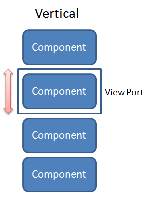
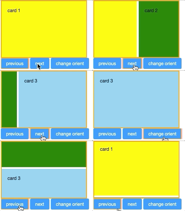
Cardlayout is a layout that allows end-users to change component like changing cards. The selectedIndex will decide which component will be shown in the view port. When the value of selectedIndex changes or when next() or previous() is called, transition of components through animation will occur whereas the orient attribute decides whether the direction of the animation is horizontal or vertical.
Example
    <cardlayout id="card" width="300px" height="200px" style="border:3px solid orange" selectedIndex="1">
        <div vflex="1" hflex="1" style="background-color:yellow;padding:20px">card 1</div>
        <div vflex="1" hflex="1" style="background-color:green;padding:20px">card 2</div>
        <div vflex="1" hflex="1" style="background-color:skyblue;padding:20px">card 3</div>
    </cardlayout>
    <hlayout>
        <button onClick="card.previous()">previous</button>
        <button onClick="card.next()">next</button>
        <button
          onClick='card.setOrient("horizontal".equals(card.getOrient()) ? "vertical" : "horizontal")'>
          change orient
        </button>
    </hlayout>
Size Issue
If Cardlayout of hflex is set as "min", it's width will be decided by the selected component's size when initializing. On the other hand, if the child component of Cardlayout sets hflex="1", its width will equal to Cardlayout's width.
Swipe Distance Issue
On tablet, think for user experience Cardlayout will change component if swipe distance bigger than one-third of it's width/height. If Cardlayout's width/height is smaller than 90px, the minimum trigger distance will be 30px. Another case is Image. If Cardlayout's child component is Image, it will use default swipe distance trigger setting.
Supported Events
| None | None |
- Inherited Supported Events: XulElement
Supported Children
*ALL
Use Cases
| Version | Description | Example Location |
|---|---|---|
Version History
| Version | Date | Content |
|---|---|---|
| 6.5.0 | August, 2012 | Cardlayout was introduced. |


