Lineitem"
m (→Properties) |
m ((via JWB)) |
||
| Line 63: | Line 63: | ||
{{LastUpdated}} | {{LastUpdated}} | ||
| − | {| | + | {| class='wikitable' | width="100%" |
! Version !! Date !! Content | ! Version !! Date !! Content | ||
|- | |- | ||
Revision as of 13:12, 7 January 2022
Lineitem
- Available for ZK:
-

[Since 9.0.0]
Employment/Purpose
Lineitem is the child of Linelayout, it can contain up to 2 components inside. The content of Lineitem will be placed separately in different area of linelayout.
Properties
Note: Lineitem does not support inline style, but you can still set height/width and vflex/hflex to customize spacing.
PointVisible
Sets whether the point is visible, the default value is true. This property only affects the point.
PointStyle
The CSS inline style for the point.
PointImageSrc
The source URI of the point background image.
PointImageContent
The point background Image content.
PointIconSclass
Specify the sclass name of the point icon.
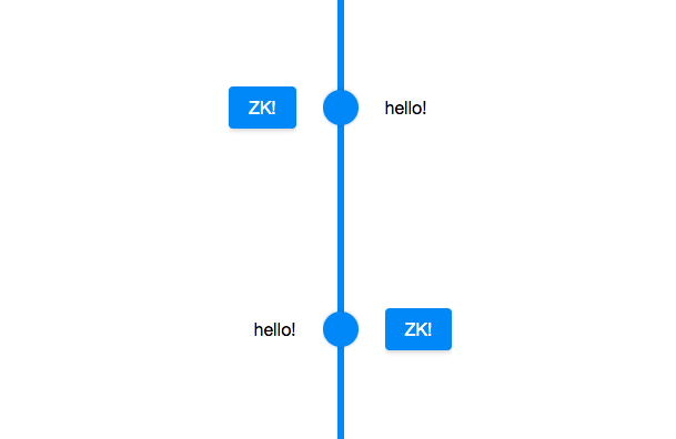
Opposite
Set whether the first child is displayed in the first area(left when it is vertical / top when it is horizontal). The default value is false. Once the first child is displayed in the first or last area, the second child will be displayed in the other area.
<zk>
	<linelayout height="400px">
		<lineitem>
			<label>hello!</label>
			<button label="ZK!"></button>
		</lineitem>
		<lineitem opposite="true">
			<label>hello!</label>
			<button label="ZK!"></button>
		</lineitem>
	</linelayout>
</zk>
FrontSpace
Sets additional spacing from the previous lineitem. (such as "5px" or "5em"). If null or empty (""), the default spacing is used (i.e., controlled by CSS alone).
BackSpace
Sets additional spacing to the next lineitem. (such as "5px" or "5em"). If null or empty (""), the default spacing is used (i.e., controlled by CSS alone).
Supported Children
* ALL
Version History
| Version | Date | Content |
|---|---|---|
| 9.0.0 | Nov 2019 | ZK-4377: Provide a Linelayout component |
