Selectbox
Selectbox
- Demonstration: selection_dropdown
- Java API: Selectbox
- JavaScript API: Selectbox
- Style Guide: N/A
- Available for ZK:
-

Since 6.0.0
Employment/Purpose
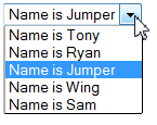
Selectbox is a lightweight dropdown list and it can support ListModel, Renderer, and Databinding as well. The benefit of it is not to create child widgets for each data, so the memory usage is much lower at the server.
Example
<zk>
	<zscript>
		<![CDATA[
		String[] userName = { "Tony", "Ryan", "Jumper", "Wing", "Sam" };
		ListModelList model = new ListModelList(userName);
	]]></zscript>
	<selectbox model="${model}" onSelect='alert(model.get(event.getData()));'>
		<template name="model">
			Name is ${each}
		</template>
	</selectbox>
</zk>
To give the selectbox an initial value, for example, Tony, add the following code after the model is created:
model.addToSelection ("Tony");
Data binding
Here is the MVVM way:
    <zscript><![CDATA[
    public class MyUserBean {
        private String[] userList = { "Tony", "Ryan", "Jumper", "Wing", "Sam" };
        private int index = 0;

        public ListModelList getUserList() {
            return new ListModelList(Arrays.asList(userList));
        }

        public void setUserList() {
        }

        public void setIndex(int ind) {
            index = ind;
        }

        public int getIndex() {
            return index;
        }

    }
    MyUserBean mybean = new MyUserBean();
/**   Implements ItemRenderer without using template
       org.zkoss.zul.ItemRenderer render = new org.zkoss.zul.ItemRenderer() {
        public String render(Component owner, Object data, int index) throws Exception {
            return data.toString();
        }
    };
*/
    ]]></zscript>
    <div apply="org.zkoss.bind.BindComposer">
        Select User:
        <selectbox id="box" model="@init(mybean.userList)"
                   selectedIndex="@bind(mybean.index)">
            <template name="model">${each}</template>
        </selectbox>

    Selected:
    <label id="val" value="@load(mybean.index)" />
    </div>
Custom Item Rendering
Since this component has no child component like Listbox, if you want to render its items differently, there 2 ways:
Change text
If you just want to change the text e.g. enclosing it with brackets, just put <template> as its child and add characters with ${each}:
   <selectbox>
       <template name="model">[${each}]</template>
   </selectbox>
- The template only allows text that can be converted into a ZK
Label.
Change HTML Structure
If you want to make more changes e.g. adding tooltips by setting title attributes, you need to create your own ItemRenderer. See ZK Developer's Reference/MVC/View/Renderer/Item Renderer.
Supported Events
onSelect |
Event: SelectEvent
Notifies one that the user has selected a new item in the selectbox. |
- Inherited Supported Events: HtmlBasedComponent
Supported Children
*NONE
Use Cases
| Version | Description | Example Location |
|---|---|---|
Version History
| Version | Date | Content |
|---|---|---|
| 6.0.0 | October 4, 2011 | Add the new Selectbox component |
| 6.0.0-RC2 | December 6, 2011 | Rename OptionRenderer to ItemRenderer |
