Borderlayout
Borderlayout
- Demonstration: Borderlayout
- Java API: Borderlayout
- JavaScript API: Borderlayout
- Style Guide: Borderlayout
Employment/Purpose
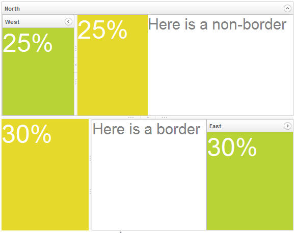
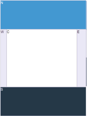
The layout component is a nested component. The parent component is borderlayout, and its children components include north, south, center, west, and east. All extra space is placed in the center area. The combination of children components of borderlayout is free.
A borderlayout could be nested to another borderlayout (actually, almost all kinds of components) to form a complicated layout.
Example
<borderlayout height="450px">
	<north title="North" maxsize="300" size="50%" splittable="true" collapsible="true">
		<borderlayout>
			<west title="West" size="25%" flex="true" maxsize="250" splittable="true" collapsible="true">
				<div style="background:#B8D335">
					<label value="25%"
						style="color:white;font-size:50px" />
				</div>
			</west>
			<center border="none">
				<div style="background:#E6D92C" vflex="1">
					<label value="25%"
						style="color:white;font-size:50px" />
				</div>
			</center>
			<east size="50%" border="none">
				<label value="Here is a non-border"
					style="color:gray;font-size:30px" />
			</east>
		</borderlayout>
	</north>
	<center border="0">
		<borderlayout>
			<west maxsize="600" size="30%" border="0" splittable="true">
				<div style="background:#E6D92C" vflex="1">
					<label value="30%"
						style="color:white;font-size:50px" />
				</div>
			</west>
			<center>
				<label value="Here is a border"
					style="color:gray;font-size:30px" />
			</center>
			<east title="East" size="30%" collapsible="true">
				<div style="background:#B8D335"  vflex="1">
					<label value="30%"
						style="color:white;font-size:50px" />
				</div>
			</east>
		</borderlayout>
	</center>
</borderlayout>
How to Layout
Borderlayout divides its child components into to five areas: North, South, East, West and Center. The heights of North and South are firstly decided, the remainder space is then given to Center as its height. Note that East and West also takes on the height of Center.
flex
Layout region shares the height of Borderlayout with a distributing sequence of: North, South and Center while the heights of East and West takes on the height of Center. In the previous sample, the div in the layout region does not take up all of layout region's space. In order for the child to occupy the whole area, please set vflex="1" to the child component.
Scrolling
- The height of Center depends on Borderlayout but not on its child, therefore, the height of Center will not be expanded by the growing size of its child components. If Center's height is too short for it's child, Center will cut out the contents of it's child, hence, to avoid this, specify autoscroll="true" to Center in order to assign Center to handle the scrolling.
[Since 7.0.0]
The autoscroll attribute will create floating scrollbar and it is not visible unless user mouse over on the region. To turn off the floating scrollbar and use browser's default scrollbar, please add the following configuration in zk.xml.
<library-property>
    <name>org.zkoss.zul.nativebar</name>
    <value>true</value>
</library-property>
Note: the value of org.zkoss.zul.nativebar is true by default (since 7.0.2)
Grown by children
- To make Borderlayout dependable on the size of its child components, vflex feature is applied. Specify vflex="min" to each layout region and Borderlayout.
Borderlayout in a container
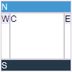
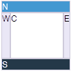
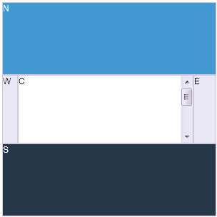
- Almost all containers' heights depend on their child components, however, the height of Borderlayout does not expand accordingly to the sizes of its child components, therefore, when placing Borderlayout in a container, users have to specify a fixed height in order for Borderlayout to be visible.
<zk>
	<window title="win" border="normal">
		<borderlayout height="200px">
			<north>
				<div style="background:blue">N</div>
			</north>
			<south>
				<div style="background:blue">S</div>
			</south>
			<center>
				<div>C</div>
			</center>
			<east>
				<div style="background:yellow">E</div>
			</east>
			<west>
				<div style="background:yellow">W</div>
			</west>
		</borderlayout>
	</window>
</zk>
- The default height of Borderlayout is dependent on its parent component, therefore, users can also put Borderlayout in a container with a fixed height.
<zk>
	<window title="win" border="normal" height="200px">
		<borderlayout>
			<north>
				<div style="background:blue">N</div>
			</north>
			<south>
				<div style="background:blue">S</div>
			</south>
			<center>
				<div>C</div>
			</center>
			<east>
				<div style="background:yellow">E</div>
			</east>
			<west>
				<div style="background:yellow">W</div>
			</west>
		</borderlayout>
	</window>
</zk>
Properties
AnimationDisabled
Since 5.0.8 You can specify this property to true to disable the animation effects of this component.
Configure to Disable the Animation Effects as Default
If you prefer to disable the animation effects as default, you could configure ZK by adding the following to /WEB-INF/zk.xml
<library-property>
	<name>org.zkoss.zul.borderlayout.animation.disabled</name>
	<value>true</value>
</library-property>
Supported Events
| None | None |
- Inherited Supported Events: HtmlBasedComponent
Supported Children
* North, South, Center, West, East
Use Cases
| Version | Description | Example Location |
|---|---|---|
Version History
| Version | Date | Content |
|---|---|---|
| 5.0.8 | August 11, 2011 | Added a way to disable the animation of borderlayout. |
| 6.0.0 | Feb 14, 2012 | The flex attribute has been deprecated, please set vflex="1" to the child component in order to occupy the whole area. |
| 7.0.2 | April 2014 | Due to the better user-firendly for the scrollbar layout, we changed the org.zkoss.zul.nativebar of the library property to true by default for Grid, Listbox, Tree and Borderlayout component. |
