Difference between revisions of "Embed demo"
From Documentation
| Line 3: | Line 3: | ||
If the <code>select</code> mold is used, Listbox renders an HTML <code><select></code> tag instead. | If the <code>select</code> mold is used, Listbox renders an HTML <code><select></code> tag instead. | ||
| − | <div id="demo1" class="component-demo" data-path="data/listbox/listbox.zul"> | + | <div id="demo1" class="component-demo" data-path="data/listbox/listbox-mold.zul"> |
... | ... | ||
</div> | </div> | ||
Latest revision as of 03:00, 2 November 2022
Select Mold
If the select mold is used, Listbox renders an HTML <select> tag instead.
...
	<listbox mold="select">
		<listitem label="Matthew"/>
		<listitem label="Macus"/>
		<listitem label="Lucas"/>
		<listitem label="John"/>
	</listbox>
Note: if the mold is "select", rows is "1", and none of the items are marked as selected, the browser will display the listbox as if the first item is selected. Worst of all, if user selects the first item in this case, no onSelect event is sent. To avoid this confusion, developers should select at least one item when using mold="select" and rows="1".
In addition to each items label, you can assign an application-specific value to each item using the setValue method.
Listgroup Supported
Since 8.6.0
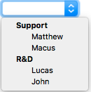
This mold supports having Listgroups and renders them as HTML <optgroup>.
...
<listbox mold="select">
<listgroup label="Support"/>
<listitem label="Matthew"/>
<listitem label="Macus"/>
<listgroup label="R&D"/>
<listitem label="Lucas"/>
<listitem label="John"/>
</listbox>
