New Features of ZK 8.6.0"
m (→Introduction) |
|||
| Line 15: | Line 15: | ||
* 10+ New Components | * 10+ New Components | ||
* Breeze-compatible Compact Theme | * Breeze-compatible Compact Theme | ||
| + | |||
ZK 8.6 contains versatile components that is exclusively designed for modern users with improved usability, functions, and features. | ZK 8.6 contains versatile components that is exclusively designed for modern users with improved usability, functions, and features. | ||
Revision as of 01:23, 29 October 2018
Hawk Chen, Engineer, Potix Corporation
2018
ZK 8.6.0
Introduction
Having rich and user-friendly components was one of the main reasons that developers love ZK. Now, with the release of the 8.6 version, we aim at creating more integrated and modernernized features that excites your users. You will come across enhanced multimedia and input widgets such as video clips, toggle switch, signature or slider knob, and image cropper.
Expect a better look and feel of different applications with improved efficiency. With Iceblue Compact, you can easily create a refreshed theme without losing the essentials.
Highlights:
- 10+ New Components
- Breeze-compatible Compact Theme
ZK 8.6 contains versatile components that is exclusively designed for modern users with improved usability, functions, and features.
Download and Demo
Highlighted Features
Refresh Theme without a Change - Compact Theme
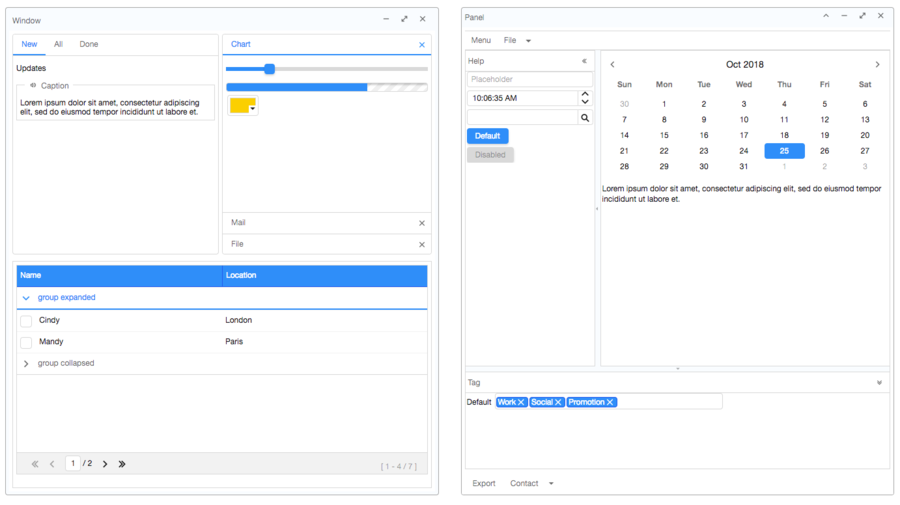
The new default Iceblue theme from 8.5 was great and brought you with a refreshed, ultra modern look and feel. Now, for users upgrading from an older version, Iceblue Compact is available bringing you a same refreshed modern look and feel, along with breeze-compatible font size, paddings, and margins. Yes, this means zero code upgrade!
For theme-pack theme users, all 24 theme pack themes have their corresponding compact theme. To apply a theme, you need to include theme pack jar and specify the compact theme name, for example:
<library-property>
    <name>org.zkoss.theme.preferred</name>
    <value>iceblue_c</value>
</library-property>
- Each compact theme is named after the original theme name appended with "_c". For example, iceblue_c.
Please check them out at Theme Demo
Ios Style Switch and Toggle
- Available for ZK:
-

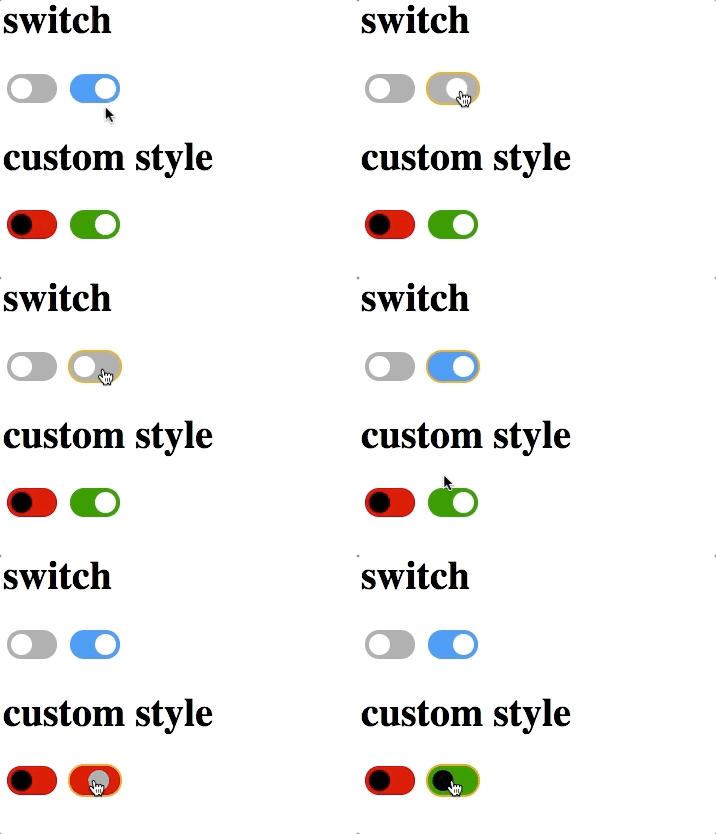
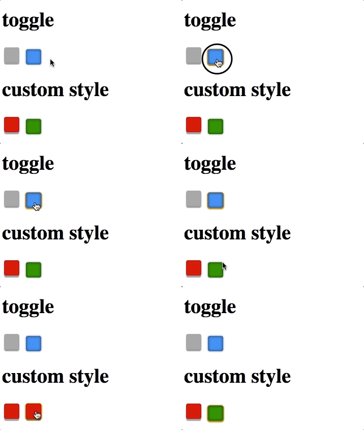
Checkbox supports 2 new molds: switch mold and toggle mold.
Ios Style Switch
Toggle
Tri-state Checkbox
- Available for ZK:
-

In addition to Checked and Unchecked, the Checkbox component now supports indeterminate states:
Slider Knob
- Available for ZK:
-

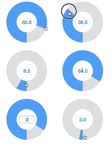
Set mold attribute with knob will enable slider knob. You can control it by mouse wheeling, dragging, clicking or by entering a value into the textbox in the center.
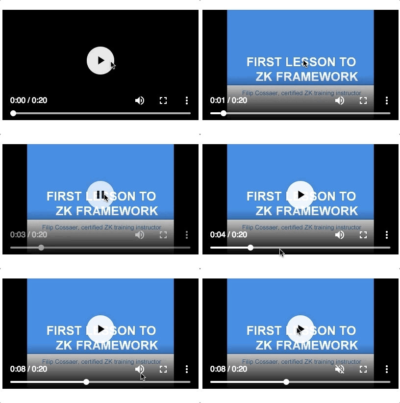
Video Player
- Available for ZK:
-

With this component, you can build your own youtube or a online school.
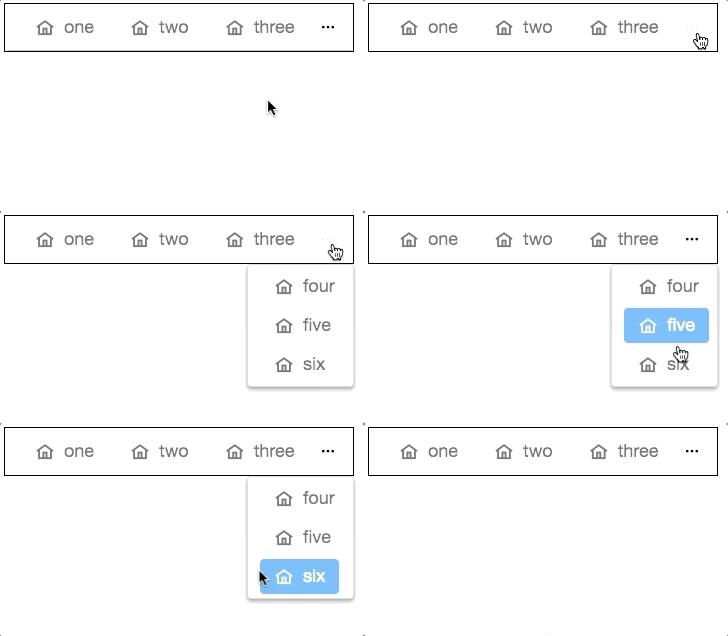
Toolbar Accommodates More Buttons
- Available for ZK:
-

When overflowPopup="true", a toolbar will have a ... symbol that shows a popup which contains those buttons weren't able to fit in the toolbar.
- Available for ZK:
-

With the help of NavigationModel and <apply>, we can construct a multi-level page navigation mechanism and navigate among those pages by loading the template.
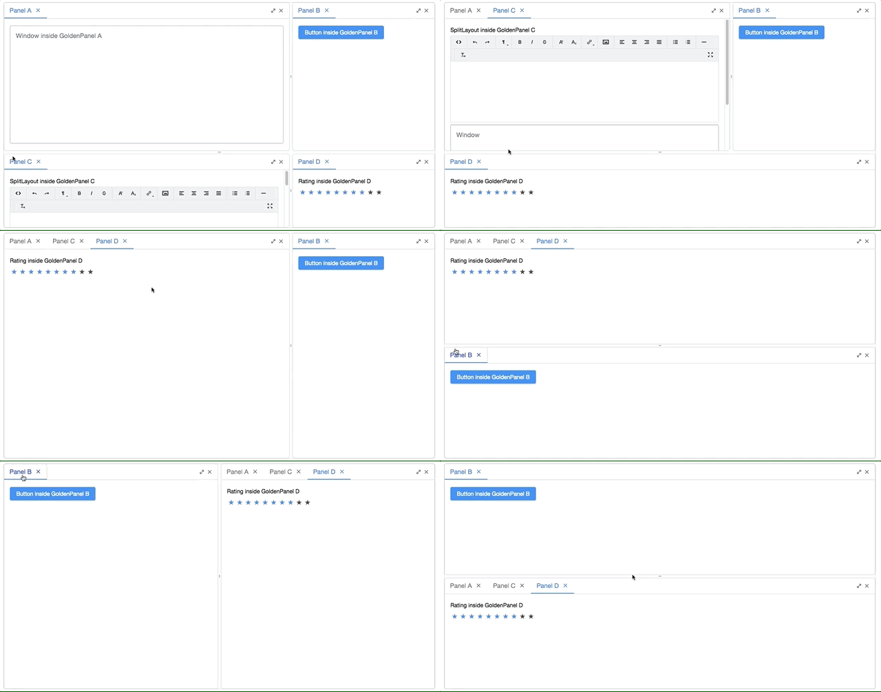
Multi-Screen Layout - Goldenlayout
- Available for ZK:
-

GoldenLayout is a layout container which layouts panels as docker type. You can drag a panel to dock at 4 regions (north, east, south, west) or to stack on another panel. This component is suitable for building a workspace like interface.
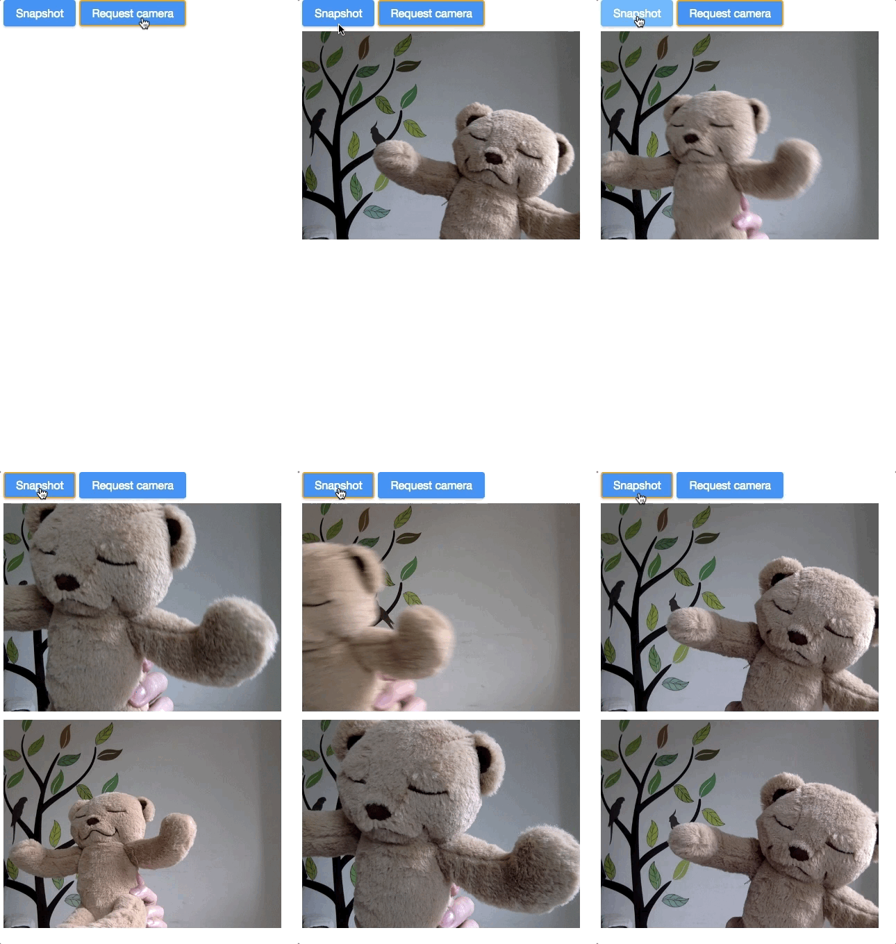
Smile! - Camera
- Available for ZK:
-

Developers can control the Camera component to take a snapshot with the camera that a browser can access.
Record a Clip
- Available for ZK:
-

The Camera component can also record a clip with the camera that a browser can access.
Show Your Organization - Organigram
- Available for ZK:
-

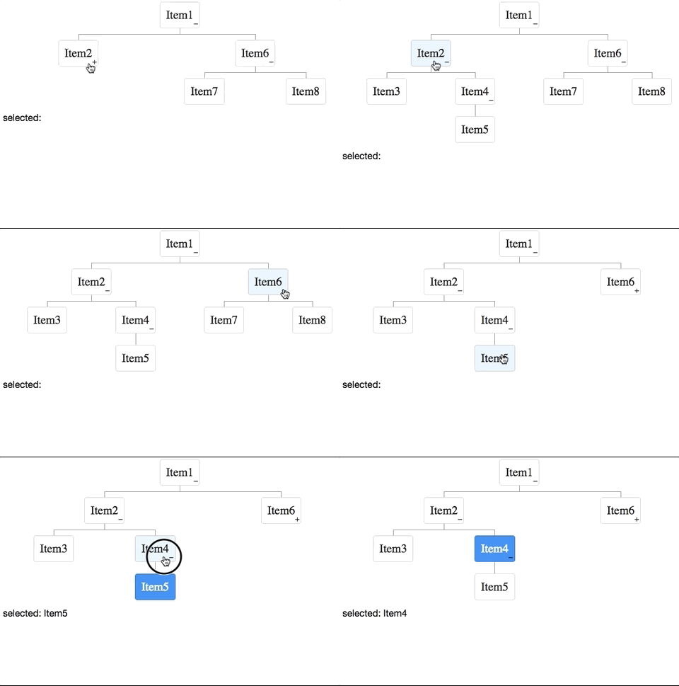
The component can render a organizational diagram upon a TreeModel.
Sign Here, Please
- Available for ZK:
-

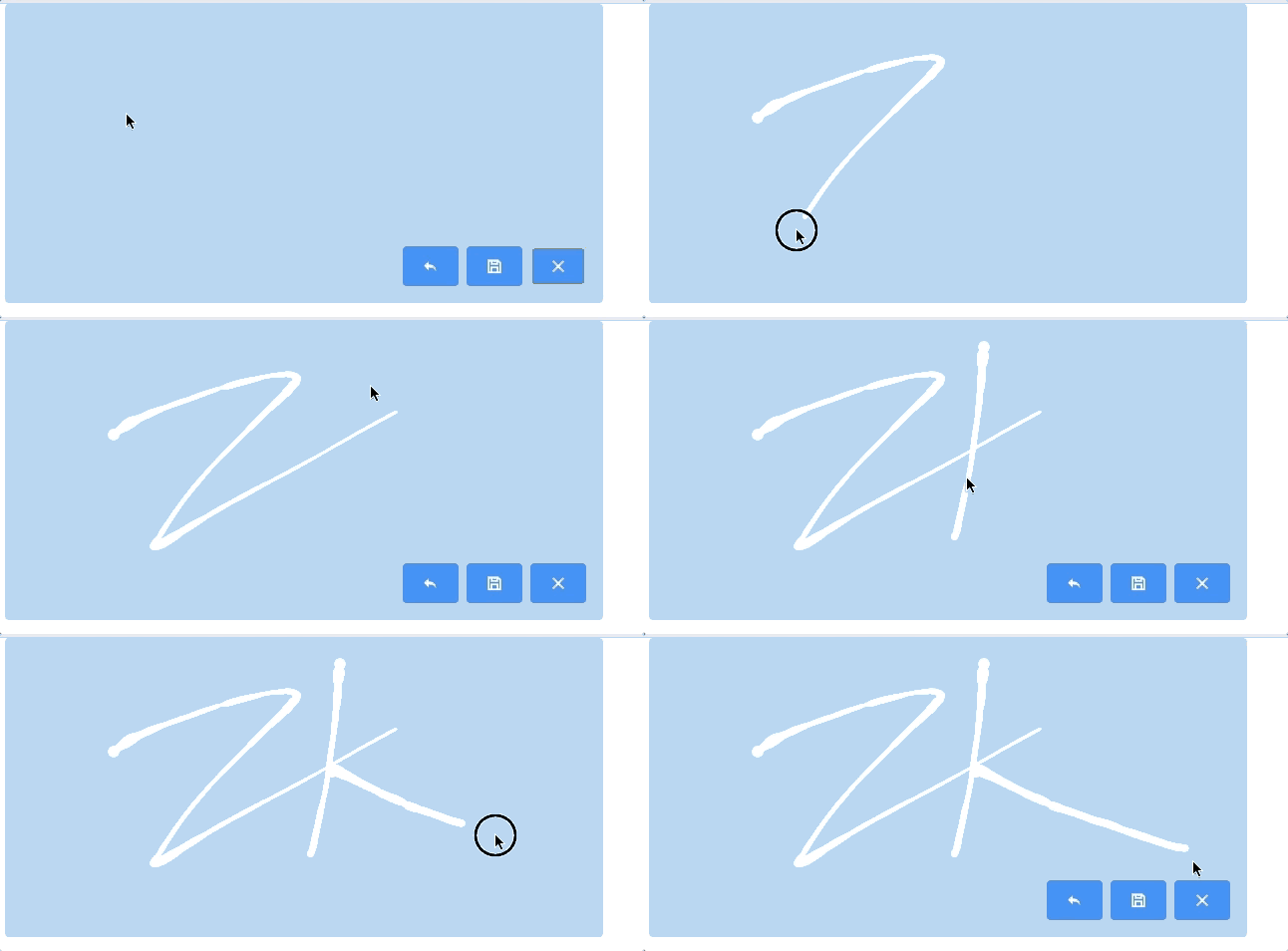
Signature supports singature pad on the desktop and mobile browsers. Developers can setup pen size, pen color, and background color etc. Users can undo, save and clear their signatres.
Give Me a Rating
- Available for ZK:
-

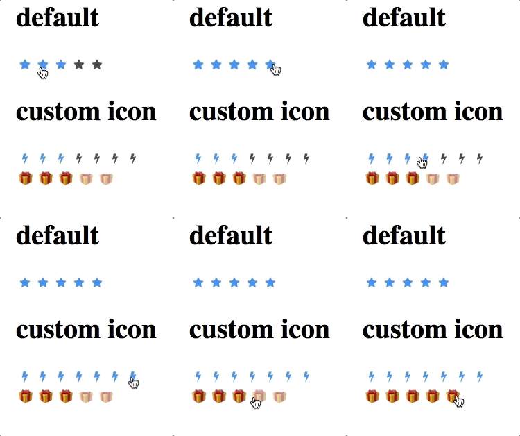
The Rating component allows users clicking an icon to give a rate.
Crop an Uploaded Image
- Available for ZK:
-

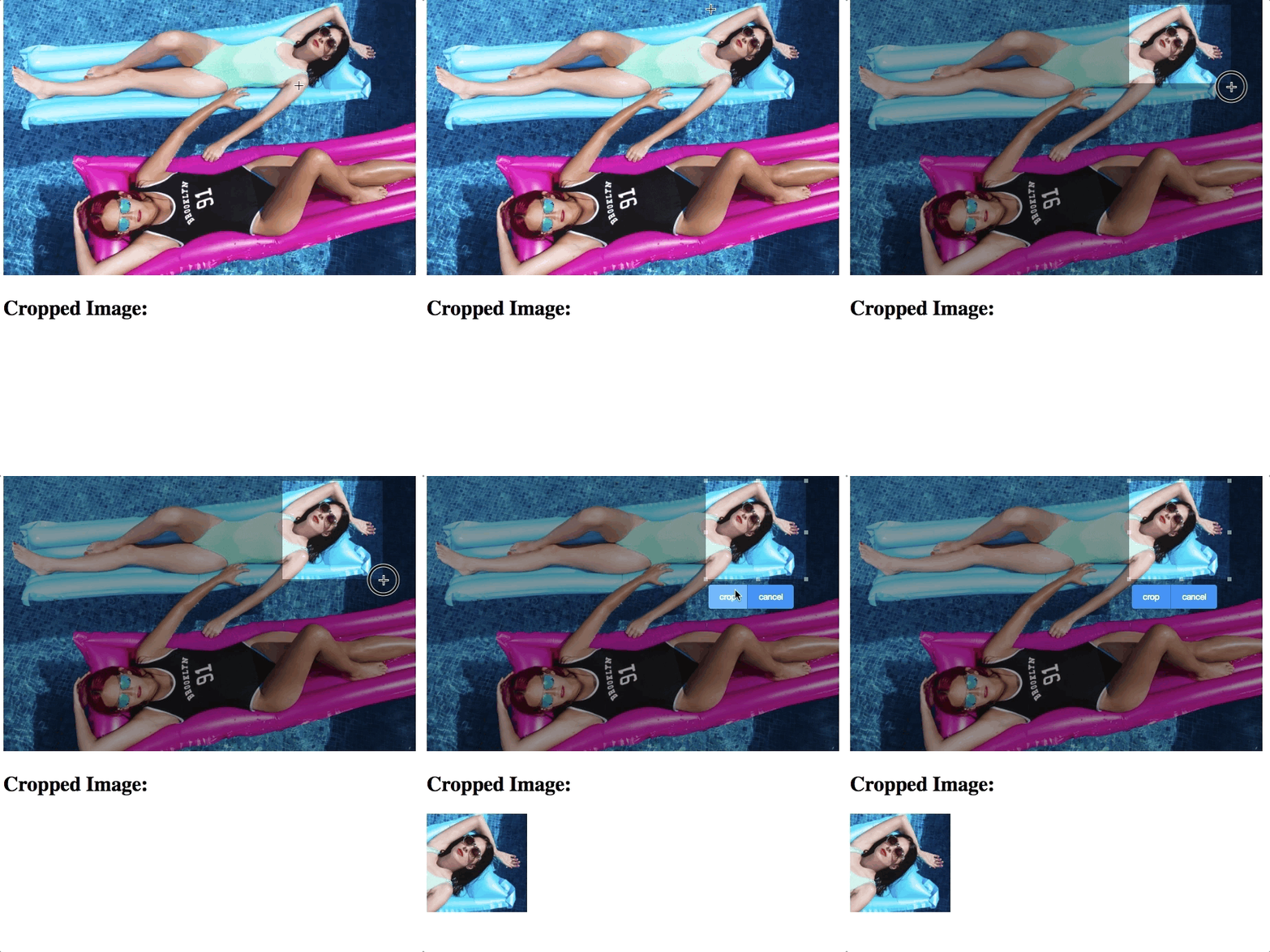
This component allows users to crop a selected range of an image. Then a developer can process the selected image further, e.g. show it on the page.
Display a Barcode
- Available for ZK:
-

A barcode component is used to generate a barcode at the browser, and decode the barcode at the server side.
<barcode type="qr" value="https://www.zkoss.org/" height="100px"/>
<barcode type="code128" value="https://www.zkoss.org/" height="100px"/>
Scan a Barcode
- Available for ZK:
-

A Barcodescanner component is used to scan and decode the barcode at the client side.
Other Enhancements
Guide Users with a Pop-up Menuitem
- Available for ZK:
-

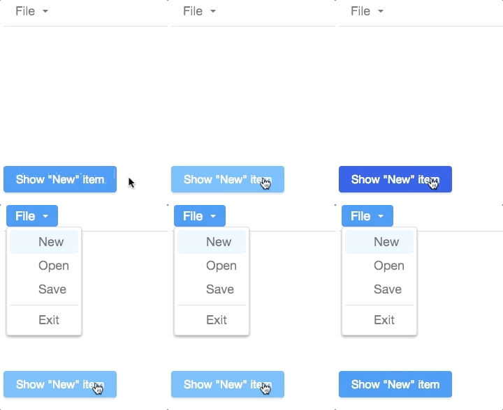
If you want to guide new users to click a menuitem or open a menupopup for them, ZK provide a method to pop up the menuitem in front of users.
menu.getMenupopup().setActive(i);
Web Fragment
- Available for ZK:
-

We now separate ZK web fragment support into another artifact, so that you can decide to include it or not according to your requirement.
Improved Rendering Speed
We improve the rendering speed when opening a tree node and a model change of a chosenbox.
ZK grows with you. Feel free to share with us your feedback or suggestion.
Comments
| Copyright © Potix Corporation. This article is licensed under GNU Free Documentation License. |


