Style"
From Documentation
Jumperchen (talk | contribs) |
m ((via JWB)) |
||
| Line 26: | Line 26: | ||
=Supported Events= | =Supported Events= | ||
| − | {| | + | {| class='wikitable' | width="100%" |
! <center>Name</center> | ! <center>Name</center> | ||
! <center>Event Type</center> | ! <center>Event Type</center> | ||
| Line 41: | Line 41: | ||
=Use Cases= | =Use Cases= | ||
| − | {| | + | {| class='wikitable' | width="100%" |
! Version !! Description !! Example Location | ! Version !! Description !! Example Location | ||
|- | |- | ||
| Line 51: | Line 51: | ||
=Version History= | =Version History= | ||
{{LastUpdated}} | {{LastUpdated}} | ||
| − | {| | + | {| class='wikitable' | width="100%" |
! Version !! Date !! Content | ! Version !! Date !! Content | ||
|- | |- | ||
Revision as of 11:06, 7 January 2022
Style
Employment/Purpose
The style component used to specify CSS styles for the owner desktop.
Note:
- a style component can appear anywhere in a ZUML page, but it affects all components in the same desktop.
- getContent() simply get the string that is set by setContent(). If you call setSrc() or call the constructor of Style(), getContent() still gets null.
Example
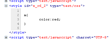
<style> a{ color:red; }</style>
Supported Events
| None | None |
- Inherited Supported Events: AbstractComponent
Supported Children
*NONE
Use Cases
| Version | Description | Example Location |
|---|---|---|
Version History
| Version | Date | Content |
|---|---|---|
| 5.0.3 | June 2010 | The media property is supported. |
