Signature"
| (18 intermediate revisions by 5 users not shown) | |||
| Line 1: | Line 1: | ||
| − | {{ | + | {{ZKComponentReferencePageHeader}} |
| − | |||
| − | |||
| − | |||
| − | + | = Signature = | |
| − | + | {{versionSince| 8.6.0}} | |
| − | |||
| − | = | ||
| − | |||
| − | |||
| − | |||
| − | |||
| − | |||
| − | |||
| − | |||
| − | |||
| − | |||
| − | |||
| − | |||
| − | |||
| − | |||
| − | |||
| − | |||
| − | |||
| − | |||
| − | |||
| − | |||
| − | |||
| − | |||
| − | |||
| − | |||
| − | |||
| − | |||
| − | |||
| − | |||
| − | |||
| − | |||
| − | |||
| − | |||
| − | |||
| − | |||
| − | |||
| − | |||
| − | |||
| − | |||
| − | |||
| − | |||
| − | |||
| − | |||
| − | |||
| − | |||
| − | |||
| − | |||
| − | |||
| − | |||
| − | |||
| − | |||
| − | |||
| − | |||
| − | |||
| − | |||
| − | |||
| − | |||
| − | |||
| − | |||
| − | |||
| − | |||
| − | |||
| − | |||
| − | |||
| − | |||
| − | |||
| − | |||
| − | |||
| − | |||
| − | |||
| − | |||
| − | |||
| − | |||
| − | |||
| − | |||
| − | |||
| − | |||
| − | |||
{{ZK EE}} | {{ZK EE}} | ||
| − | + | *Java API: <javadoc>org.zkoss.zkmax.zul.Signature</javadoc> | |
| + | *JavaScript API: <javadoc directory="jsdoc">zkmax.wgt.Signature</javadoc> | ||
| − | + | = Browser Support = | |
| + | *This component supports IE10+ and modern browsers. | ||
| + | = Employment/Purpose = | ||
| + | Signature components support signature pad on the desktop and mobile browsers. User can customize pen size, pen color, background color etc., it also provides undo, save and clear methods. | ||
| + | = Example = | ||
| + | [[File:Signature.png]] | ||
| − | = | + | <source lang="xml" > |
| − | < | + | <signature width="600px" height="300px" penColor="white" backgroundColor="#AED6F1" penSize="6"/> |
| − | + | </source> | |
| + | == Buttons == | ||
| − | + | There are 3 buttons when you hover on this component: (from left to right) | |
| − | |||
| + | # '''undo''': to remove the last step that was drawn on the signature pad. | ||
| + | # '''save''': to save the signature image to the server, a user can get the image by listening onSave event. | ||
| + | # '''clear''': to clear signature pad. | ||
| − | = | + | = toolbarVisible = |
| − | |||
| − | The | + | The toolbar contains 3 buttons: undo button, clear button, and save button. They are visible by default. If you can hide them: |
| − | + | <source lang="xml"> | |
| + | <signature toolbarVisible="false"/> | ||
| + | </source> | ||
| − | + | The toolbar buttons only contain icons by default. If you want to show message after icons on the buttons, we provide three attributes: <code>undoLabel</code>, <code>clearLabel</code>, and <code>saveLabel</code>. | |
| − | < | ||
| − | |||
| − | + | Default: | |
| − | [[ | + | [[File:Signature toolbar.png]] |
| − | + | Customized: | |
| − | |||
| − | |||
| − | [[File: | + | [[File:Signature toolbar2.png]] |
| + | <source lang="xml"> | ||
| + | <signature undoLabel="Undo" clearLabel="Clear" saveLabel="Save"/> | ||
| + | </source> | ||
| + | = Style Attributes = | ||
| − | + | There are some attributes to adjust the signature style: | |
| − | |||
| − | |||
| − | + | == penSize== | |
| + | the width of a line on the signature, the default is 1. | ||
| − | = | + | == penColor == |
| − | + | Can be any color format accepted by context.fillStyle(canvas), defaults to black. | |
| + | == backgroundColor== | ||
| + | Can be any color format accepted by context.fillStyle(canvas), defaults to white. | ||
| − | + | == backgroundImage== | |
| − | + | {{versionSince| 9.6.0}} | |
| − | + | Can be any image format accepted by context.drawImage(canvas), defaults to null. | |
| − | |||
| + | = BackgroundIncluded = | ||
| + | {{versionSince |9.6.0}} | ||
| − | + | The background color and image will be saved by default. If you don't want to save the background color and image, please use the following setting. | |
| − | + | <source lang="xml"> | |
| − | + | <signature backgroundIncluded="false"/> | |
| − | If you want to | ||
| − | |||
| − | |||
| − | |||
| − | <source lang= | ||
| − | |||
</source> | </source> | ||
| − | = | + | == Scanned Paper Form== |
| − | + | You can load a scanned paper form as a background and save it with a signature. | |
| − | + | [[File:Paper-form.jpg|center]] | |
| − | + | = Saves Signature Image = | |
| + | After clicking "Save" button, the component will upload the signature to a server. You can listen <code>onSave</code> to get the uploaded signature and show it with [https://www.zkoss.org/wiki/ZK_Component_Reference/Essential_Components/Image Image]: | ||
| − | = | + | <source lang="xml"> |
| − | + | <signature onSave="image.setContent(event.getMedia())"/> | |
| − | < | + | <image id="image"/> |
| − | + | </source> | |
| − | |||
| − | |||
| − | = | + | == File Size Limit == |
| − | + | If you see <code>SizeLimitExceededException</code>, you can adjust max uploading file size by | |
| − | < | + | [[ZK_Configuration_Reference/zk.xml/The_system-config_Element/The_max-upload-size_Element | file-size-threshold]]. |
| − | |||
| − | + | =Supported Events= | |
| − | < | + | {| class='wikitable' | width="100%" |
| − | < | + | ! <center>Name</center> |
| − | < | + | ! <center>Event Type</center> |
| + | |- | ||
| + | | <center>onSave</center> | ||
| + | | '''Event:''' <javadoc>org.zkoss.zk.ui.event.UploadEvent</javadoc> | ||
| + | When user invoke the save method, the event would be triggered. | ||
| + | |- | ||
| + | | <center>onClear</center> | ||
| + | | '''Event:''' <javadoc>org.zkoss.zk.ui.event.Event</javadoc> | ||
| + | When user invoke the clear method, the event would be triggered. | ||
| + | |} | ||
| − | + | =Version History= | |
| + | {{LastUpdated}} | ||
| + | {| class='wikitable' | width="100%" | ||
| + | ! Version !! Date !! Content | ||
| + | |- | ||
| + | | 8.6.0 | ||
| + | | August 2018 | ||
| + | | | ||
| + | |} | ||
| − | {{ | + | {{ZKComponentReferencePageFooter}} |
| − | |||
| − | }} | ||
Latest revision as of 10:15, 19 September 2022
Signature
Since 8.6.0
- Available for ZK:
-

Browser Support
- This component supports IE10+ and modern browsers.
Employment/Purpose
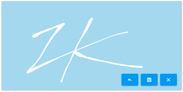
Signature components support signature pad on the desktop and mobile browsers. User can customize pen size, pen color, background color etc., it also provides undo, save and clear methods.
Example
<signature width="600px" height="300px" penColor="white" backgroundColor="#AED6F1" penSize="6"/>
Buttons
There are 3 buttons when you hover on this component: (from left to right)
- undo: to remove the last step that was drawn on the signature pad.
- save: to save the signature image to the server, a user can get the image by listening onSave event.
- clear: to clear signature pad.
toolbarVisible
The toolbar contains 3 buttons: undo button, clear button, and save button. They are visible by default. If you can hide them:
<signature toolbarVisible="false"/>
The toolbar buttons only contain icons by default. If you want to show message after icons on the buttons, we provide three attributes: undoLabel, clearLabel, and saveLabel.
Default:
Customized:
<signature undoLabel="Undo" clearLabel="Clear" saveLabel="Save"/>
Style Attributes
There are some attributes to adjust the signature style:
penSize
the width of a line on the signature, the default is 1.
penColor
Can be any color format accepted by context.fillStyle(canvas), defaults to black.
backgroundColor
Can be any color format accepted by context.fillStyle(canvas), defaults to white.
backgroundImage
Since 9.6.0 Can be any image format accepted by context.drawImage(canvas), defaults to null.
BackgroundIncluded
Since 9.6.0
The background color and image will be saved by default. If you don't want to save the background color and image, please use the following setting.
<signature backgroundIncluded="false"/>
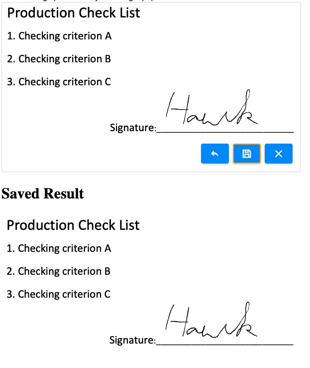
Scanned Paper Form
You can load a scanned paper form as a background and save it with a signature.
Saves Signature Image
After clicking "Save" button, the component will upload the signature to a server. You can listen onSave to get the uploaded signature and show it with Image:
	<signature onSave="image.setContent(event.getMedia())"/>
	<image id="image"/>
File Size Limit
If you see SizeLimitExceededException, you can adjust max uploading file size by
file-size-threshold.
Supported Events
| Event: UploadEvent
When user invoke the save method, the event would be triggered. | |
| Event: Event
When user invoke the clear method, the event would be triggered. |
Version History
| Version | Date | Content |
|---|---|---|
| 8.6.0 | August 2018 |


