More Layout Components"
Maya001122 (talk | contribs) m |
m (correct highlight (via JWB)) |
||
| Line 4: | Line 4: | ||
===Portallayout=== | ===Portallayout=== | ||
| − | The < | + | The <code>Portallayout</code> allows developers to create a similar user experience to iGoogle which provides ways to drag-and-drop <code>panels </code> into other <code>portalchildren</code>. Users can also change the position of <code>portalchildren</code>. |
| − | < | + | <code>Portallayout</code> is a nested component whose child component is <code>Portalchildren</code>, with <code>panel </code> being the child of <code>Portalchildren</code>. One thing of note is that developers must specify the width (either percentage or pixel) for each portal child or the ZK engine cannot determine the size of it. |
[[Image:Portallayout.PNG]] | [[Image:Portallayout.PNG]] | ||
| Line 30: | Line 30: | ||
====The position property==== | ====The position property==== | ||
| − | If you would like to know the position of a specific < | + | If you would like to know the position of a specific <code>panel</code>, you need to use the <code>position</code> property to get the location. |
====The onPortalMove Event==== | ====The onPortalMove Event==== | ||
| − | When any portal child is moved, the onPortalMove event is sent to the < | + | When any portal child is moved, the onPortalMove event is sent to the <code>Portallayout</code> component. |
===Columnlayout=== | ===Columnlayout=== | ||
| − | A < | + | A <code>columnlayout</code> is a container with multiple columns, each of these columns can contain one or more panels. <code>columnlayout</code> is a nested component whose child component is <code>Columnchildren</code>. One thing of note is that the width (either percentage or pixel) must be set for each column child, or the ZK engine cannot determine its』 size |
[[Image:ColumnLayout2.PNG]] | [[Image:ColumnLayout2.PNG]] | ||
| Line 74: | Line 74: | ||
===Tablelayout=== | ===Tablelayout=== | ||
| − | A < | + | A <code>Tablelayout</code> is a container with rows, and columns. It's pretty much like an html table tag. The <code>Tablelayout</code> has child components called <code>Tablechildren</code> which in turn have <code>Panels</code> as their children. |
<br/> | <br/> | ||
[[Image:Tablelayout1.png]] | [[Image:Tablelayout1.png]] | ||
| Line 115: | Line 115: | ||
==== The columns property ==== | ==== The columns property ==== | ||
| − | The arrangement of < | + | The arrangement of <code>Tablechildren</code> depends on the <code>columns</code> property of the <code>Tablelayout</code> component. If set the number of <code>columns</code> to 2, the result is as follows: |
<br/> | <br/> | ||
[[Image:Tablelayout2.png]] | [[Image:Tablelayout2.png]] | ||
| Line 123: | Line 123: | ||
==== rowspan, and colspan properties==== | ==== rowspan, and colspan properties==== | ||
| − | Another approach to changing the arrangement of the < | + | Another approach to changing the arrangement of the <code>Tablechildren</code> is to use either the <code>rowspan</code> or <code>colspan</code> property on the <code>Tablechilder</code>. |
<br /> | <br /> | ||
[[Image:Tablelayout3.png]] | [[Image:Tablelayout3.png]] | ||
| Line 164: | Line 164: | ||
=== Separators and Spaces === | === Separators and Spaces === | ||
| − | Components: < | + | Components: <code>separator</code> and <code>space</code>. |
A separator is used to insert a space between two components. There are several ways to customize the separator. | A separator is used to insert a space between two components. There are several ways to customize the separator. | ||
| − | # By use of the < | + | # By use of the <code>orient</code> attribute, you are able to specify whether the separator is vertical or horizontal. By default it is a horizontal separator, which inserts a line break. On the other hand, a vertical separator inserts white space. In addition, <code>space</code> is a variant of <code>separator</code> whose default orientation is vertical. |
| − | # By use of the < | + | # By use of the <code>bar</code> attribute, you can control whether to show a horizontal or vertical line between components. |
| − | # By use of the < | + | # By use of the <code>spacing</code> attribute, you can control the size of spacing. |
[[Image:10000000000001170000007AB8B71E54.png]] | [[Image:10000000000001170000007AB8B71E54.png]] | ||
| Line 191: | Line 191: | ||
=== Group boxes === | === Group boxes === | ||
| − | Components: < | + | Components: <code>groupbox</code>. |
A group box is used to group components together. A border is typically drawn around the components to show that they are related. | A group box is used to group components together. A border is typically drawn around the components to show that they are related. | ||
| − | The label across the top of the group box can be created by using the < | + | The label across the top of the group box can be created by using the <code>caption</code> component. It works in a similar manner to the HTML legend element. |
Unlike windows, a group box is not an owner of the ID space. It cannot be overlapped or popped-up. | Unlike windows, a group box is not an owner of the ID space. It cannot be overlapped or popped-up. | ||
| Line 214: | Line 214: | ||
</source> | </source> | ||
| − | In addition to the < | + | In addition to the <code>default</code> mold, the group box also supports the <code>3d</code> mold. If the 3d mold is used, it works in a similar fashion to a simple-tab tab box. Firstly, you can control whether its』 content is visible using <code>open</code> attribute. Similarly, you can create the content of a group box when the <code>onOpen</code> event is received. |
[[Image:10000000000000FA000000416860D242.png]] | [[Image:10000000000000FA000000416860D242.png]] | ||
| Line 232: | Line 232: | ||
==== The contentStyle Property and Scrollable Groupbox ==== | ==== The contentStyle Property and Scrollable Groupbox ==== | ||
| − | The < | + | The <code>contentStyle</code> attribute is used to specify the CSS style for the content block of the groupbox. Thus, you can make a groupbox scrollable by specifying <code>overflow:auto</code> (or <code>overflow:scroll</code>) as follows. |
[[Image:10000000000000960000005F20FC9CD7.png]] | [[Image:10000000000000960000005F20FC9CD7.png]] | ||
| Line 250: | Line 250: | ||
</source> | </source> | ||
| − | '''Note''': The < | + | '''Note''': The <code>contentStyle</code> attribute is ignored if the default mold is used. |
| − | The height specified in the < | + | The height specified in the <code>contentStyle</code> attribute means the height of the content block, excluding the caption. Thus, if the groupbox is dismissed (i.e., the content block is ''not'' visible), the height of the whole groupbox will shrink to contain only the caption. On the other hand, if you specify the height for the whole groupbox (by use of the <code>height</code> attribute), only the content block disappears and the whole height remains intact, when dismissing the groupbox. |
=== Toolbars === | === Toolbars === | ||
| − | Components: < | + | Components: <code>toolbar</code> and <code>toolbarbutton</code>. |
A toolbar is used to place a series of buttons. The toolbar buttons can be used without toolbars, so a toolbar can also be used without toolbar buttons. However, toolbar buttons change their appearance if they are placed inside a toolbar. | A toolbar is used to place a series of buttons. The toolbar buttons can be used without toolbars, so a toolbar can also be used without toolbar buttons. However, toolbar buttons change their appearance if they are placed inside a toolbar. | ||
| − | The toolbar has two orientations: < | + | The toolbar has two orientations: <code>horizontal</code> and <code>vertical</code>. It controls how the buttons are placed. |
[[Image:100000000000011100000014F49FBE5E.png]] | [[Image:100000000000011100000014F49FBE5E.png]] | ||
Latest revision as of 10:43, 19 January 2022
![]() This documentation is for an older version of ZK. For the latest one, please click here.
This documentation is for an older version of ZK. For the latest one, please click here.
Portallayout
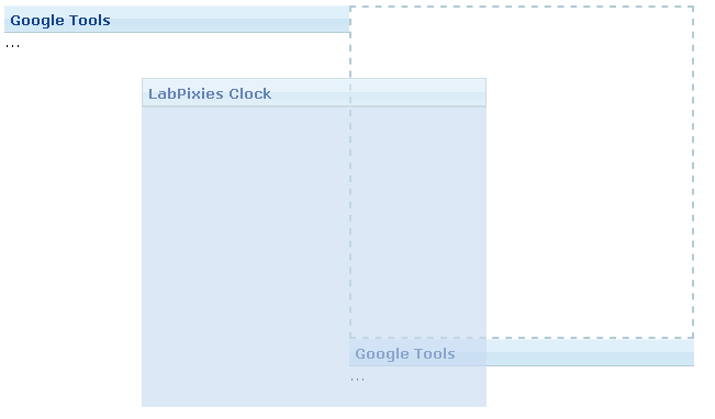
The Portallayout allows developers to create a similar user experience to iGoogle which provides ways to drag-and-drop panels into other portalchildren. Users can also change the position of portalchildren.
Portallayout is a nested component whose child component is Portalchildren, with panel being the child of Portalchildren. One thing of note is that developers must specify the width (either percentage or pixel) for each portal child or the ZK engine cannot determine the size of it.
<zk>
	<portallayout>
		<portalchildren width="30%">
			<panel height="150px" title="Google Tools">
				<panelchildren>...</panelchildren>
			</panel>
			<panel height="300px" title="LabPixies Clock">
				<panelchildren>...</panelchildren>
			</panel>
		</portalchildren>
		<portalchildren width="30%">
			<panel height="150px" title="Google Tools">
				<panelchildren>...</panelchildren>
			</panel>
		</portalchildren>
	</portallayout>
</zk>
The position property
If you would like to know the position of a specific panel, you need to use the position property to get the location.
The onPortalMove Event
When any portal child is moved, the onPortalMove event is sent to the Portallayout component.
Columnlayout
A columnlayout is a container with multiple columns, each of these columns can contain one or more panels. columnlayout is a nested component whose child component is Columnchildren. One thing of note is that the width (either percentage or pixel) must be set for each column child, or the ZK engine cannot determine its』 size
<zk>
	<columnlayout>
		<columnchildren width="30%" style="padding: 5px">
			<panel height="100px" title="colum 1-1"
				style="margin-bottom:10p" border="normal" maximizable="true"
				collapsible="true">
				<panelchildren>Panel</panelchildren>
			</panel>
			<panel height="100px" framable="true" title="column1-2"
				maximizable="true" style="margin-bottom:10px">
				<panelchildren>Panel</panelchildren>
			</panel>
			<panel height="100px" title="column1-3" border="normal"
				closable="true">
				<panelchildren>Panel</panelchildren>
			</panel>
		</columnchildren>
		<columnchildren width="30%" style="padding: 5px">
			<panel height="100px" style="margin-bottom:10p"
				title="column 2-1" border="normal" maximizable="true"
				collapsible="true">
				<panelchildren>Panel</panelchildren>
			</panel>
			<panel height="100px" framable="true" title="column2-2"
				maximizable="true" style="margin-bottom:10px">
				<panelchildren>Panel</panelchildren>
			</panel>
		</columnchildren>
	</columnlayout>
</zk>
Tablelayout
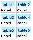
A Tablelayout is a container with rows, and columns. It's pretty much like an html table tag. The Tablelayout has child components called Tablechildren which in turn have Panels as their children.

<zk>
	<tablelayout id="tbl" columns="3">
		<tablechildren id="tc1">
			<panel title="table1" border="normal">
				<panelchildren>Panel</panelchildren>
			 </panel>
		</tablechildren>
		<tablechildren>
			<panel title="table2" border="normal">
				<panelchildren>Panel</panelchildren>
			 </panel>
		</tablechildren>
		<tablechildren >
			<panel title="table3" border="normal">
				<panelchildren>Panel</panelchildren>
			 </panel>
		</tablechildren>
		<tablechildren>
			<panel title="table4" border="normal">
				<panelchildren>Panel</panelchildren>
			 </panel>
		</tablechildren>
		<tablechildren >
			<panel title="table5" border="normal">
				<panelchildren>Panel</panelchildren>
			 </panel>
		</tablechildren>
		<tablechildren>
			<panel title="table6" border="normal">
				<panelchildren>Panel</panelchildren>
			 </panel>
		</tablechildren>
	</tablelayout>
</zk>
The columns property
The arrangement of Tablechildren depends on the columns property of the Tablelayout component. If set the number of columns to 2, the result is as follows:

<tablelayout id="tbl" columns="2">
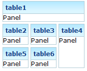
rowspan, and colspan properties
Another approach to changing the arrangement of the Tablechildren is to use either the rowspan or colspan property on the Tablechilder.

<zk>
	<tablelayout id="tbl" columns="3">
		<tablechildren id="tc1" colspan="3">
			<panel title="table1" border="normal">
				<panelchildren>Panel</panelchildren>
			 </panel>
		</tablechildren>
		<tablechildren>
			<panel title="table2" border="normal">
				<panelchildren>Panel</panelchildren>
			 </panel>
		</tablechildren>
		<tablechildren >
			<panel title="table3" border="normal">
				<panelchildren>Panel</panelchildren>
			 </panel>
		</tablechildren>
		<tablechildren rowspan="2">
			<panel title="table4" border="normal" height="90px">
				<panelchildren>Panel</panelchildren>
			 </panel>
		</tablechildren>
		<tablechildren >
			<panel title="table5" border="normal">
				<panelchildren>Panel</panelchildren>
			 </panel>
		</tablechildren>
		<tablechildren>
			<panel title="table6" border="normal">
				<panelchildren>Panel</panelchildren>
			 </panel>
		</tablechildren>
	</tablelayout>
</zk>
Separators and Spaces
Components: separator and space.
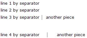
A separator is used to insert a space between two components. There are several ways to customize the separator.
- By use of the
orientattribute, you are able to specify whether the separator is vertical or horizontal. By default it is a horizontal separator, which inserts a line break. On the other hand, a vertical separator inserts white space. In addition,spaceis a variant ofseparatorwhose default orientation is vertical. - By use of the
barattribute, you can control whether to show a horizontal or vertical line between components. - By use of the
spacingattribute, you can control the size of spacing.
<window>
	line 1 by separator
	<separator />
	line 2 by separator
	<separator />
	line 3 by separator
	<space bar="true" />
	another piece
	<separator spacing="20px" />
	line 4 by separator
	<space bar="true" spacing="20px" />
	another piece
</window>
Group boxes
Components: groupbox.
A group box is used to group components together. A border is typically drawn around the components to show that they are related.
The label across the top of the group box can be created by using the caption component. It works in a similar manner to the HTML legend element.
Unlike windows, a group box is not an owner of the ID space. It cannot be overlapped or popped-up.
<zk>
	<groupbox width="250px">
		<caption label="Fruits" />
		<radiogroup>
			<radio label="Apple" />
			<radio label="Orange" />
			<radio label="Banana" />
		</radiogroup>
	</groupbox>
</zk>
In addition to the default mold, the group box also supports the 3d mold. If the 3d mold is used, it works in a similar fashion to a simple-tab tab box. Firstly, you can control whether its』 content is visible using open attribute. Similarly, you can create the content of a group box when the onOpen event is received.
<zk>
	<groupbox mold="3d" open="true" width="250px">
		<caption label="fruits" />
		<radiogroup>
			<radio label="Apple" />
			<radio label="Orange" />
			<radio label="Banana" />
		</radiogroup>
	</groupbox>
</zk>
The contentStyle Property and Scrollable Groupbox
The contentStyle attribute is used to specify the CSS style for the content block of the groupbox. Thus, you can make a groupbox scrollable by specifying overflow:auto (or overflow:scroll) as follows.
<zk>
	<groupbox mold="3d" width="150px" contentStyle="height:50px;overflow:auto">
		<caption label="fruits" />
		<radiogroup onCheck="fruit.value = self.selectedItem.label"
			orient="vertical">
			<radio label="Apple" />
			<radio label="Orange" />
			<radio label="Banana" />
		</radiogroup>
	</groupbox>
</zk>
Note: The contentStyle attribute is ignored if the default mold is used.
The height specified in the contentStyle attribute means the height of the content block, excluding the caption. Thus, if the groupbox is dismissed (i.e., the content block is not visible), the height of the whole groupbox will shrink to contain only the caption. On the other hand, if you specify the height for the whole groupbox (by use of the height attribute), only the content block disappears and the whole height remains intact, when dismissing the groupbox.
Toolbars
Components: toolbar and toolbarbutton.
A toolbar is used to place a series of buttons. The toolbar buttons can be used without toolbars, so a toolbar can also be used without toolbar buttons. However, toolbar buttons change their appearance if they are placed inside a toolbar.
The toolbar has two orientations: horizontal and vertical. It controls how the buttons are placed.
<zk>
	<toolbar>
	    <toolbarbutton label="button1"/>
	    <toolbarbutton label="button2"/>
	</toolbar>
</zk>


