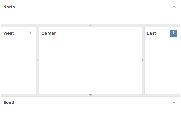
Borderlayout"
From Documentation
(Created page with "{{ZKStyleCustomizationGuidePageHeader}} = Component Reference = Component Reference: Borderlayout, [[ZK_Component_Reference/La...") |
|
(No difference)
| |
Revision as of 09:55, 7 November 2013
Component Reference
Component Reference: Borderlayout, North, South, Center, West, East
DOM Structure
<div class="z-borderlayout">
    <!-- North -->
    <div>
        <div class="z-north">
            <div class="z-north-header">
                <i class="z-borderlayout-icon z-icon-chevron-up"></i>
            </div>
            <div class="z-north-body"></div>
        </div>
        <div class="z-north-splitter">
            <span class="z-north-splitter-button">
                <i class="z-north-icon z-icon-ellipsis-horizontal"></i>
                <i class="z-north-icon z-icon-caret-up"></i>
                <i class="z-north-icon z-icon-ellipsis-horizontal"></i>
            </span>
        </div>
        <div class="z-north-collapsed">
            <i class="z-borderlayout-icon z-icon-chevron-down"></i>
        </div>
    </div>
    <!-- South (same as North) -->
    <!-- East (same as North) -->
    <!-- West (same as North) -->
    <!-- Center -->
    <div>
        <div class="z-center">
            <div class="z-center-header"></div>
            <div class="z-center-body"></div>
        </div>
    </div>
</div>
- Line 6: Chevron-direction Icon Font used for North, South, East and West.
- North: Chevron-up
- South: Chevron-down
- West: Chevron-left
- East: Chevron-right
- Line 12, 14: Ellipsis-horizontal Icon Font used for North and South, Ellipsis-vertical Icon Font used for East and West.
- Line 13: Caret-direction Icon Font used forNorth, South, East and West.
- North: Caret-up
- South: Caret-down
- West: Caret-left
- East:Caret-right
- Line 18: Chevron-direction Icon Font used for Collapsed North, South, East and West.
- South: Chevron-up
- North: Chevron-down
- East: Chevron-left
- West: Chevron-right
LESS Source
Basically, LESS source is correspond to it's DOM structure, then North, South, East and West have different style.
/* borderlayout and it's icon */
.z-borderlayout {
    &-icon {}
}
/* North, South, East, West and Center style */
.z-north,
.z-south,
.z-west,
.z-east,
.z-center {
    &-header {}
    &-body {}
}
.z-north,
.z-south,
.z-west,
.z-east {
    &-collapsed {}
    &-splitter {}
    &-icon {}
}
Check complete LESS source for Borderlayout from Github.
LESS Variables
The following LESS variables are used for Splitter between North, South, East and West components. Check other variables from Github.
| Variables | Default Value |
|---|---|
| @splitterGradientStart | #FDFDFD |
| @splitterGradientEnd | #F1F1F1 |
Customize Sample
Check the instruction for customization step, and if we change the LESS variables in borderlayout.less as follows:
@import "~./zul/less/_header.less";

@baseBorderColor: #006400;
@baseBarHeight: 40px;
@baseButtonHeight: 32px;
@baseGradientStart: #F8FFE8;
@baseGradientEnd: #B7DF2D;
@splitterGradientStart: #F8FFE8;
@splitterGradientEnd: #B7DF2D;

.z-borderlayout {
    /* omitted */
}
The look and feel of Borderlayout component looks like the image below:
Version History
| Version | Date | Content |
|---|---|---|
