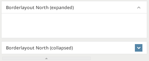
Borderlayout"
From Documentation
| Line 106: | Line 106: | ||
= Customize Sample = | = Customize Sample = | ||
| − | + | == Target Design == | |
| − | + | Assume the image below is our target design for Borderlayout component and Splitter component. | |
| − | |||
| − | + | [[File:styleguide-borderlayout-design.png]] | |
| − | |||
| − | |||
| − | |||
| − | |||
| − | |||
| − | |||
| − | + | == Implementation Details == | |
| − | |||
| − | |||
| − | |||
| − | + | === Setup environment and Analyze design === | |
| + | |||
| + | * Check [[ZK_Style_Customization_Guide/Look_and_Feel_Customization/Customize_Component | the instruction]] to setup component customization environment. | ||
| + | * Analyze the design | ||
| + | ** Used Color for Borderlayout (North, South, East, West) | ||
| + | **: Text: 14px, #555555 | ||
| + | **: Background: #FFFFFF | ||
| + | **: Icon: 12px, #ACACAC | ||
| + | **: Icon Background: #FFFFFF | ||
| + | **: Icon Hover Background: #5687A8 | ||
| + | ** Used Color for Splitter | ||
| + | **: Background: #EBEBEB | ||
| + | **: Icon: 12px, #ACACAC | ||
| + | ** Borderlayout Size | ||
| + | **: Height (North and South): 40px | ||
| + | **: Width (East and West): 40px | ||
| + | **: Horizontal Padding: 8px | ||
| + | **: Vertical Padding: 8px | ||
| + | **: Icon: 24px * 24px | ||
| + | ** Splitter Size | ||
| + | **: Height (North and South): 8px | ||
| + | **: Width (East and West): 8px | ||
| + | |||
| + | === Modify borderlayout.less file to achieve target design === | ||
| + | |||
| + | == Final result == | ||
[[File:styleguide-borderlayout.png]] | [[File:styleguide-borderlayout.png]] | ||
| − | |||
=Version History= | =Version History= | ||
Revision as of 03:51, 18 November 2013
Component Reference
Component Reference: Borderlayout, North, South, Center, West, East
DOM Structure
<div class="z-borderlayout">
    <!-- North -->
    <div>
        <div class="z-north">
            <div class="z-north-header">
                <i class="z-borderlayout-icon z-icon-chevron-up"></i>
            </div>
            <div class="z-north-body"></div>
        </div>
        <div class="z-north-splitter">
            <span class="z-north-splitter-button">
                <i class="z-north-icon z-icon-ellipsis-horizontal"></i>
                <i class="z-north-icon z-icon-caret-up"></i>
                <i class="z-north-icon z-icon-ellipsis-horizontal"></i>
            </span>
        </div>
        <div class="z-north-collapsed">
            <i class="z-borderlayout-icon z-icon-chevron-down"></i>
        </div>
    </div>
    <!-- South (same as North) -->
    <!-- East (same as North) -->
    <!-- West (same as North) -->
    <!-- Center -->
    <div>
        <div class="z-center">
            <div class="z-center-header"></div>
            <div class="z-center-body"></div>
        </div>
    </div>
</div>
- Line 6: Chevron-direction Icon Font used for North, South, East and West.
- North: Chevron-up
- South: Chevron-down
- West: Chevron-left
- East: Chevron-right
- Line 12, 14: Ellipsis-horizontal Icon Font used for North and South, Ellipsis-vertical Icon Font used for East and West.
- Line 13: Caret-direction Icon Font used forNorth, South, East and West.
- North: Caret-up
- South: Caret-down
- West: Caret-left
- East:Caret-right
- Line 18: Chevron-direction Icon Font used for Collapsed North, South, East and West.
- South: Chevron-up
- North: Chevron-down
- East: Chevron-left
- West: Chevron-right
LESS Source
Basically, LESS source is correspond to it's DOM structure, then North, South, East and West have different style.
/* borderlayout and it's icon */
.z-borderlayout {
    &-icon {}
}
/* North, South, East, West and Center style */
.z-north,
.z-south,
.z-west,
.z-east,
.z-center {
    &-header {}
    &-body {}
}
.z-north,
.z-south,
.z-west,
.z-east {
    &-collapsed {}
    &-splitter {}
    &-icon {}
}
Check complete LESS source for Borderlayout from Github.
LESS Variables
The following LESS variables are used for Splitter between North, South, East and West components. Check other variables from Github.
| Variables | Default Value |
|---|---|
| @splitterGradientStart | #FDFDFD |
| @splitterGradientEnd | #F1F1F1 |
Customize Sample
Target Design
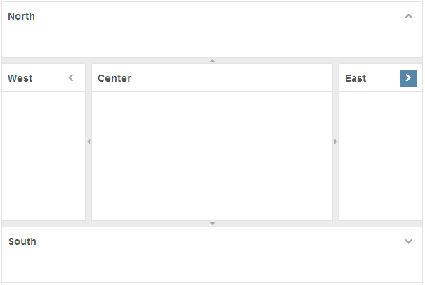
Assume the image below is our target design for Borderlayout component and Splitter component.
Implementation Details
Setup environment and Analyze design
- Check the instruction to setup component customization environment.
- Analyze the design
- Used Color for Borderlayout (North, South, East, West)
- Text: 14px, #555555
- Background: #FFFFFF
- Icon: 12px, #ACACAC
- Icon Background: #FFFFFF
- Icon Hover Background: #5687A8
- Used Color for Splitter
- Background: #EBEBEB
- Icon: 12px, #ACACAC
- Borderlayout Size
- Height (North and South): 40px
- Width (East and West): 40px
- Horizontal Padding: 8px
- Vertical Padding: 8px
- Icon: 24px * 24px
- Splitter Size
- Height (North and South): 8px
- Width (East and West): 8px
- Used Color for Borderlayout (North, South, East, West)
Modify borderlayout.less file to achieve target design
Final result
Version History
| Version | Date | Content |
|---|---|---|

