A Simple, Flexible, and Powerful ZK Layout
Jumper Chen, Engineer, Potix Corporation
September 28, 2007
Applicable to zk-3.0.0-FL-2007-09-28 and later.
Introduction
In the previous article ( here), we introduced the Ext Layout component in which the layout engine depends on Ext JS. In this case, you need to load its JavaScript library (about 500KB), and it decreases the performance on the client side. For better performance, and better integration with ZK, we develop ZK layout (about 20KB) component. Layout component is easy-to-use, and its structure is simpler than Ext JS. Moreover, ZK Layout not only supports the original Ext Layout features (including splittable and collapsible) but also provides a flexible function to grow and shrink vertical/horizontal to fit their given space.
Architecture
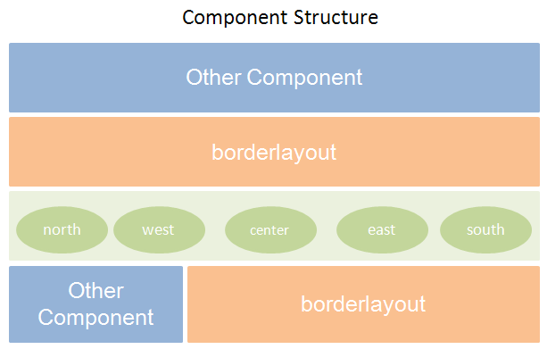
We simplified the ZK Layout component structure and it can be used seamlessly with any ZK components as shown in Figure1.

Figure 1: Component structure.
As you can see, the borderlayout can be embedded into other components and it can be embedded into region—north, south, center, west, and east— too. The region can be embedded into borderlayout only and it can allow any kind of ZK component as its child (only one child).
Live Demo
- First: Let's take a look at a real case, a mail application which uses many layout designs in one page.
Note:The mail materials are borrowed from GWT Mail Demo.
This demo is similar to Y-Layout but its code can be simplified as follows.
- Here is a Y-Layout component code.
...
<y:west>
  <attribute name="config">
	margins= '{1,5,5,1}', initialSize= 220, titlebar= true,
	collapsible= true, animate= true, title='Mail'
  </attribute>
  <y:nestedpanel>
	<y:borderlayout>
	  <y:center autoScroll="true">
		<y:contentpanel fitToFrame="true"
		  onCreate="self.setResizeEl(wp)">
		  <include id="wp" src="wp.zul" />
		</y:contentpanel>
	  </y:center>
	  <y:south>
		<attribute name="config">
		  title=Calendar, collapsedTitle=Calendar,
		  split=true, initialSize= 180, minSize= 100,
		  maxSize= 200, autoScroll=true,
		  collapsible=true, titlebar= true
		</attribute>
		<y:contentpanel>
		  <calendar width="200px" />
		</y:contentpanel>
	  </y:south>
	</y:borderlayout>
  </y:nestedpanel>
</y:west>
...
- Here is a ZK Layout component code.
...
<west margins="1,5,1,1" size="20%" splittable="true"
  collapsible="true" minsize="100" maxsize="400">
  <borderlayout>
	<center autoscroll="true" flex="true">
	  <include src="wp.zul" />
	</center>
	<south splittable="true" size="180px" minsize="100"
	  maxsize="200" autoscroll="true" collapsible="true">
	  <calendar width="200px" />
	</south>
  </borderlayout>
</west>
...
Note: To use ZK Layout component we need to specify the page height to be 100% as below.
<?page ... style="height:100%"?>
- Second: This demo is a flexible half Layout.
As you can see, we demonstrate how to separate the height or the width of the region with a percent parameter "%" and it will grow and shrink on resizing the browser window. This feature is good for many layout designers to design their project.
Note: These demo codes can be found in the zk-layout-demo.war file.
ZK Layout attribute specification table:
| Attribute | Usage | Component Name |
|---|---|---|
| flex |
Sets whether to grow and shrink vertical/horizontal to fit their given space, so called flexibility. Default: false. |
north, south, west, east and center |
| size | Sets the size of this region. This method is shortcut for setHeight(String) and setWidth(String). If this region is North or South, this method will invoke setHeight(String). If this region is West or East, this method will invoke setWidth(String). Otherwise it will throw a UnsupportedOperationException. | north, south, west and east. |
| splittable |
Sets whether enable the split functionality. Default: false. |
north, south, west and east. |
| collapsible | Sets whether set the initial display to collapse.
Default: false. |
north, south, west and east. |
| margins | Sets margins for the element "0,1,2,3" that direction is "top,left,right,bottom".
Default: "0,0,0,0". |
north, south, west, east and center |
| open |
Opens or collapses the splitter. Meaningful only if isCollapsible is not false. Default: true. |
north, south, west and east. |
| autoscroll |
Sets whether enable overflow scrolling. Default: false. |
north, south, west, east and center |
| border |
Sets the border (either none or normal). Default: normal |
north, south, west, east and center |
| maxsize |
Sets the maximum size of the resizing element. Default: 2000. |
north, south, west and east. |
| minsize |
Sets the minimum size of the resizing element. Default: 0. |
north, south, west and east. |
Events: onOpen (north, south, west and east only).
Download
Download the zk-layout-demo.war for the article here.
Summary
In this small talk, we have demonstrated you the power of ZK Layout, and it promotes the designing layout level for ZK. If you come up with any problem, please feel free to ask us on ZK forum.
| Copyright © Potix Corporation. This article is licensed under GNU Free Documentation License. |