New Features of ZK 5.0 RC
Timothy Clare, Technology Evangelist, Potix Corporation
September 28th, 2009
ZK 5 RC
Architectural Advancements
Server+Client Fusion
Since 2005 ZK has been renowned for its' server-centric approach, providing the ultimate in productivity gains. We will continue to push the server-centric envelope to make ZK even more productive. In addition to the server-centric approach, developers can now optionally leverage the full controllability of client-side programming using jQuery and GWT[1]!
ZK is developer-centric
It's the developer's choice whether to implement a function using either server-side or client-side development according to their requirements. In fact, now developers do not need to choose between productivity and controllability as you can use both server-centric and client-centric approaches in the same application, even in the same page! The amalgamation of these two development strategies is called Server+Client Fusion.
It is not about server-centric or client-centric, it is about developer-centric!
For more information, you can take a look at the following resources:
- The server-centric and the Server+Client Fusion approach
- Client-centric approach 1 2
Ajax-as-a-Service
One of the main new architectural features is the ability to load client-side JavaScript packages from distributed servers. This means that a local copy of the library does not have to be kept, freeing authors from constantly updating their application to use the latest libraries. This architecture delivers EAI integration at the client-side, enabling the same close knit ease of integration of a backend system but at the client!
For more information on this topic you can take a look at Tom Yeh』s blog post here
Change to LGPL License
To extend our reach beyond what a GPL-licensed framework can achieve, ZK 5 is now moving to LGPL (Lesser General Public License) offering more freedom and allowing ZK to be integrated with more frameworks under different licensing models.
Now, with the LGPL-licensed ZK 5, you are free to use, develop and deploy your ZK powered application/framework, regardless of whether it is open source, proprietary, or commercial.
ZK 3 and older versions were licensed under the GPL and will continue to be in the future.
Ease of use
Freezing columns
In ZK 5 you are now able to freeze columns within a Grid and Listbox. This mirrors functionality seen within Excel and makes data in these components easier to read, interpret and handle.
The following code demonstrates how to freeze a column within a Grid:
<grid>
	<frozen style="background: #dfded8" columns="3">
		...
	</frozen>
</grid>
For more information and a demonstration please here!
The Event Queue
When server push was introduced in ZK 3, we minimized the server-push API to two methods: activate and deactivate. Once activated, a developer could access any component in any way he liked. However, it still requires some knowledge of thread programming. We have now encapsulated the use of server push in the form of event firing and listening, named the Event Queue (org.zkoss.zkmax.ui.eq.EventQueue).
We extended the event queue to support the concept of scope. Currently, there are two scopes: desktop and application. Within the desktop scope, an event queue is visible only to the associated desktop. Within an application scope, an event queue is visible to the whole application and any thread (not just event listeners) can access it. The application-scope event queue is based on the server push but the developer doesn't need to know that and he doesn't need to do any thread programming, as it is handled automatically by the event queue.
For more information on the Event Queue please take a look at the Small Talk.
Enhanced Datebox
The Datebox has now been enhanced as you can see in the demo below.
Button supports Ctrl+Click when hyperlinked
When a button is used to link to another page, see example below, you are able to hold Control and click on the button to follow the link in a new browser window.
<button label="Goto hello" href="test.zul"/>
Improved Layout Control
vFlex/hFlex support
You are now able to embed any component into the vFlex/hFlex containers, meaning the layout and size of each control can be controlled. You can find out more information regarding this in this Small Talk.
File upload
Within ZK 5, the file upload has been redesigned so it can be integrated with any widget. For example, buttons and menu items can now be used to upload a file. In addition to this, the display of the upload status has been enhanced and can be customized easily.
For more information and a live demo please click here!
The vbox and hbox
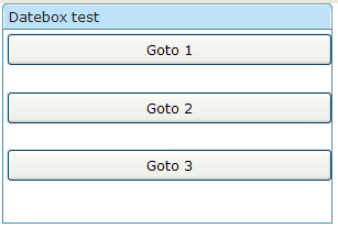
The vbox and hbox now have a XUL box model with align and pack attributes, the align attribute specifies how child elements of the box are aligned when the box size is greater than that of its' children combined. For vboxes the align attribute defines how they will be aligned horizontally and vice versa for the hbox. An example below shows a vbox with the align attribute set to stretch and the results of such.
<window width="300px" height="200px" title="Datebox test" border="normal">
	<vbox width="300px" height="150px" align="stretch">
		<button height="30px" label="Goto 1" />
		<button height="30px" label="Goto 2" />
		<button height="30px" label="Goto 3" />
	</vbox>
</window>
In the above example the stretch option will stretch the button out to fit the container, using start, center and end will align you buttons on the left hand side, center and right hand side respectively.
The pack attribute defines where the controls are placed within the box if the combined size of the controls is smaller than that of the size of the box. When the box is an hbox they describe the position horizontally and when the box is a vbox they describe the position vertically.
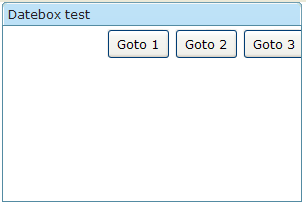
An example below shows an hbox with it's pack attribute set to end.
<window width="300px" height="200px" title="Datebox test" border="normal">
	<hbox width="300px" height="150px" pack="end">
		<button height="30px" label="Goto 1" />
		<button height="30px" label="Goto 2" />
		<button height="30px" label="Goto 3" />
	</hbox>
</window>
In the above example the end option places the buttons on the right hand side of the window. The other options start, center and stretch will position your buttons on the left hand side, center and spread them out to fill the container.
Special cases
- If you specify "stretch,start", then the Extra proportionally and evenly allocated space for each child is placed on the right or bottom side of the child
- If you specify "stretch,center", then the Extra proportionally and evenly allocated space for each child is split equally along each side of the child
- If you specify "stretch,end", then the Extra proportionally and evenly allocated space for each child is placed on the left or top side of the child
- If there are {@link Splitter} child inside Box component, then the box behaves like setting stretch pack attribute; no matter you specify "stretch" in pack attribute or not
New Cell component
In ZK5, we have introduced a new component named Cell which can be embedded into a Grid or Box (Hbox and Vbox) to fully control the layout and the style. You can now use the rowspan or the colspan property to layout your Grid, for example a content cell can now cross over multiple rows. The code below demonstrates how to do this:
<row>
	<cell sclass="years" rowspan="12">
		...
	</cell>
</row>
More information and a live demo is available here!
Functional Improvements
Input element supports inplace editing
In ZK5, all input elements can have the in-place-editing functionality, like the combobox, textbox, datebox, and so on.
For example,
<textbox inplace="true"/>
<combobox inplace="true"/>
<datebox inplace="true"/>
The inplace property is used to enable or disable the in-place-editing function for the input element. More information and a live demo is available here!
After clicking a button it can be disabled
To prevent multiple clicks of a button upon clicking a button and a process executing the button is now disabled. The button is then re-enabled after the processing has finished, this is done using the autodisable feature.
<button id="ok" label="OK" autodisable="self" />
The above code demonstrates autodisable functionality, it is possible to re-enable buttons using the following method.
<button label="enable all" onClick="ok.disabled = cancel.disabled =
false"/>
Timebox now supports new date format
The timebox now supports new date formats, for example you can now use a to signify it is am or pm. The input string follows the formatting of the SimpleDateFormat.
Below is an example of using a within the format.
<zk>
	<window title="Test">
		<timebox cols="20" format="a hh:mm:ss"/>
	</window>
</zk>
The Fisheye control supports dynamic images
The Fisheye now supports dynamically created images, for example you can create an image using the Java2D libraries and then set the content of the fisheye to the create image, below is an example of how to do this.
<?page title="Auto Generated index.zul"?>
<zk>
	<window title="test of autodisable">
		<fisheyebar><fisheye id="fish1" /></fisheyebar>

		<zscript>
		import java.awt.*;
		import java.awt.image.*;
		import java.awt.geom.*;


		void draw() {
			BufferedImage bi = new BufferedImage(200, 200, BufferedImage.TYPE_INT_RGB);
			Graphics2D g2d = bi.createGraphics();
			Line2D line = new Line2D.Double(0, 0, bi.getWidth(), bi.getHeight());
			g2d.setColor(Color.blue);
			g2d.setStroke(new BasicStroke(100));
			g2d.draw(line);
			fish1.setImageContent(bi);
		}

		draw();
		</zscript>
	</window>
</zk>
ToolbarButton enhanced
A button supports the toolbar mold and the toolbarbutton derives from a button with the default mold set to "toolbarbutton".
	<window title="Test">
		<toolbar><toolbarbutton label="toolbarbutton" /></toolbar>
	</window>
As a compatibility note, when using the toolbarbutton when it is not in a toolbar it will produce a hyperlink. Now within ZK 5 you are able to use a new control called the a which will produce a normal hyperlink!
Overlapping windows improved
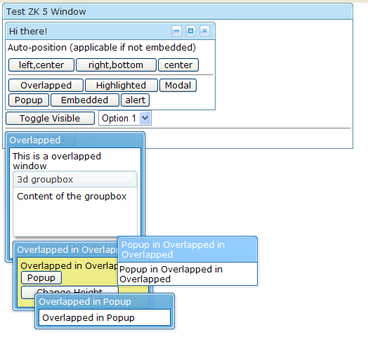
The overlapping windows have been improved to included better pop-up functionality and the ability to close the pop-up by clicking on the area surrounding it.
Configuration
Specifying crawlable content
You are not able to specify whether content is crawlable, this works by generating tags within your content where content only exists in the form of Javascript. This allows your content to be crawled by Google and is similar to how the client-centric frameworks behave. However, there is a performance penalty so this option is disabled by default. You can enable it by using the example below.
<system-config>
   <crawlable>true</crawlable>
</system-config>
Specify javascript directory
You are now able to specify one or multiple locations of your JavaScript files, since it is overkill to place some JavaScript widgets within a JAR file. You can specify a directory using the following markup.
<library-property>
  <name>org.zkoss.web.util.resource.dir</name>
  <value>/WEB-INF/cwr</value>
</library-property>
Use ZK.xml to store application specific information
The zk.xml file can now store application specific information, meaning that this information can be used within your own application or plug-in. This is a lot more convenient and will save developers time and effort!
Download & other resources
References
- ↑ Coming soon!
| Copyright © Potix Corporation. This article is licensed under GNU Free Documentation License. |


