Responsive Design in ZK Part 1
Matthieu Duchemin, Engineer, Potix Corporation
August 24, 2017
ZK 8.0.2
Responsive Design in ZK
Preface
We could roughly categorize responsive support into two levels: component level and page level.
Concerning component level support, ZK introduced responsive components since ZK 6.5. These components respond to type of device and change their behavior to provide an optimal user experience. For example a datebox component looks like a little calendar on a desktop device, but will automatically turn into a spinning wheel on a mobile phone. For more information please read here.
Concerning page level it will depend more your application design and what you wish to display on each device. The objective of this article is for readers to understand page-level fluid design and responsive design.
Introduction
Designers need to make their web pages accessible regardless of the user’s device or configuration. With an ever-wider array of resolutions and screen size, it becomes increasingly difficult to craft a single experience matching all possible users. Most common approach is to segment the UI experience into multiple parts. These UI fragments would then be arranged based on the client's properties such as client width or device type.
All examples can be found here : Git sources
Definitions
- Layout: In the following articles “Layout” will refer specifically to the logical relationships between UI elements. Notable relationships in this context are:
- Parent – Child: an element located inside another.
- Ancestor – Descendant: a structurally superior of inferior element along a chain of Parent-Child relationships.
- Sibling – Sibling: two (or more) elements located in the logical structure as children of the same Parent element.
- Fluid design: Any UI designed to adapt to the current viewing device by resizing some of its elements to provide a suitable experience. Its characteristics are:
- Adaptive: Changes the UI experience based on the screen size.
- Static layout: Fluid design changes properties of elements, but the layout doesn’t change. The relationship between the elements are not altered between versions of this design.
- Responsive design: Any UI designed to adapt to the current viewing device by providing a different layout for the page elements. Its Characteristics are:
- Adaptive: Changes the UI experience based on the screen size.
- Dynamic layout: Responsive designs will provide different layouts and even different components altogether depending on the current screen size.
Illustrations
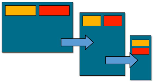
- Fluid design: Elements are resized, but their layout does not change.
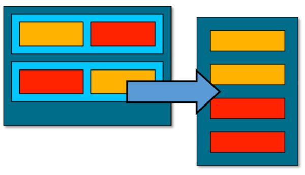
- Responsive design: A different layout is generated based on the size of screen.
Simple examples
- Fluid design git source
<html>
	<head>
		<style>
		.container {
			display: flex;
			max-width:960;
			background-color: #006DB8;
		}

		.child {
			background-color: #01C7FF;
			width: 300px;
			height: 100px;
			margin: 10px;
		}
		</style>
	</head>
	<body>
		<div class="container">
			<div class="child">child 1</div>
			<div class="child">child 2</div>
			<div class="child">child 3</div>
		</div>
	</body>
</html>
- Responsive design git source
<html>
	<head>
		<style>
			@media only screen and (max-width: 500px) {
			    #view1 {
			        display: none;
			    }
			    #view2 {
			        display: block;
			    }
			}
			@media only screen and (min-width: 500px) {
			    #view1 {
			        display: block;
			    }
			    #view2 {
			        display: none;
			    }
			}
		</style>
	</head>
	<body>
		<div>
			<div id="view1">
				view 1
			</div>
			<div id="view2">
				view 2
			</div>
		</div>
	</body>
</html>
Fluid design
A fluid design can take many forms. From a simple width=”100%” on the page container to always fit the screen, to detailed rule sets of styles to be applied depending on specific browser states and conditions.
Depending on the desired UI experience, a fluid design can be enough for an application to feel well balanced regardless of the size or device used to browse its content. Elements can automatically wrap from multiple items per line to a vertical table fitting on mobile. Containers can shrink and expand to avoid leaving empty spaces or having to restrict the user to a few expected browser dimensions.
ZK Flex
Other than setting a width="100%" attribute, the simplest tool in ZK to create a fluid design is flexing. ZK components hold the hflex and vflex attributes which can be used to set horizontal flex and vertical flexing.
In-depth information regarding flexing can be found here: https://www.zkoss.org/wiki/ZK_Developer's_Reference/UI_Patterns/Hflex_and_Vflex Component flexing is calculated in browser by the JavaScript client engine. Flexing containers will expand and shrink based on their initial size as well as their siblings flexing information. When a parent of a flex-enabled component is resized, a new size calculation is triggered for this element. The resulting width and height is then set directly on the node.
Example: ZK flex used to proportionally increase or decrease the size of UI elements:
In this example, menuitem1 and menuitem 2 will grow and shrink together to maintain a 1/3rd to 2/3rd width ratio.
<div id="menuitem1" hflex="1" sclass="box content1">
	MenuItem 1
</div>
<div id="menuitem2" hflex="2" sclass="box content2">
	MenuItem 2
</div>
CSS flexible box
The modern CSS3 standard have introduced the CSS flexible box style set. Browsers implementing this standard can implement native flexing through style definition. It can be used to declare initial sizes, growing and shrinking ratios, incuding other flexing related properties.
CSS flex is processed by the browser’s styles interpreter directly, rather than the JavaScript engine using ZK flex. More information on CSS flexible box can be found [1]
While their premise is similar, CSS Flexible and ZK flex can have different applications in specific use cases. ZK Flex works at Javascript level, and is integrated in ZK Client workflow, which can provide scale economy of calculation as it can be recalculated on a need-to basis, or triggered manually by firing change events in a complex layout. On the other hand, CSS Flexible box can be applied on simpler layouts with different parameters including shrink and grow rates, wrapping, etc.
Example: CSS flex box used to proportionally grow or shrink UI elements:
In this example, menuitem1 and menuitem2 style attributes are defined to make these elements grow and shrink with a 2 to 1 ratio. With a flex value of 0, menuitem3 become static and will not resize.
<style>
	.panel{
		height:80px;
		width:100%;
		display:flex;
	}
</style>
...
<div class="panel">
	<div style="flex:2;" width="200px" [..]>MenuItem 1</div>
	<div style="flex:1;" width="200px" [..]>MenuItem 2</div>
	<div style="flex:0;" width="200px" [..]>MenuItem 3</div>
</div>
Bootstrap grid
Client level frameworks can be leveraged to add fluidity to an existing layout. For example, the bootstrap grid system provides a convenient class-based system to define resizing rules for elements.
Bootstrap grid is only a small fragment of the complete bootstrap framework. As it is modular in nature, it can easily be integrated in any page output by ZK Framework. The grid system is a set of predefined CSS rules which can be applied to UI elements. These rules are designed to provide convenient key classes which will apply specific behaviors to their target components with the goal of displaying UI elements on a virtual grid.
More information about the bootstrap grid system can be found here
The grid system uses a 12 columns layout which can be used to proportionally grow or shrink each item based on the number of columns used.
For this first bootstrap grid example, we will only use 3 classes:
Container: Define a container which will automatically resize with the browser window. The container element width will be as stable as possible, but will also try to be reasonably close to the current browser width.
Row: Define a sub-container inside which elements will automatically wrap if the total number of columns used to display the content of the row exceed 12.
Cell: Elements to be used inside a row. Their width is defined by the css class "col-[responsive category]-[columns]" define a block inside a row, which will span [columns] columns. the [responsive category] indicates when this definition should be used. In this example, we are defining all from xs (extra small). This mean, apply this rule from extra-small browsers or larger (i.e. all browsers sizes).
Example: Bootstrap grid framework used to make UI elements flexible:
In this example, menuitem1 is defined to use 2 columns, and menuitem2 is defined to use 6 columns of the 12 columns available in bootstrap grid system.
<div class="box content1 col-xs-2">MenuItem 1</div>
<div class="box content2 col-xs-6">MenuItem 2</div>
CSS Media queries
Another new feature of CSS3, media queries can be used to define specific rules based on screen definition. They can be used to activate any CSS rules relevant to UI states. A default use for media queries is to set boundaries between two or more states, and styles relevant for each state.
For example, we can define a large state (width >= 800px) where content is displayed on a line and grows as needed, and a smaller state (width < 800px) in which content is displayed vertically and always use all the horizontal space.
Example: Media query used to set two different style sets based on the screen width
In this example, menuitem1 is defined to use 2 columns, and menuitem2 is defined to use 6 columns of the 12 columns available in bootstrap grid system.
@media(min-width:1200px){
	.content1{
		[style set 1]
[...]
@media(max-width:1199px){
	.content1, .content2{
		[style set 2]
Media queries in CSS Bootstrap grid
Like the flex example above, the bootstrap grid system can be used to easily to implement a set of media query based UI states, and switch between them. Still built on the 12 columns grid system, we can define our state such as:
- Extra-small (from width:0px to the next state defined): using the col-xs-N classes
- Medium (from width:760px to the next state defined): using the col-md-N classes
Using both together let us define 2 states:
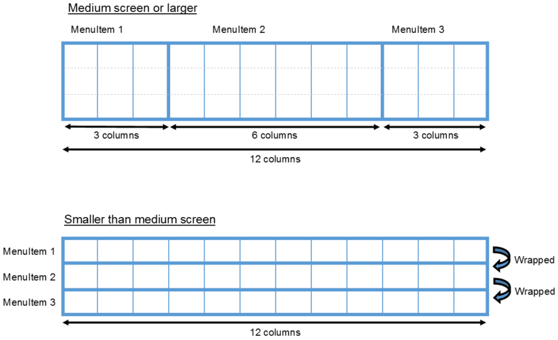
Width >= 760px: medium screen or larger < 760px: smaller than medium screen.
We can use these classes to create the arrange of contents on a single line, with a larger central item (6 columns) and 2 smaller outer items (3 columns each) on the medium state, and switch to each item using 12 columns (all available space) in the extra-small state.
Example: Bootstrap grid framework used to define a set of behaviors based on screen width.
In this example, menuitem1 will use 12 columns on width ranging from extra small to medium, then switch to using 3 columns on medium screens or larger.
<div class="box content1 col-xs-12 col-md-3">MenuItem 1</div>
Summary
I hope this article has given you some ideas in doing responsive design, let us know if you have any question or comments. Part 2 for Responsive design in ZK is coming soon so stay tuned!
Comments
| Copyright © Potix Corporation. This article is licensed under GNU Free Documentation License. |


